The Photographers Gallery Exhibition-
The Photographers' Gallery was created in Covent Garden in 1971 as the first public gallery in the UK dedicated to photography. They are often the home of talks from artists such as Mohamed Bourouissa and Clare Strand. For a school trip we went to see the two exhibitions 'Feast for the Eyes' and 'Shot in Soho'.
|
Nobuyoshi Araki, The Banquet, 1993
|
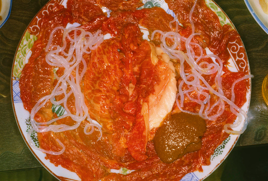
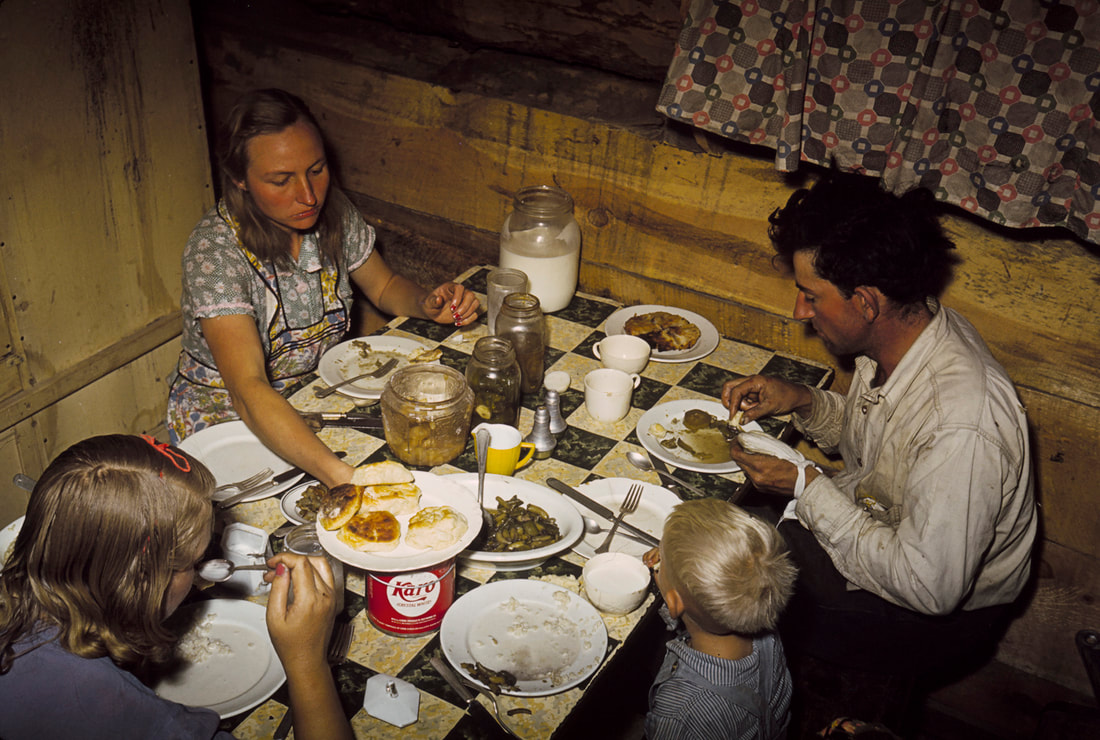
Feast for the Eyes-
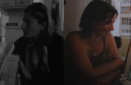
This exhibition focused on taking pictures of just food or people eating together. As you can see by the photo on the left the point wasn't for the photos to look conventionally beautiful, but to show colours and different types of food. The image on the right is just simply showing a family eating dinner, however the framing and lighting makes this concept very effective. |
Russell Lee, 1940
|
|
Artist not Named
|
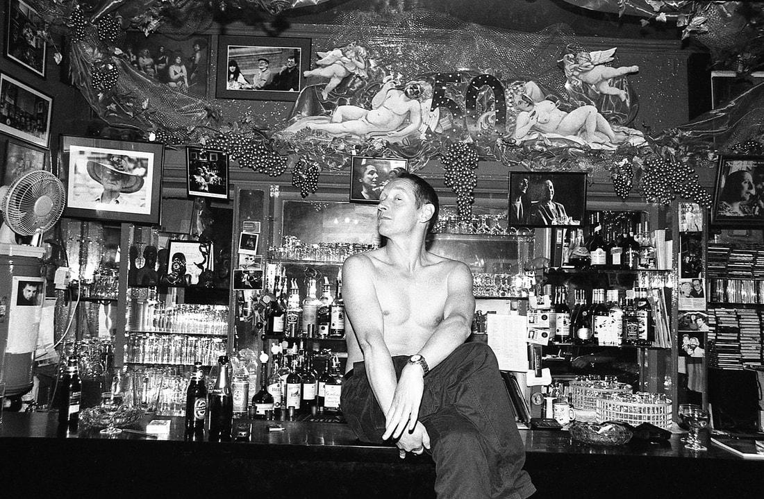
Shot in Soho-
Although the area of Soho is relatively small and borders some of London’s richest and most commercialised streets, it has remained a complex place of, diversity and tolerance, making it very interesting to photograph. The photos are intended to show daily life in Soho. This is interesting because of the variety of people. |
John Goldblatt, 1968
|
3 Artists
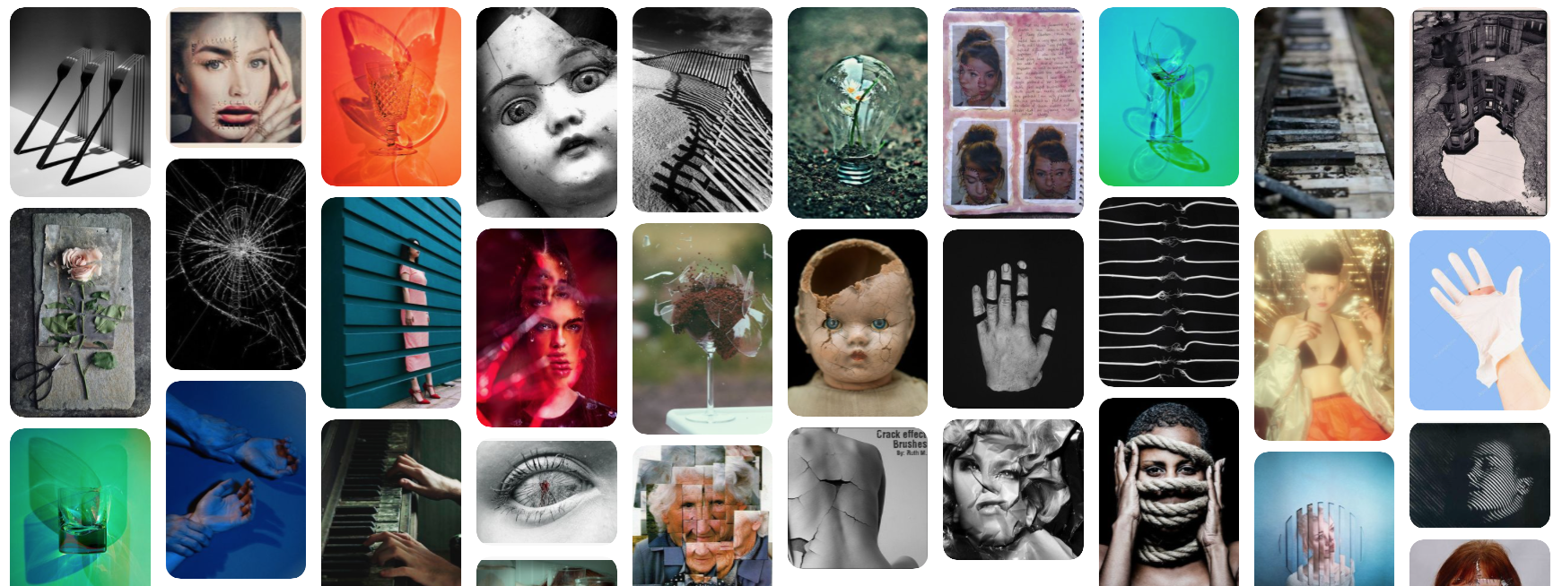
Anthony Gerace-
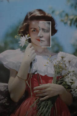
Anthony Gerace lives and works in London. His three main areas of art are collage, photography and typography. He recently completed his thesis in graphic design, with a focus in studio and outdoor portraiture at OCADU in Toronto, Canada. He has worked with brands such as The Ace Hotel, Adidas Originals and AnOther Magazine. The images I've chosen of his which I think represent the theme of 'Broken' very well are ones he did of a collage. For this he took an image, printed it out and cut it into squares. He then removed some of the squares which include the model and replaced it with the background colour. I think this art is effective as the bright colours all look nice together as a collection.
Anthony Gerace lives and works in London. His three main areas of art are collage, photography and typography. He recently completed his thesis in graphic design, with a focus in studio and outdoor portraiture at OCADU in Toronto, Canada. He has worked with brands such as The Ace Hotel, Adidas Originals and AnOther Magazine. The images I've chosen of his which I think represent the theme of 'Broken' very well are ones he did of a collage. For this he took an image, printed it out and cut it into squares. He then removed some of the squares which include the model and replaced it with the background colour. I think this art is effective as the bright colours all look nice together as a collection.
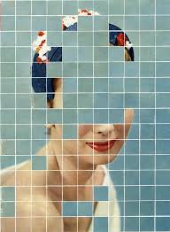
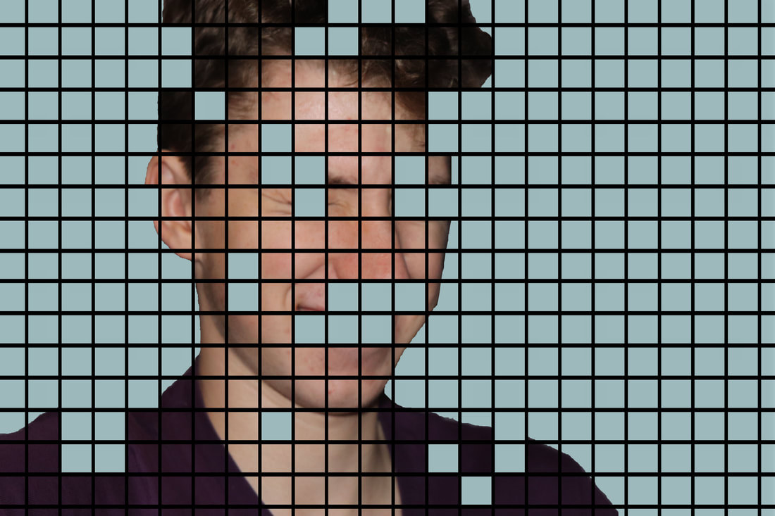
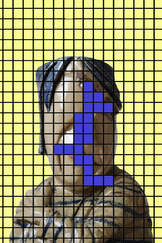
For this image the background colour is a pale tone of blue. The model is wearing a darker shade of blue and also red. This selection of different shades of blue contrasting with the bold red makes the images make the image come together in a nice composition. The artist has removed parts of the models face like her eyes adding an element of mystery.
|
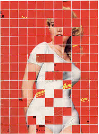
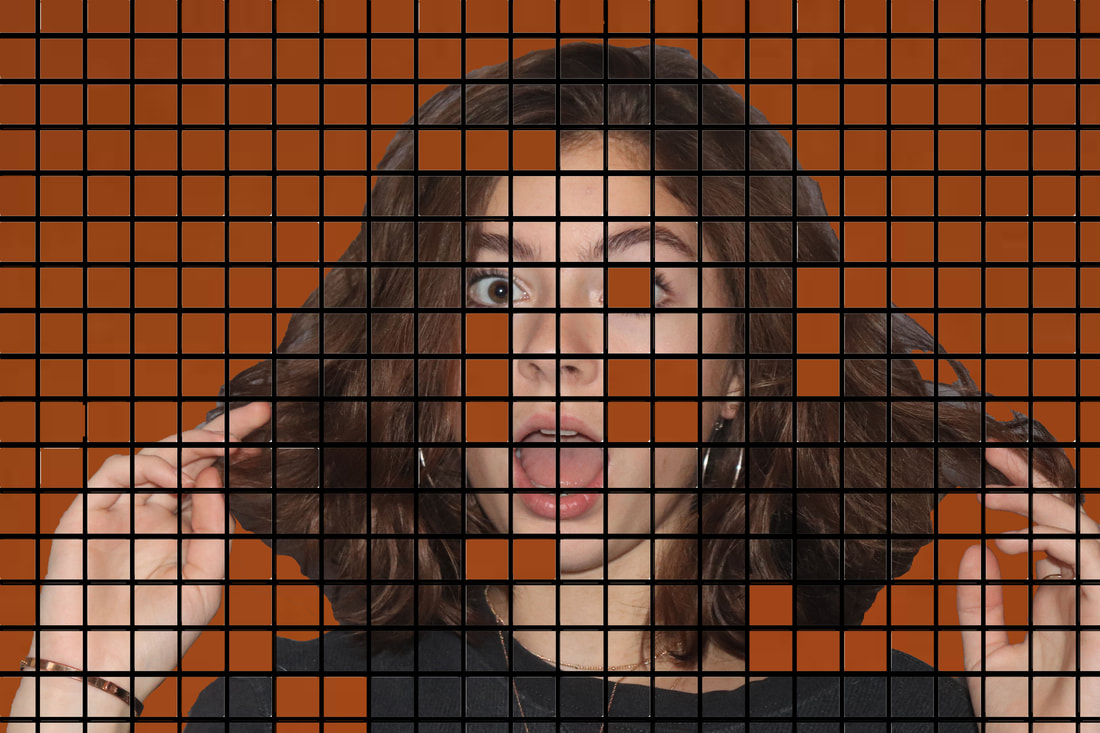
In this collage the background is a much brighter colour, being red it makes the image stand out more from the other images. Having some images that are clearly meant to stand out more against the others in a key part of Geraces' art. As apposed to the others for some of the squares he's replaced them with some yellow contrasting text.
|
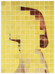
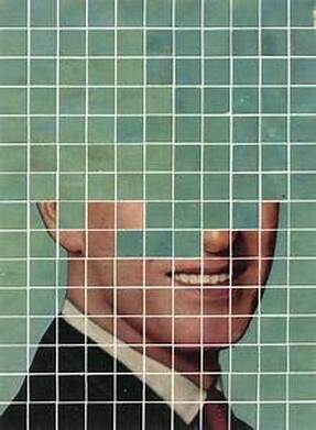
for this image the background once again is a fairly pale yellow. In this piece unlike the others Gerace has removed a lot more squares, in fact the majority of the models face has not been included. This once again adds an element of mystery to the photo as to who the model is. The model is also wearing colours which co-ordinate with yellow.
|
First Response-
When doing my response I wasn't sure if Gerace's work had been done manually or on photoshop or another online editing software, so I did mine using photoshop as I think it works best when creating multiple different images all in the same design. I used at first images of people like in the artists work and then developed on from that experimenting with plants, statues and other objects around the house. I then took those images into photoshop, put a block colour underneath, placed a grid on top and cut different blocks from that grid out of the original photo. This method creates a very similar effect for my photos when being compared to my link artist. I also tried experimenting with instead of cutting squares out the grid and revealing the same colour, I tried to look for complimenting colours instead, this effect created a contrasting composition.
When doing my response I wasn't sure if Gerace's work had been done manually or on photoshop or another online editing software, so I did mine using photoshop as I think it works best when creating multiple different images all in the same design. I used at first images of people like in the artists work and then developed on from that experimenting with plants, statues and other objects around the house. I then took those images into photoshop, put a block colour underneath, placed a grid on top and cut different blocks from that grid out of the original photo. This method creates a very similar effect for my photos when being compared to my link artist. I also tried experimenting with instead of cutting squares out the grid and revealing the same colour, I tried to look for complimenting colours instead, this effect created a contrasting composition.
For this image I started off with a landscape image of the models face, for this one I wanted it to be very similar to one of the artists examples and then I could start doing other things with the idea. So I used the same shade of blue Gerace used for one of his pieces.
|
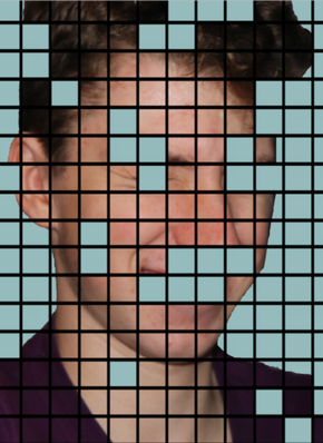
Most of the background colours in Geraces pieces are quite light, pastel shades, so in order to make mine look a bit different I used a strong dark colour which I think worked well. I also covered the main facial features which is very common in the link artists work.
|
|
|
|
|
|
WWW- I like the array of different objects used in the images, making mine different from the artists but I also did some inspired by the artists with some portraits of people. I also like the colours used in the background.
EBI- Refer more to the artist and how much the artist removed from the image with the other colours. For example some of my images remove very little from the background image whereas the link artist removes fairly large areas of the image in his work.
EBI- Refer more to the artist and how much the artist removed from the image with the other colours. For example some of my images remove very little from the background image whereas the link artist removes fairly large areas of the image in his work.
Artist and Me-
|
I decided to compare these images because the colours used are similar. One thing different which I did with all my images is the lines, the grid for mine is much thicker and I did it in black. If I were to re-do this shoot I would change the colour of the lines which I did for the final few of this task. Also what is similar between the two is that most the facial features in his work are cut out which is a feature I tried to bring to my own work, by putting all the main facial features underneath the blue. I also found the contrast in the work is important with the colours in the image.
|
|
How it's done-
John Stezaker
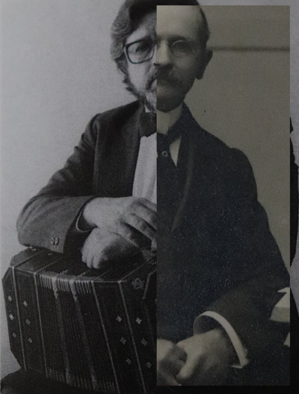
John Grenville Stezaker, is a British conceptual artist. Born in 1949 and still living in England, he had his education in the Slade School of fine art. The images I've chosen of his which I think represent the theme of 'Broken' are from his collection where he cut up different pictures and combined them with a different image of someone else, or the same person at a different time in their life. Stezaker made many of these collages in private throughout his life and has now decided to present them in multiple well known galleries such as The Museum of Modern Art in New York and the Tate Modern in London.
John Grenville Stezaker, is a British conceptual artist. Born in 1949 and still living in England, he had his education in the Slade School of fine art. The images I've chosen of his which I think represent the theme of 'Broken' are from his collection where he cut up different pictures and combined them with a different image of someone else, or the same person at a different time in their life. Stezaker made many of these collages in private throughout his life and has now decided to present them in multiple well known galleries such as The Museum of Modern Art in New York and the Tate Modern in London.
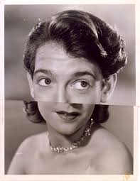
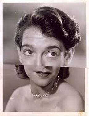
For this image Stezaker has stuck to a more simple cut, he's just cut horizontally half way through each photo. On top he has used a more zoomed in image of a man and below there is a photo of a women who is a bit further away, so the images don't perfectly line up.
|
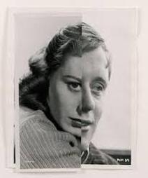
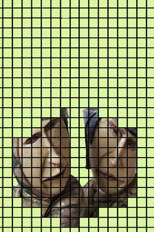
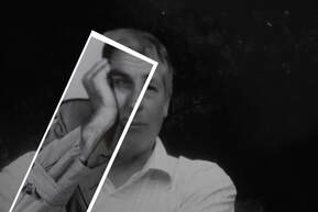
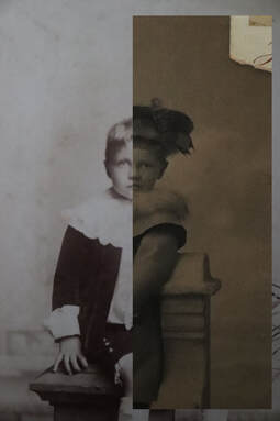
With this one the artist has done a vertical cut down the middle of each photo. He also made the decision to leave the edges of the photos in which adds to the rustic effect. The images combined almost look warped as the only part which lines up are the lips and everything else is out of proportion.
|
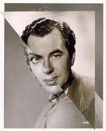
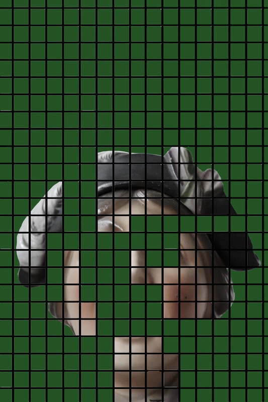
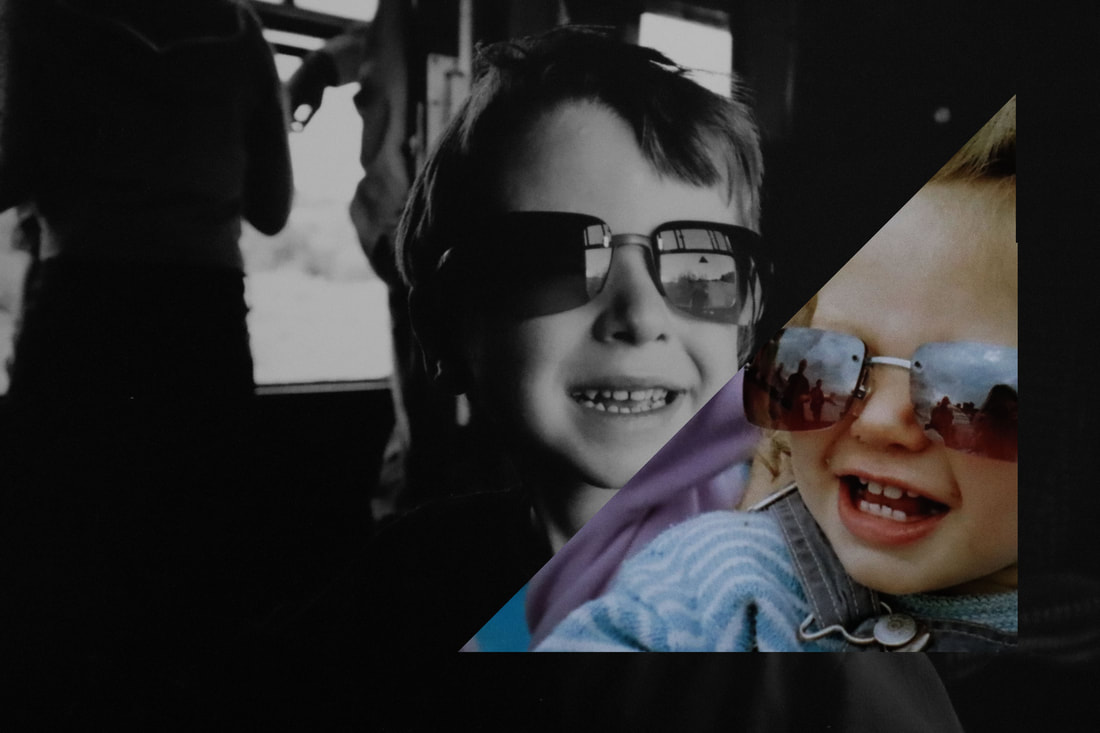
For this image the cut of the photos are a bit more abstract, its clear the artist hasn't cut the photo below but more just placed a triangle of a photo on top. The two people really compare as there two faces are so different. However he has done well to line up the bodies making them look fairly well lined up.
|
First Response-
For this shoot I needed old photos or photos which look old so I went through some old pictures I had and took photos of ones I thought would work well. I then took them into photoshop. For some of the newer photos I added different filters to the image to make it look older or different tinges like lowering the saturation, as most old photos weren't black and white and were instead just had a vey low saturation with a lack of colours. After adjusting or cropping the images I got two or three images to eventually merge into one image. To create the collage effect present in the ink artists work I selected the first image to be the base, I then got another image and put it on top in a shape but still revealing the photo underneath.
For this shoot I needed old photos or photos which look old so I went through some old pictures I had and took photos of ones I thought would work well. I then took them into photoshop. For some of the newer photos I added different filters to the image to make it look older or different tinges like lowering the saturation, as most old photos weren't black and white and were instead just had a vey low saturation with a lack of colours. After adjusting or cropping the images I got two or three images to eventually merge into one image. To create the collage effect present in the ink artists work I selected the first image to be the base, I then got another image and put it on top in a shape but still revealing the photo underneath.
Both images I used for this edit were quite new and so were both shot in colour, however in order to pull off the old picture effect present in the link artists work I made one black and white, and with the other one I lowered the saturation as colour in old pictures tend to be quite dull.
|
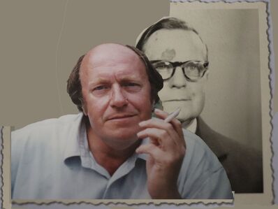
For this edit one of the pictures I used was actually old and so didn't need adjusting, however it made the newer image stand out, so to tone it down I lowered the saturation and contrast, so that made it stand out less. I then used the border the older phot had and put it on the newer one.
|
|
|
|
|
|
|
|
|
WWW- I like how the images are cut together in a way that makes it look like I've done it manually.
EBI- Some of them are very far from the link artists work although this could show development.
EBI- Some of them are very far from the link artists work although this could show development.
Artist and Me-
|
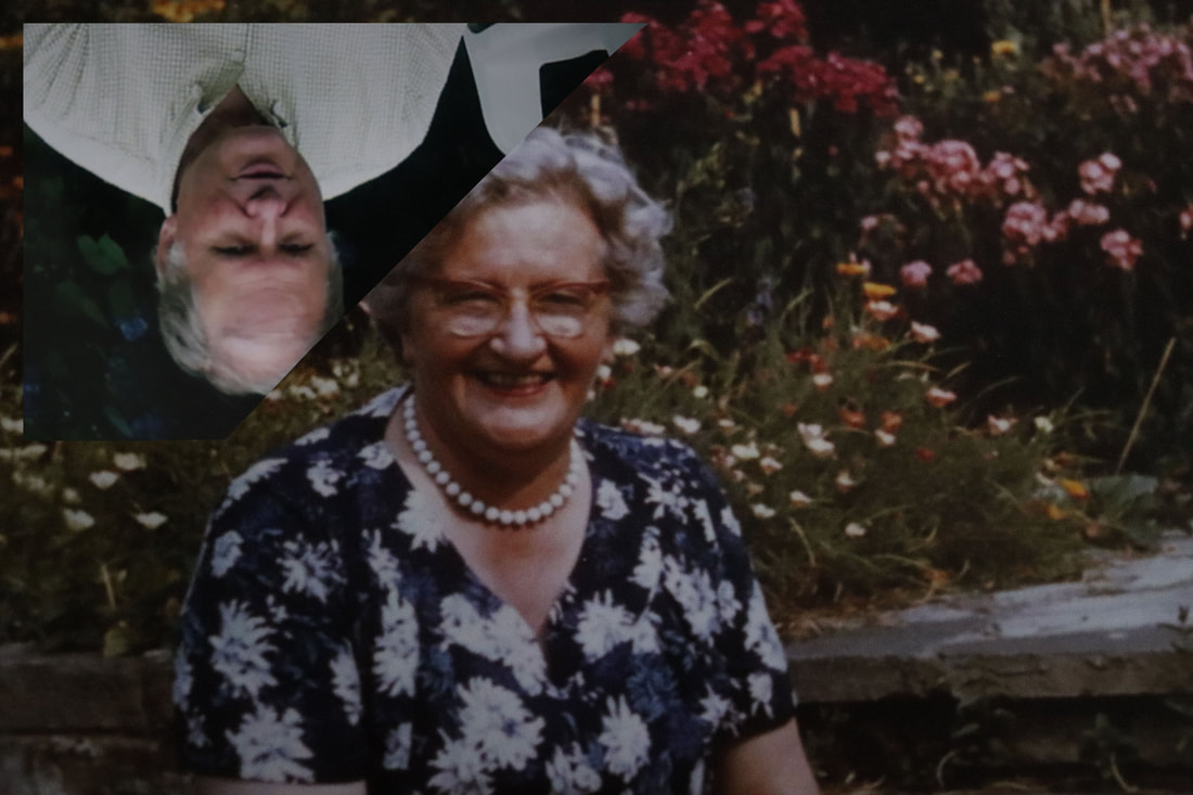
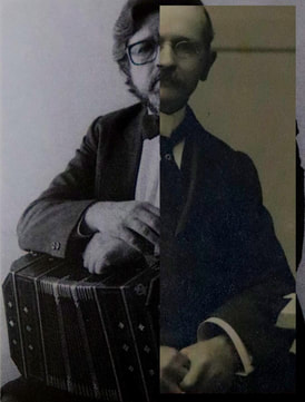
I chose this image of mine to compare with the artists work as I think they're most similar. Both images are cut down the middle to create one image and they are both joined in a way that it's supposed to be so it could look like the same picture. One difference in my whole shoot against the link artists is that Stezaker's were done by printing out the images and cutting them up rather than doing with photoshop. However I tried to make it look like I'd done it with photoshop by making it look messier.
|
|
How its done-
David Hockney
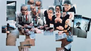
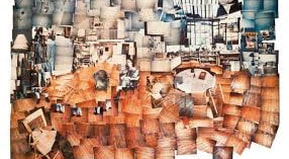
Born in 1937 David Hockney is a British painter, draftsman, printmaker, stage designer, and photographer. He is considered one of the most influential British artists of the 20th century, as he was an important contributor to the pop art movement of the 1960s. This collection of work he made is one of his most famous surrounding photography. This shoot he did is called 'Joiner' It involved taking either one or many images and joining them together to make the image more abstract, so cutting out one section and putting it somewhere else. Sometimes he tries purposely to make it attract, for example having several eyes on one face. However he sometimes tried to make it like the original image but just all differently put together.
Born in 1937 David Hockney is a British painter, draftsman, printmaker, stage designer, and photographer. He is considered one of the most influential British artists of the 20th century, as he was an important contributor to the pop art movement of the 1960s. This collection of work he made is one of his most famous surrounding photography. This shoot he did is called 'Joiner' It involved taking either one or many images and joining them together to make the image more abstract, so cutting out one section and putting it somewhere else. Sometimes he tries purposely to make it attract, for example having several eyes on one face. However he sometimes tried to make it like the original image but just all differently put together.
This image has been by taking multiple photos making the models make different facial expressions, he has ten moved it around making the image very chaotic with lots going on. Also like a lot of his images in this collection the edges are made by the shape of the focus of the image.
|
This image is very interesting as lots of different lighting and colours are in the different images so then when they're joined it looks interesting. All the images put together make the layout of an apartment but this technique shows the flat in a way you could never see through taking a normal photo.
|
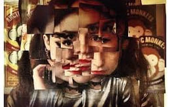
This is one of his portrait pieces, and one of his only ones created with only using one image and cutting out different bits and moving them around to make a new, different image. Hockney repeatedly places different angles of the same image creating a layered effect. The colours in the image are all quite dark and warm.
|
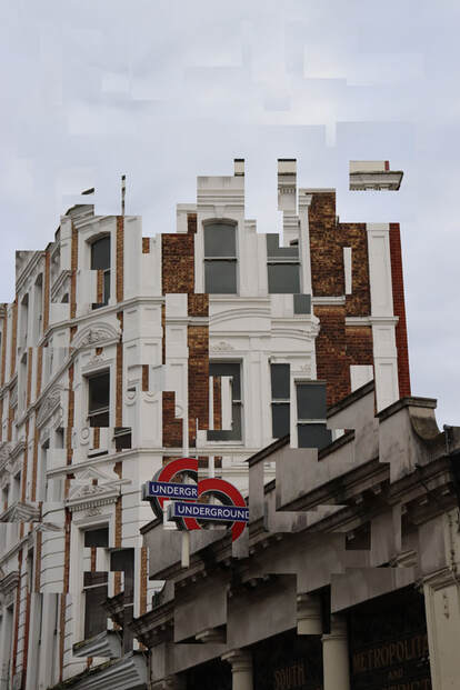
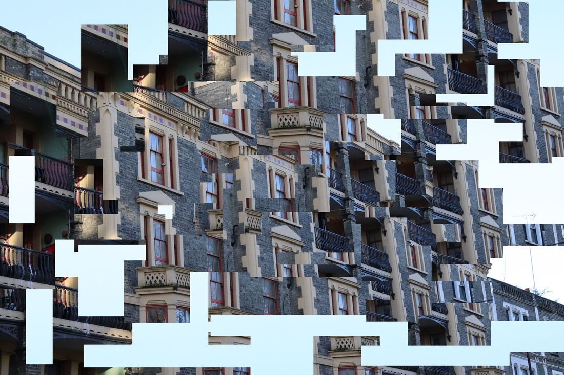
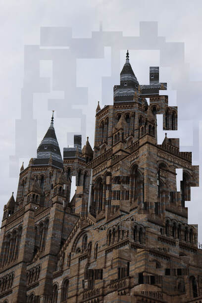
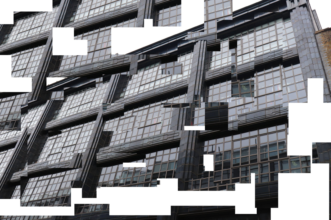
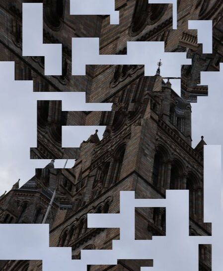
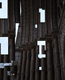
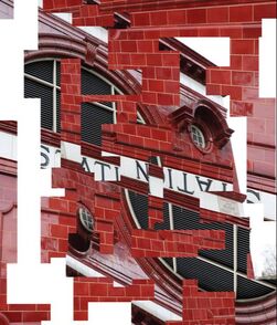
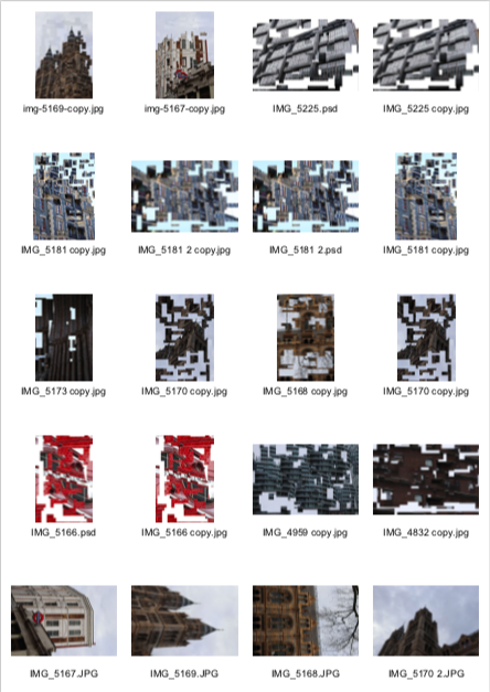
Architectural Abstraction- First Response-
For this response I tried many different methods in order to make it as similar as possible. For my first attempt I took multiple images of the same scene but moved the camera ever so slightly for each image, then for each photo I got a block from different places in the different images and layered them out as if it was a normal picture. For another approach I just used a singular picture and got different parts of the image and moved it somewhere else. Another one I did turned out not to look similar to the link artist at all but I think it was a nice development, I used one image and cut it out of where it was and pasted it in the same place but changed the colour of that layer to black and white, this effect made the rest of the colours in the picture stand out more.
For this response I tried many different methods in order to make it as similar as possible. For my first attempt I took multiple images of the same scene but moved the camera ever so slightly for each image, then for each photo I got a block from different places in the different images and layered them out as if it was a normal picture. For another approach I just used a singular picture and got different parts of the image and moved it somewhere else. Another one I did turned out not to look similar to the link artist at all but I think it was a nice development, I used one image and cut it out of where it was and pasted it in the same place but changed the colour of that layer to black and white, this effect made the rest of the colours in the picture stand out more.
|
|
|
|
|
|
|
WWW- I like how I've managed to replicate the slightly confusing look of the images by making it look very abstract.
EBI- I think the images would look better if there were more colours in the images as some of them are all very monotone pictures which makes it all blur together.
EBI- I think the images would look better if there were more colours in the images as some of them are all very monotone pictures which makes it all blur together.
Artist and Me-
How it's done-
Architectural Abstraction- Second Response-
espen dietrichson
