Richard Wentworth
Wentworth was born in Samoa then a province of New Zealand in 1947. He studied art at Hornsey College of Art in North London from 1965, and then at the Royal College of Art
|
|
|
The Good
|
|
|
|
The Bad
|
|
|
|
The Ugly
|
|
|
|
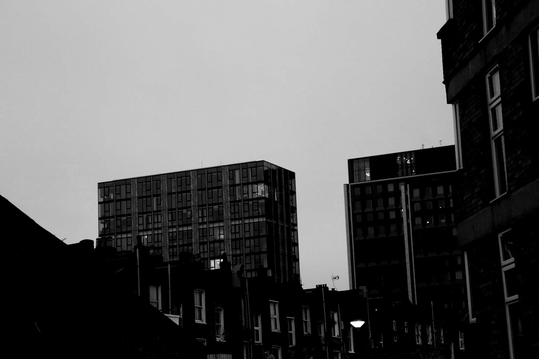
WWW: I like the contrast in light throughout all the photos.
EBI: I think I could of made the ugly ones look a bit nicer.
EBI: I think I could of made the ugly ones look a bit nicer.
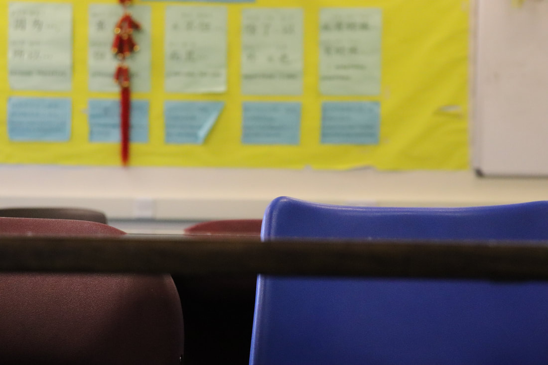
Homework
Good
|
|
|
Bad
|
|
|
Ugly
|
|
|
3 Photographers
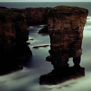
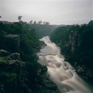
Darren Almond
|
|
|
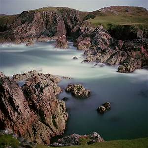
Left- This image is of an eroded piece of land connected to a cliff in the sea its on a foggy day making it dark and misty.
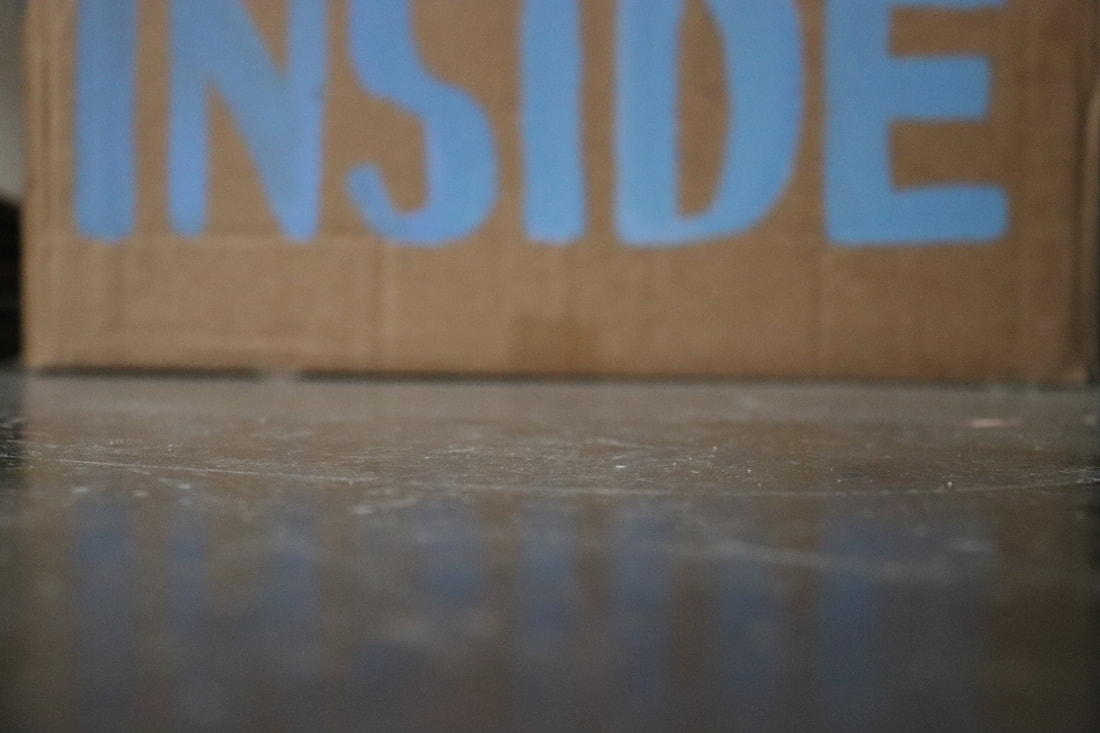
Middle- This is of a lake with trees and cliff edges on either side the water is blurred so he clearly used a slow shutter speed tis image is also foggy which most of his photos are as you can see by them being quite dingy.
Right- The sea and some very eroded cliffs this also shows the dingy theme which goes throughout.
Eliot Porter
|
|
|
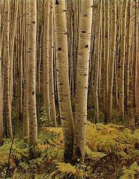
Left: The amount of trees create a sense of depth. but focusing on the front ones all his pictures are based around nature.
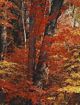
Middle: The different reds and oranges with one focus tree in the centre.
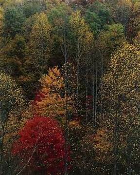
Right: This photo is taken from above of a hill with a forest on it this is why there are different layers and colours and it looks like its taken in different seasons.
Middle: The different reds and oranges with one focus tree in the centre.
Right: This photo is taken from above of a hill with a forest on it this is why there are different layers and colours and it looks like its taken in different seasons.
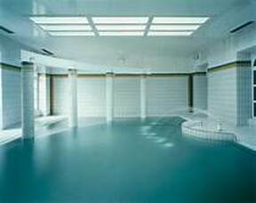
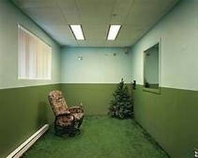
Lynne Cohen
|
|
|
All her pictures are simple yet somehow obscure and original. Another thing about her pictures is that they all revolve around one colour and different shades of that colour, for example the middle one has 2 different shades of green on the wall then a dark green on the chair and a tree in the corner this creates an interesting photo using space and colour.
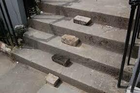
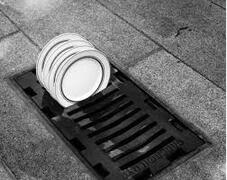
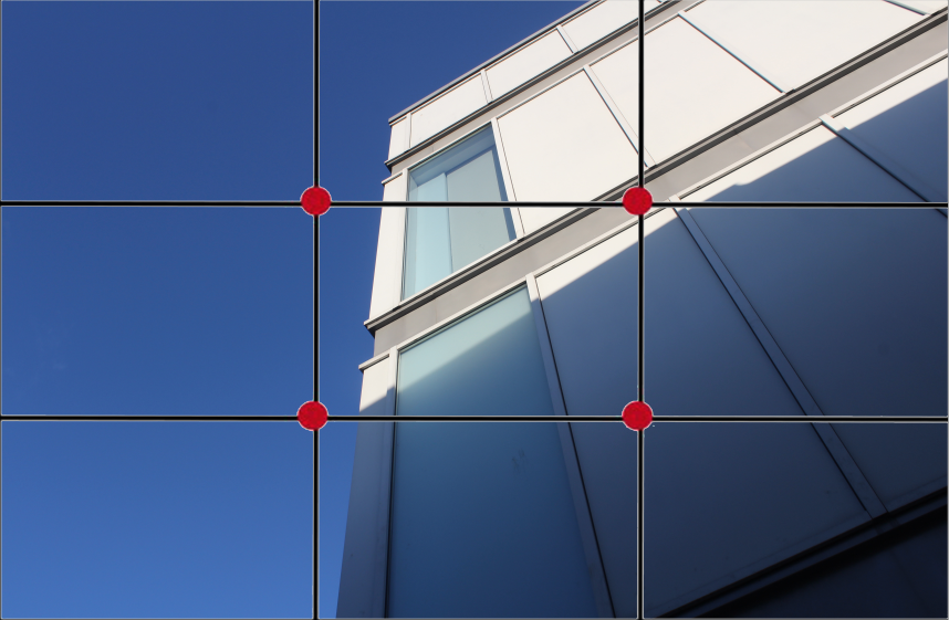
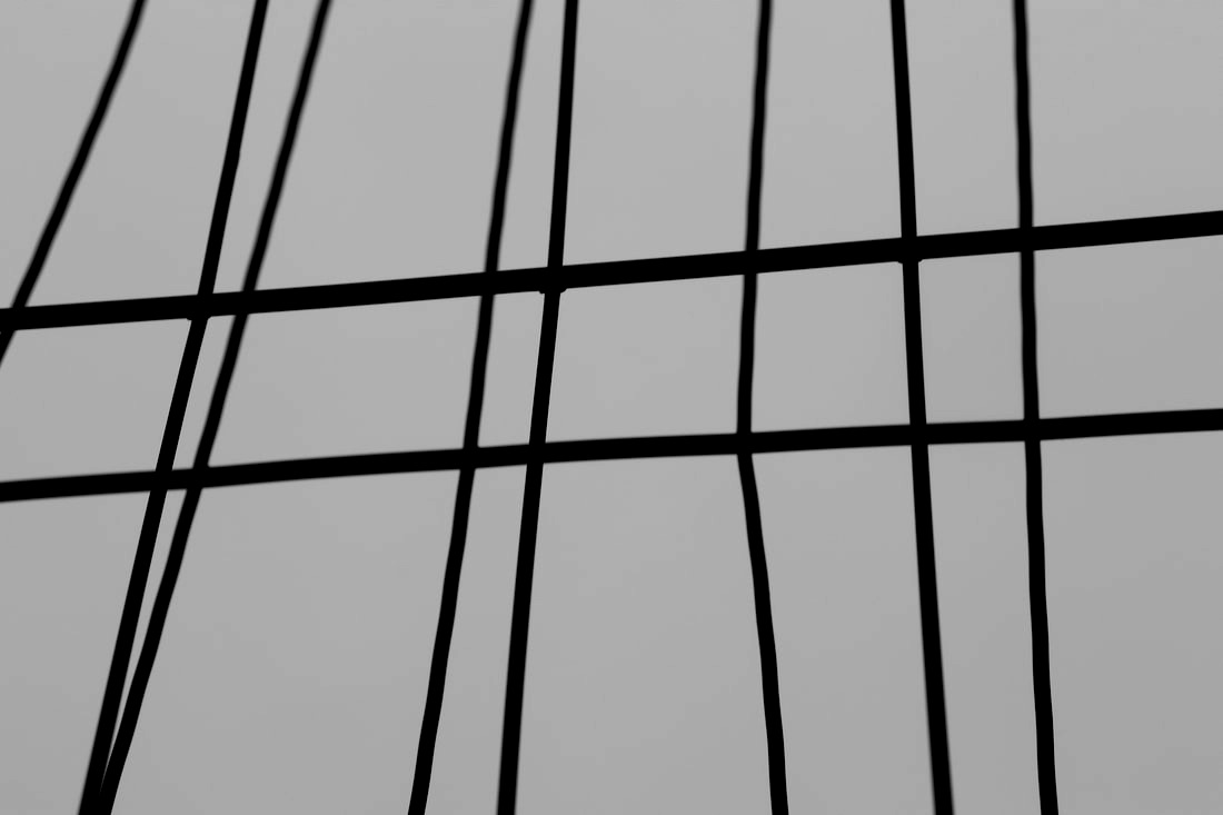
Rule of thirds
The rule of thirds is a "rule of thumb" or guideline which applies to the process of composing visual images such as designs, films, paintings, and photographs.
|
|
WWW: I used the rule of thirds and the main focuses are on the lines.
EBI: I didn't do 2 comparison photos and they are actually the same photo just one of them has the grid on it.
EBI: I didn't do 2 comparison photos and they are actually the same photo just one of them has the grid on it.
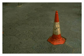
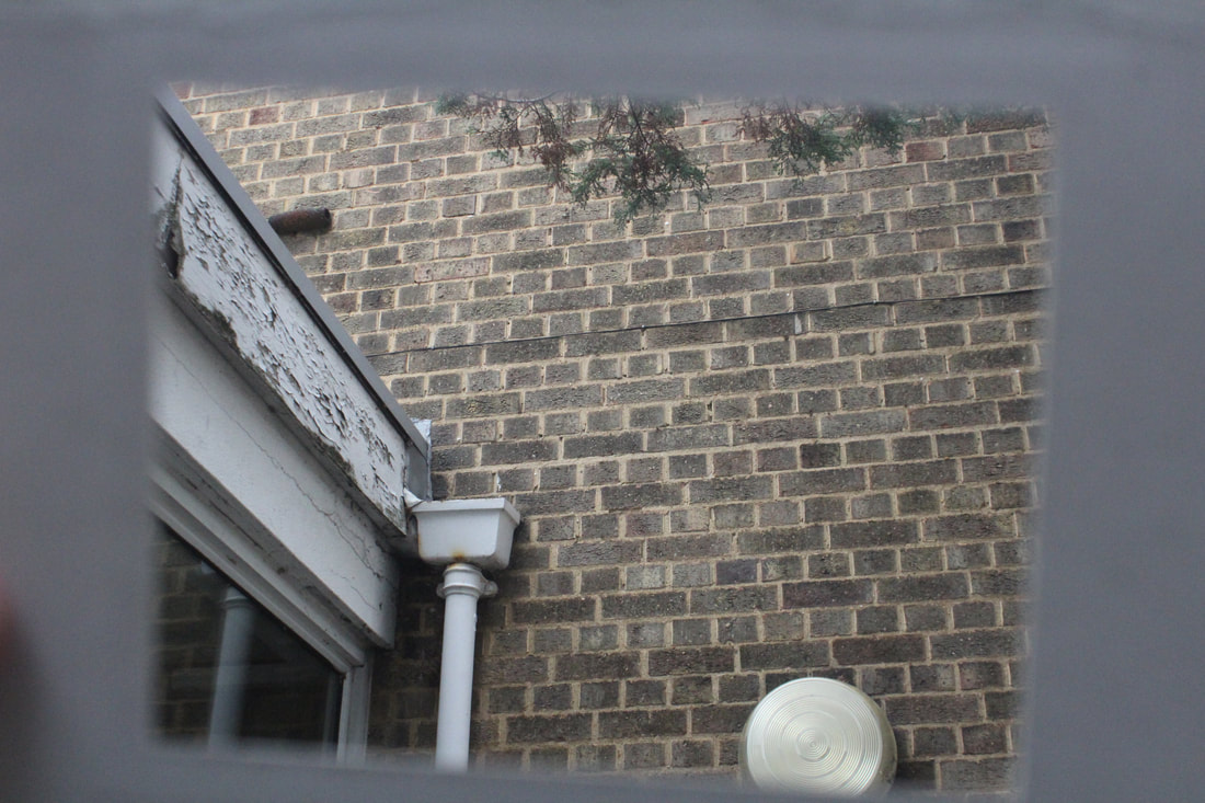
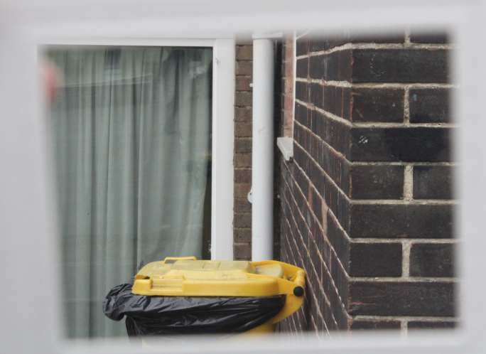
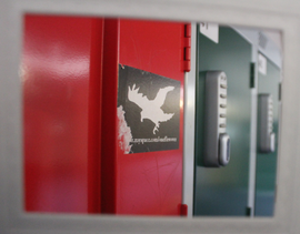
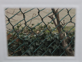
Framing
|
|

|
|
|
|
WWW: I like the things I framed.
EBI: The frame is blurry and wonky I think it would of been better if id added the frame in photoshop.
EBI: The frame is blurry and wonky I think it would of been better if id added the frame in photoshop.
Link artist
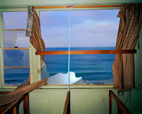
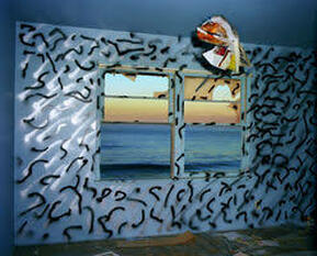
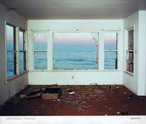
John Divola
John Divola
|
|
|
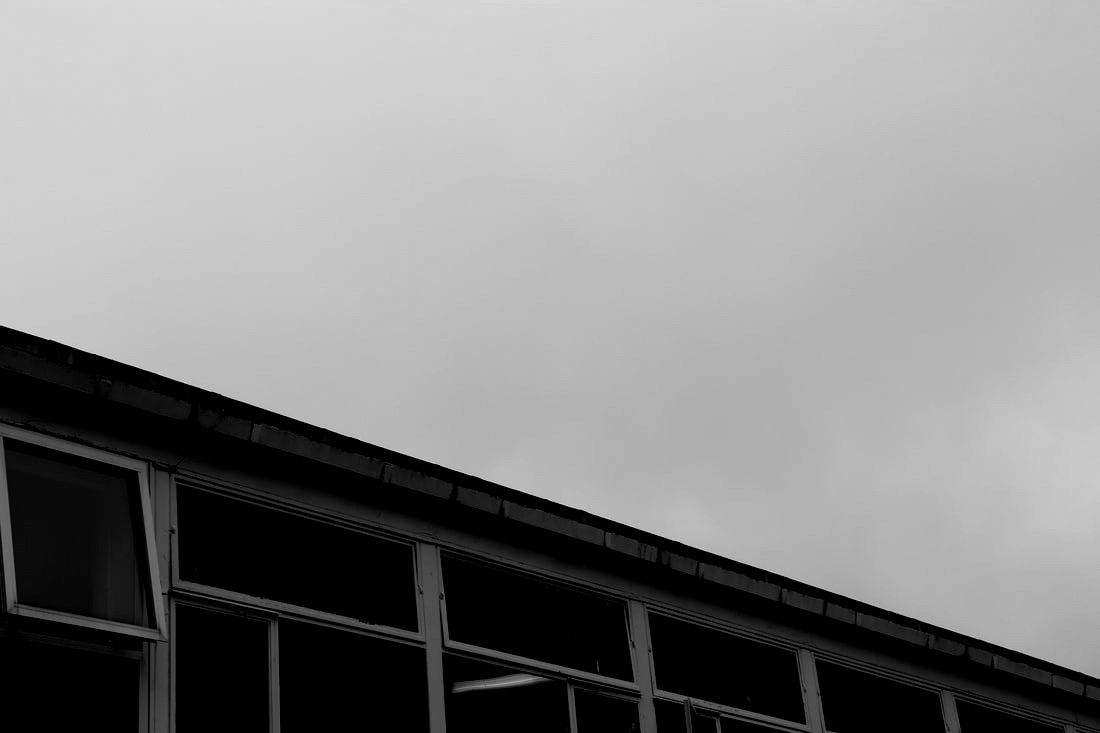
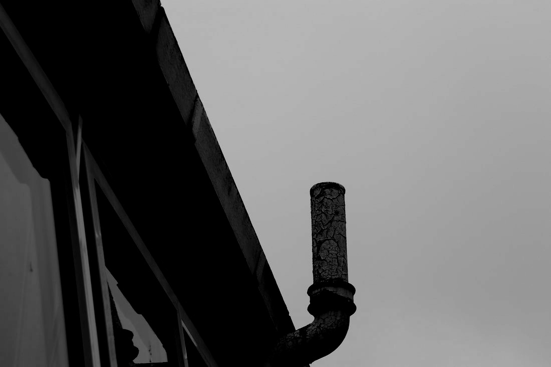
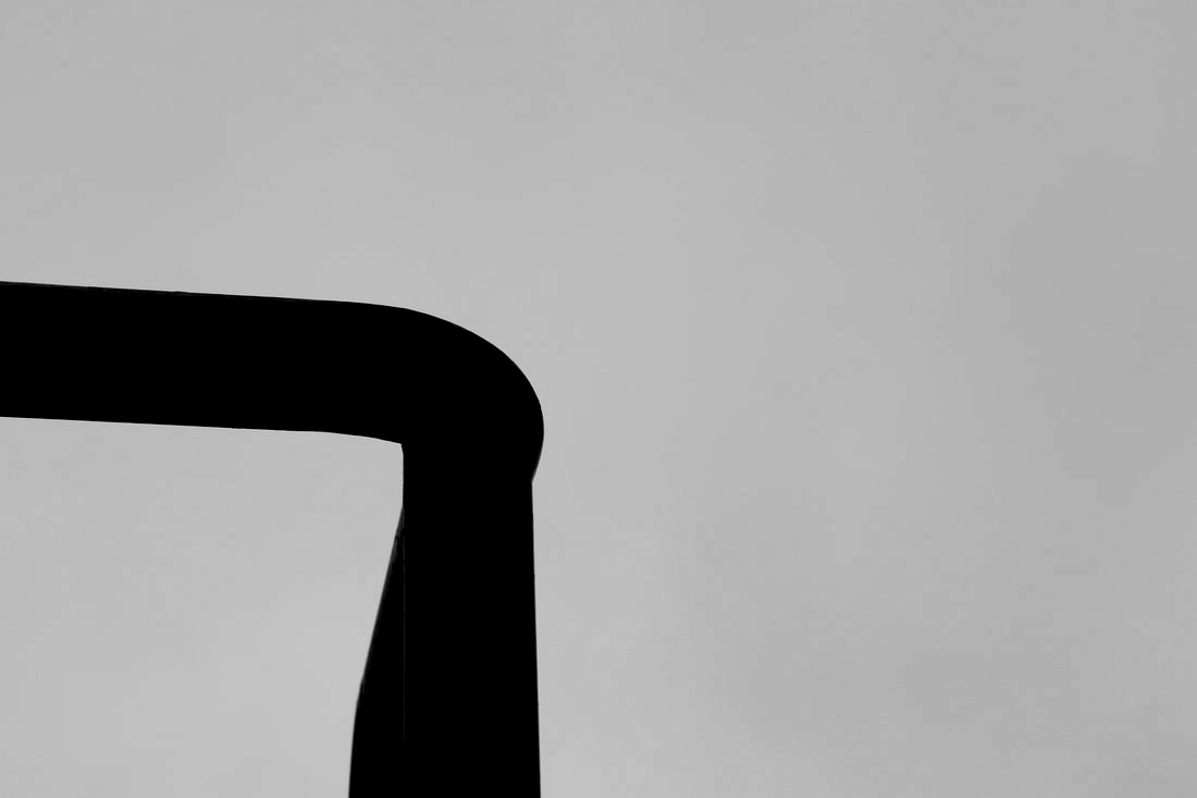
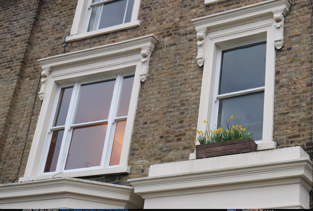
John Divola framed his images using window frames usually framing the sea. Another thing he focused on was corners, like corners of rooms and buildings.
Close up Far away
|
|
|
|
|
|

|
|
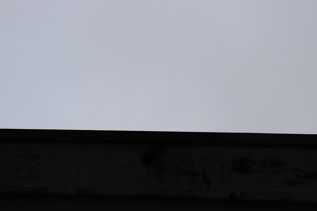
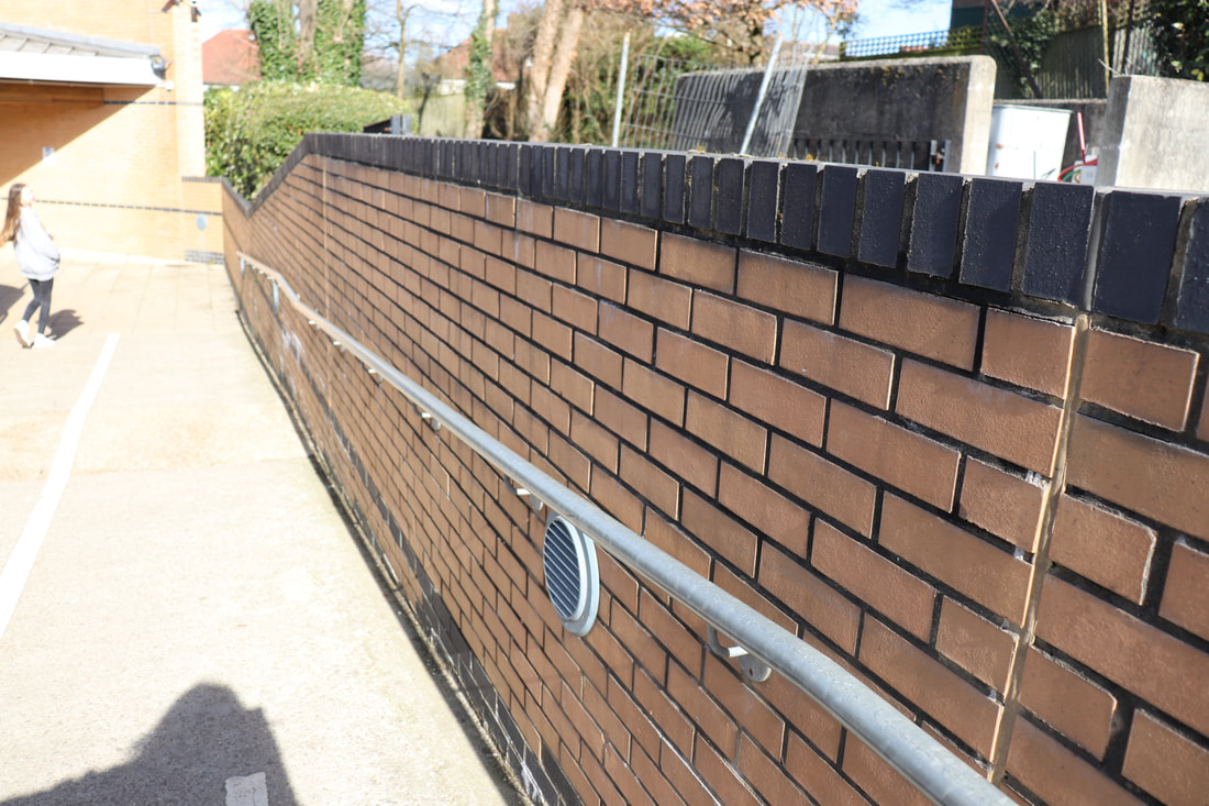
The Formal Elements
|

|
|
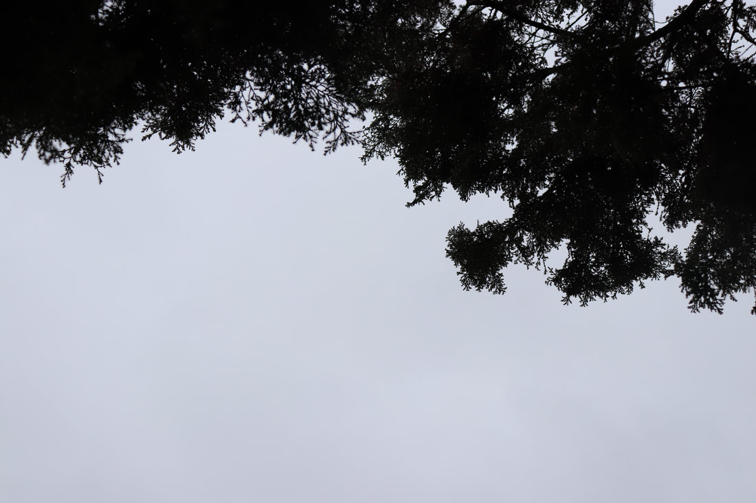
Perspective Pattern Layer
|
|
Focus. Contrast Negative Space

|
|
|
Texture Scale Colour
|
|
|
Movement Tone Balance
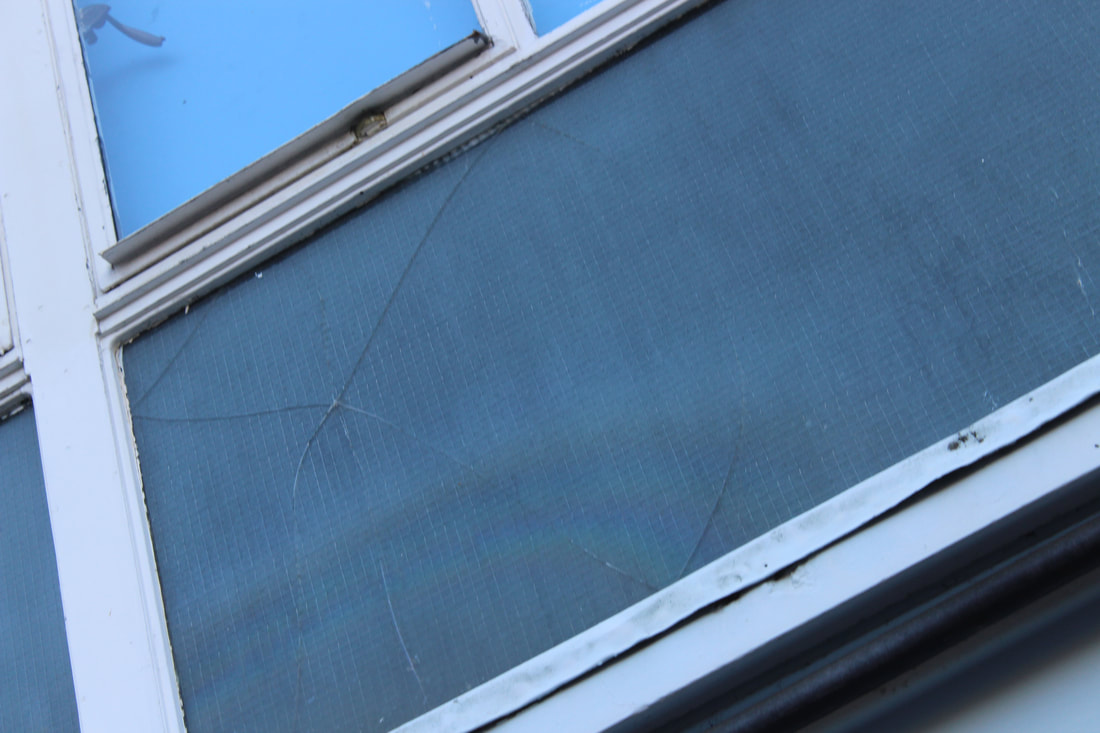
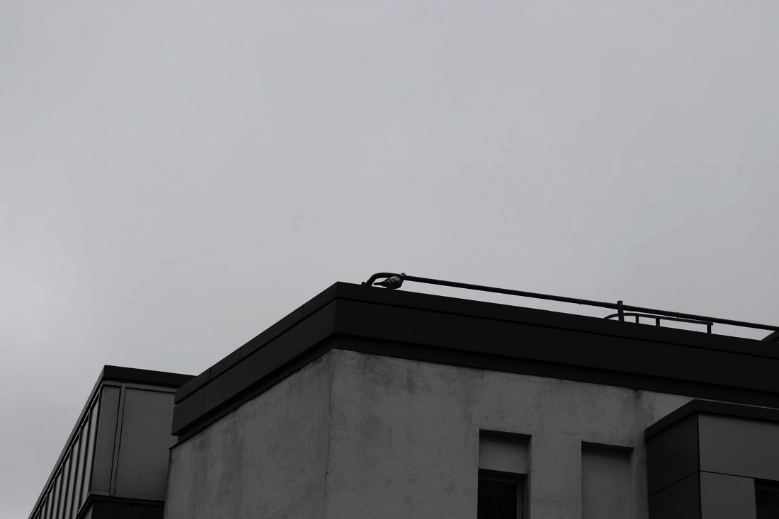
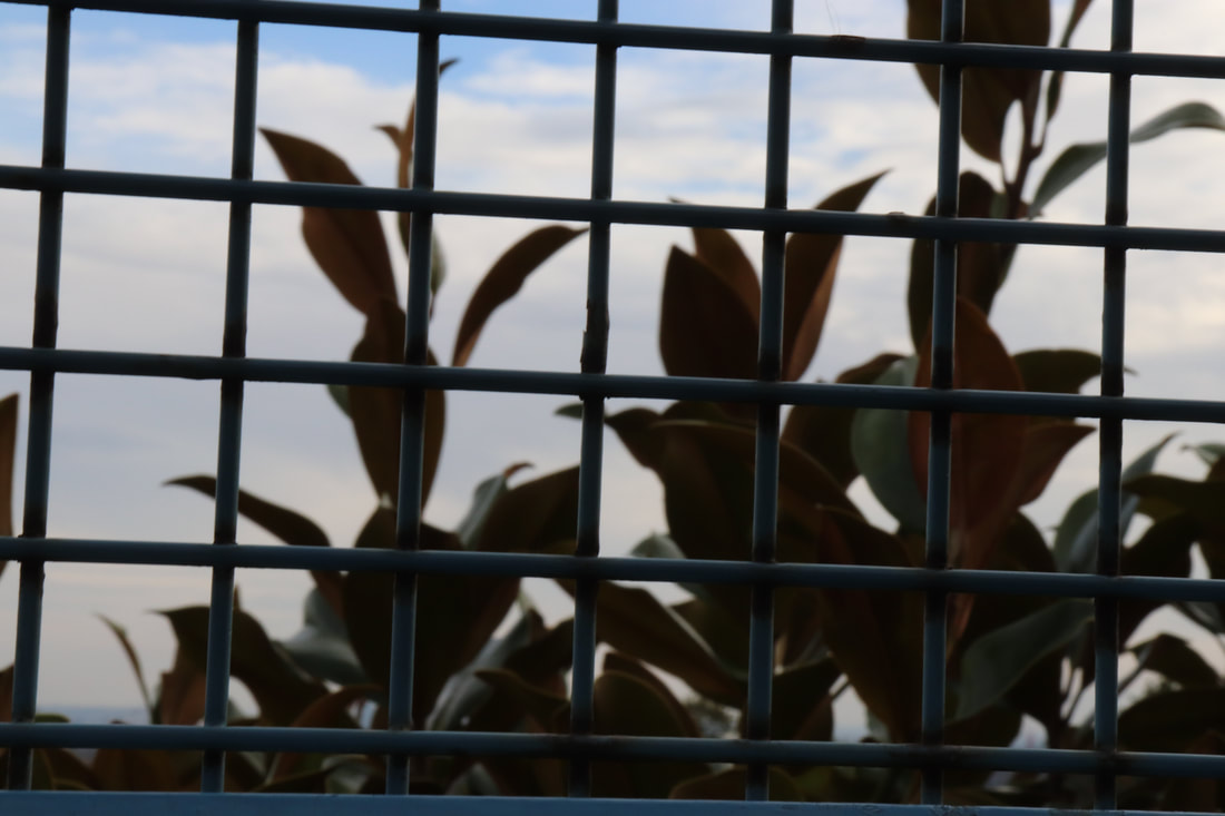
Negative space
|
|
|
|
|
|
|
|
|
|
|
|
|
|
|
Matthew Venot
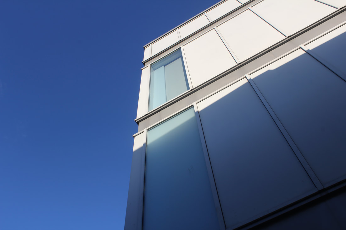
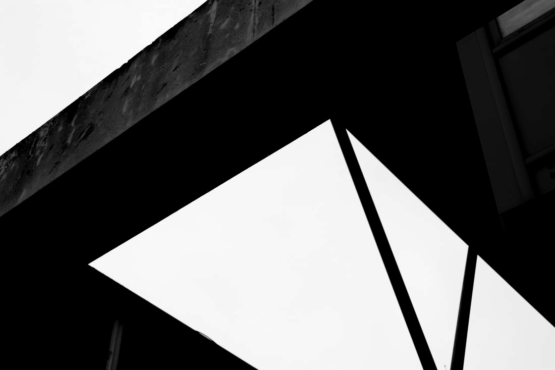
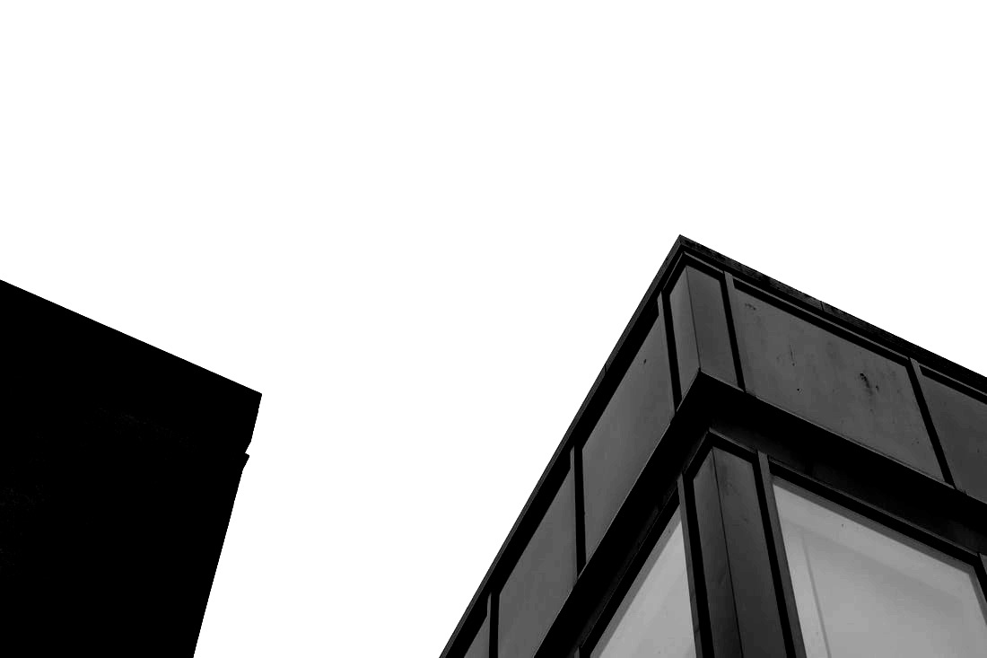
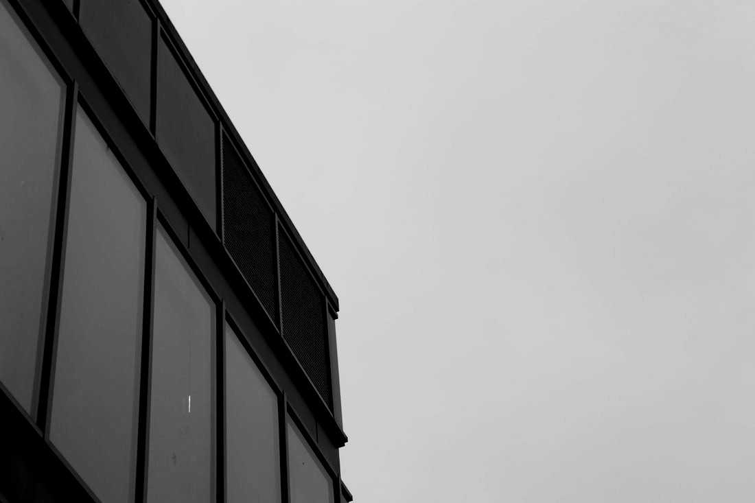
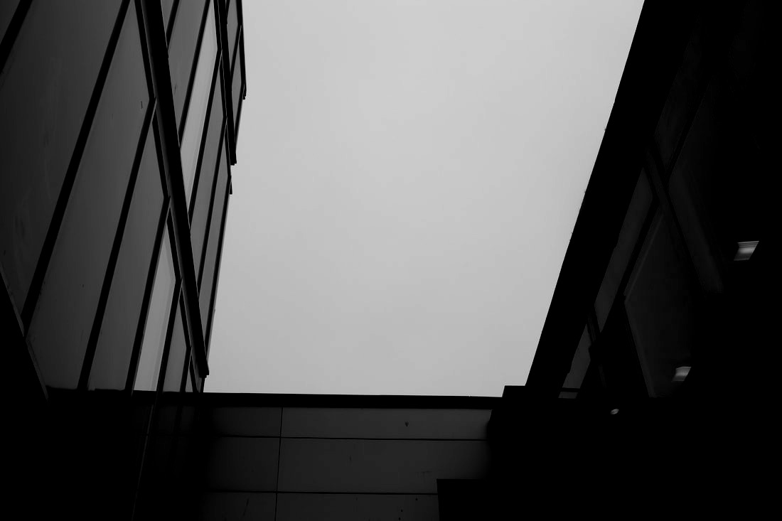
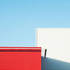
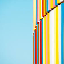
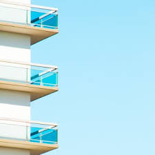
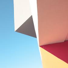
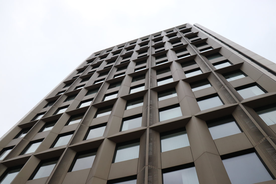
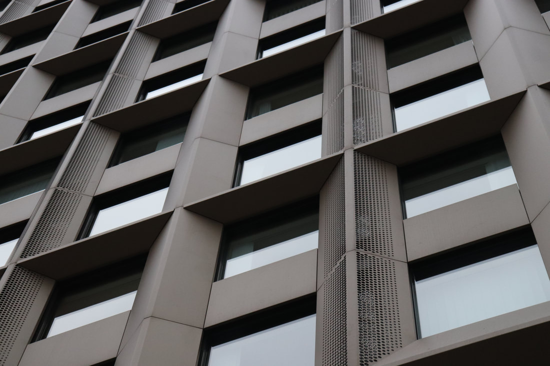
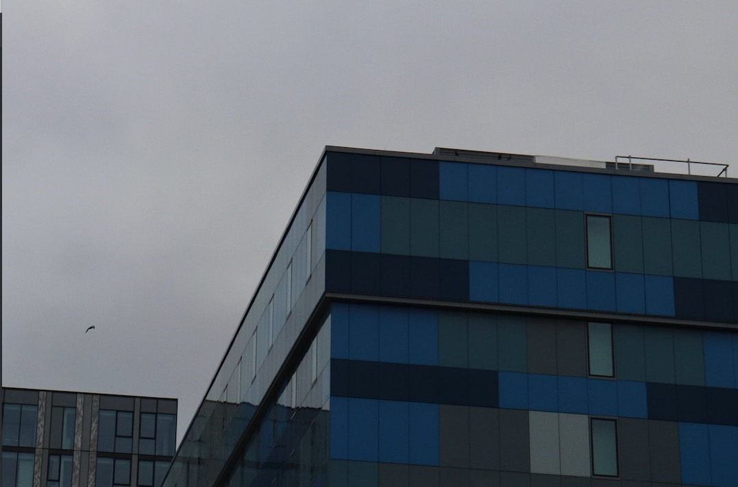
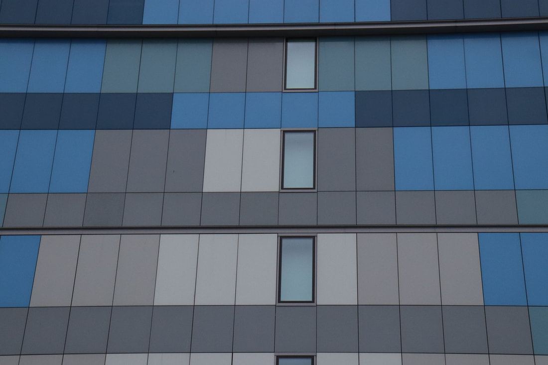
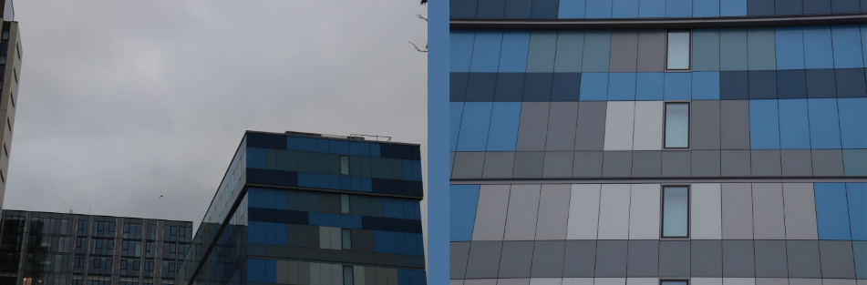
Matthieu Venot began with the desire to rediscover the city and show its own angle. By concentrating its framing on architectural details and adopting points of constructivist view, the artist manages to create abstract and geometric images. He uses clear skies and colourful buildings and objects. He tried to take his images in a way where you would forget what the building or object actually was and just focus on the colours and shapes. Which is what he had always been interested in.
|
|
|
|
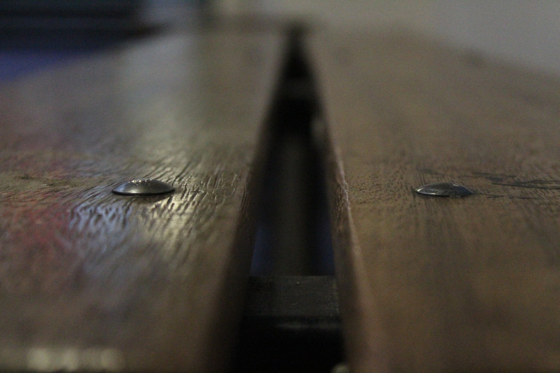
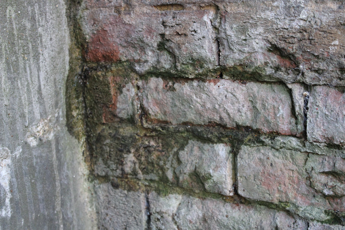
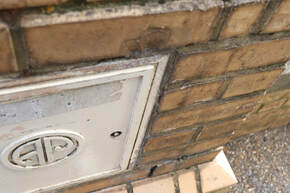
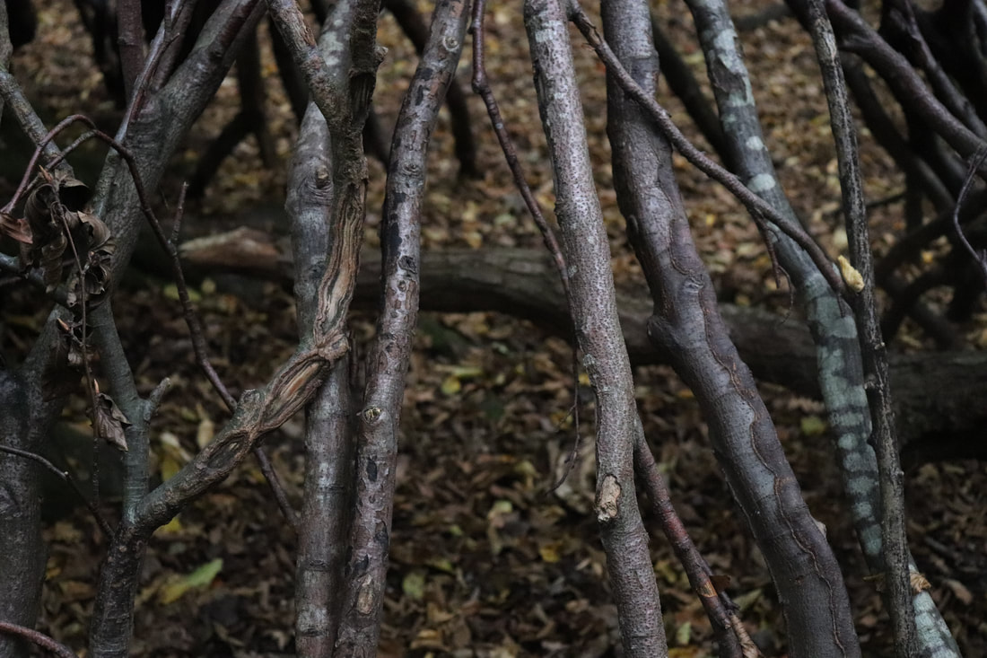
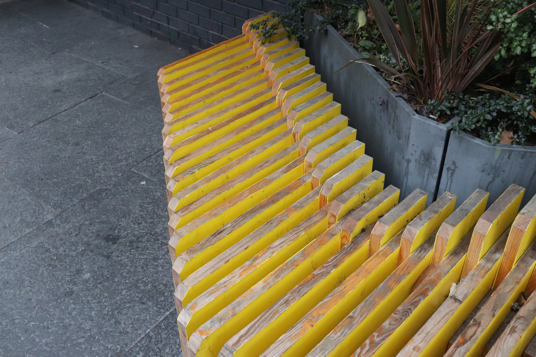
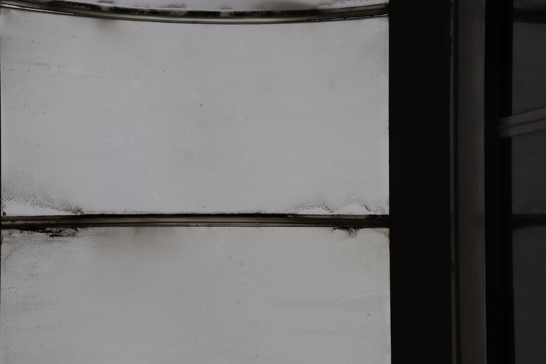
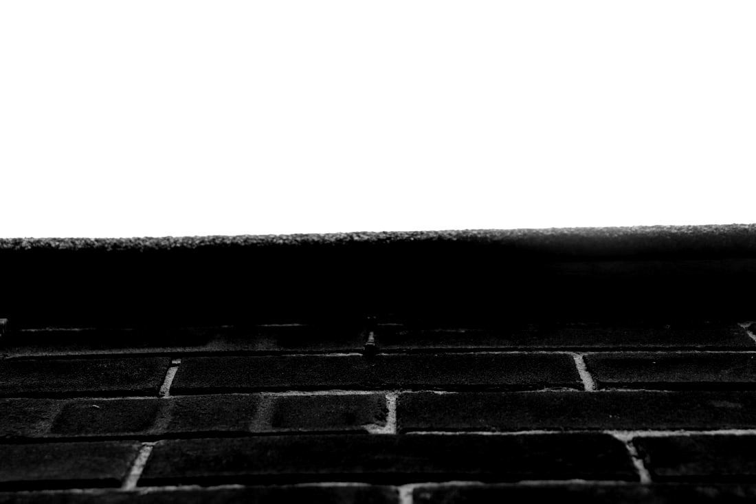
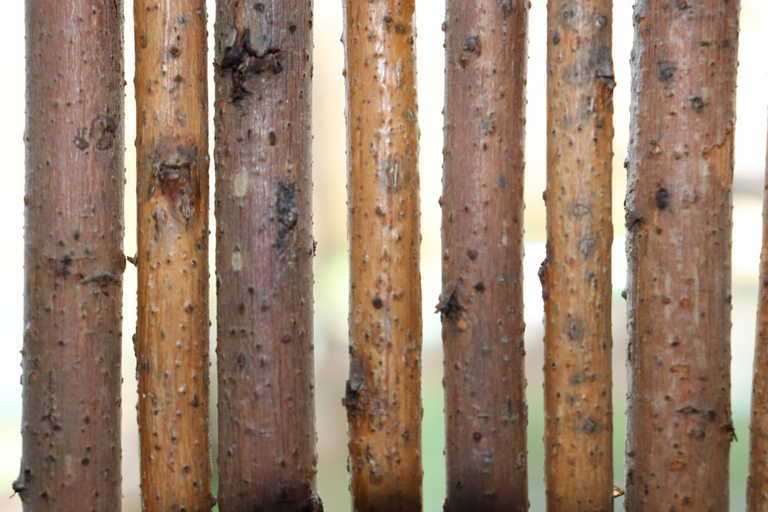
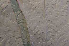
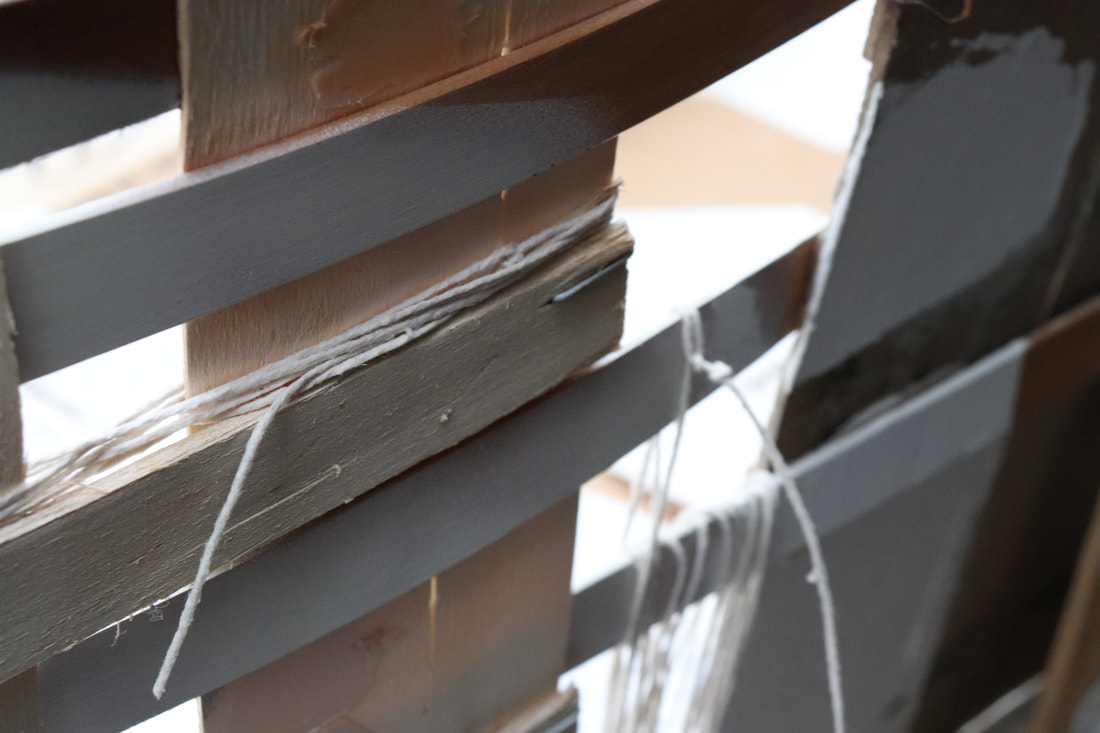
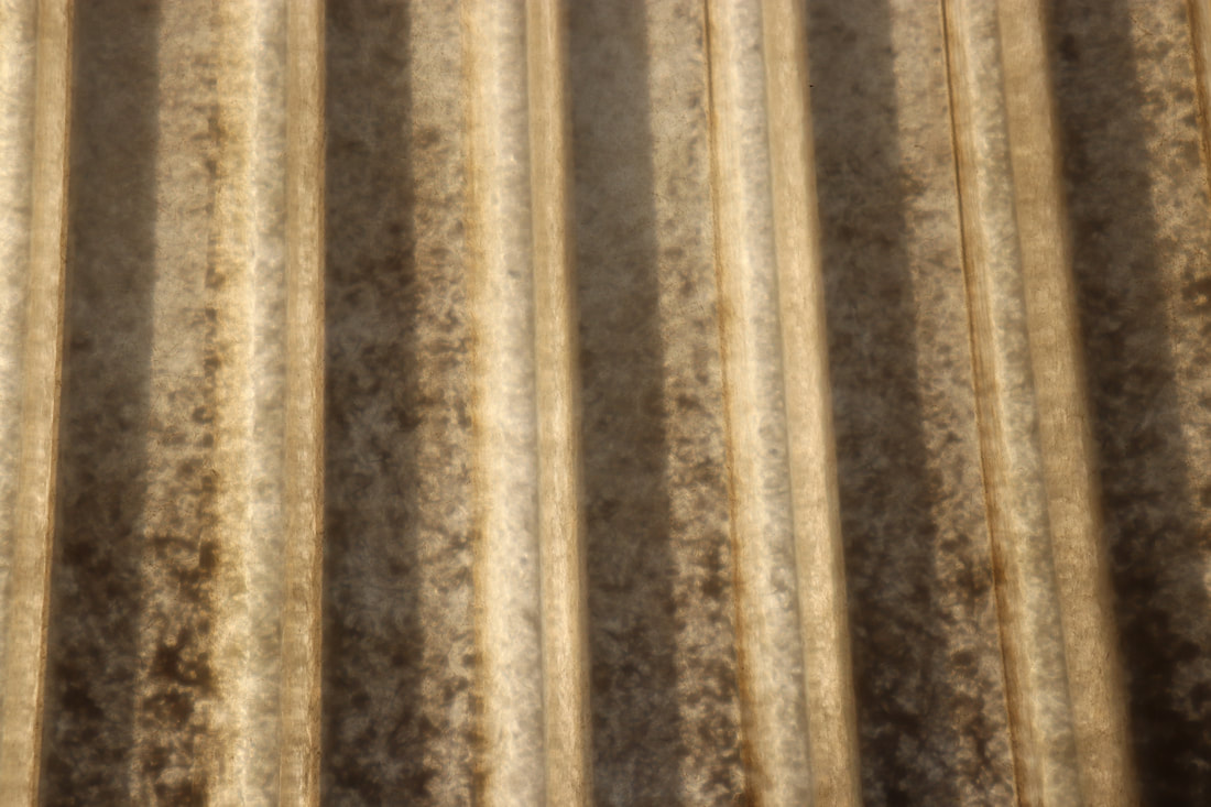
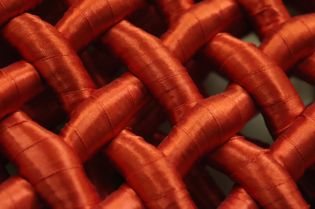
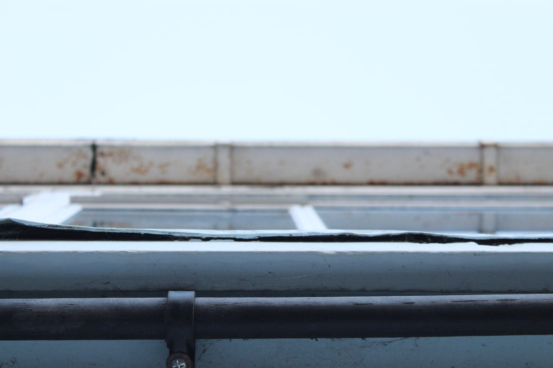
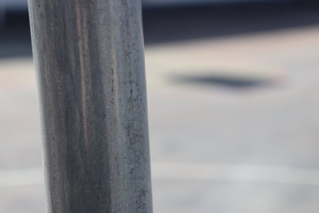
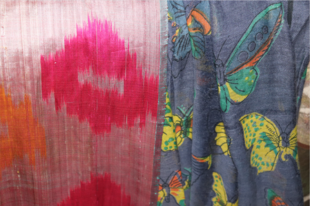
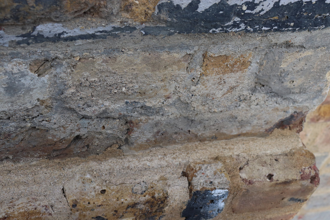
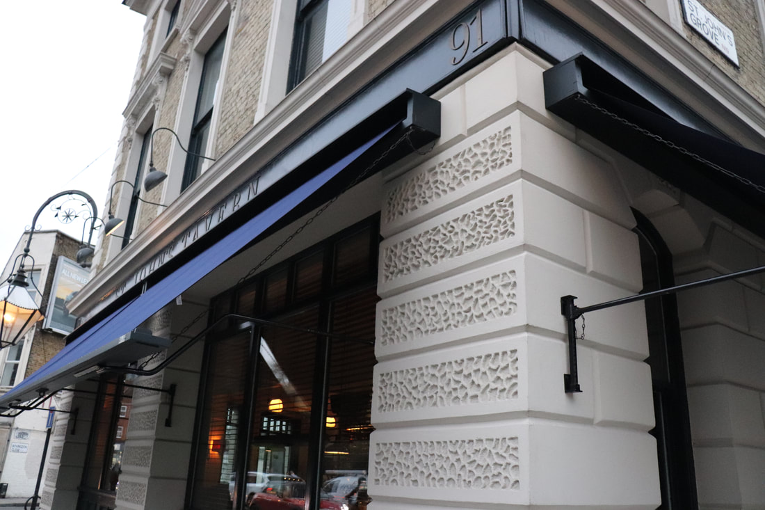
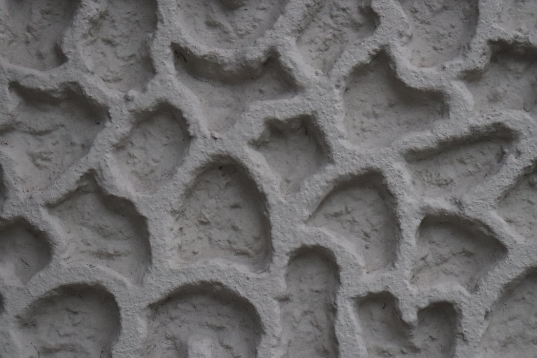
Texture
|
|
|
|
|
|
|
|
|
|
|
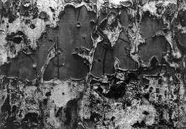
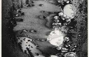
Aaron Siskind
Siskind was interested in the ideas and styles of the abstract impressions. In his later photographs he continued to emphasize the modernist concern with the flatness of the picture plane, but intensified his approach to picture making - with close-up framing, as well as emphasis on texture, line, creating an abstract and 3D presentation of the world.
Siskind was interested in the ideas and styles of the abstract impressions. In his later photographs he continued to emphasize the modernist concern with the flatness of the picture plane, but intensified his approach to picture making - with close-up framing, as well as emphasis on texture, line, creating an abstract and 3D presentation of the world.
|
|
|
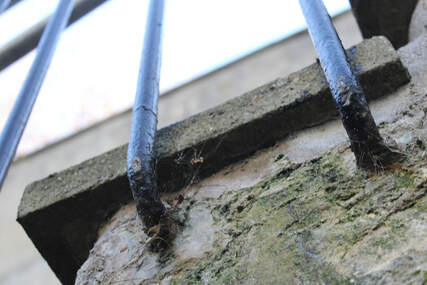
Close up abstraction
|
|

|
Focus Blue Negative space
|
|
|
Layers Light Black and White
|
|
|
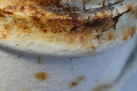
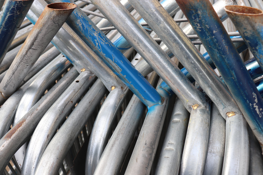
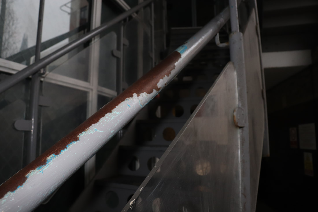
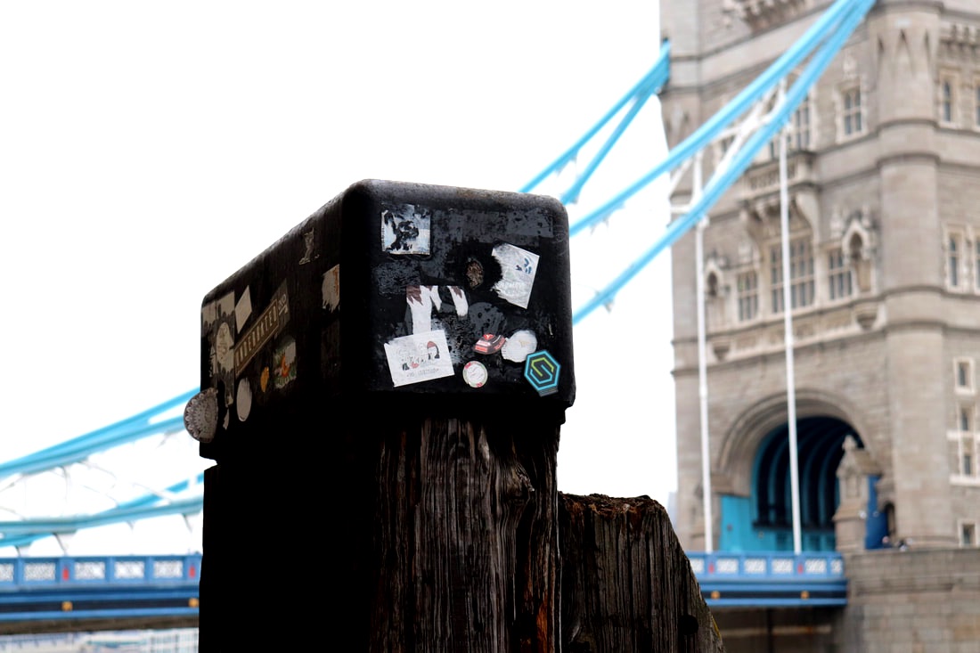
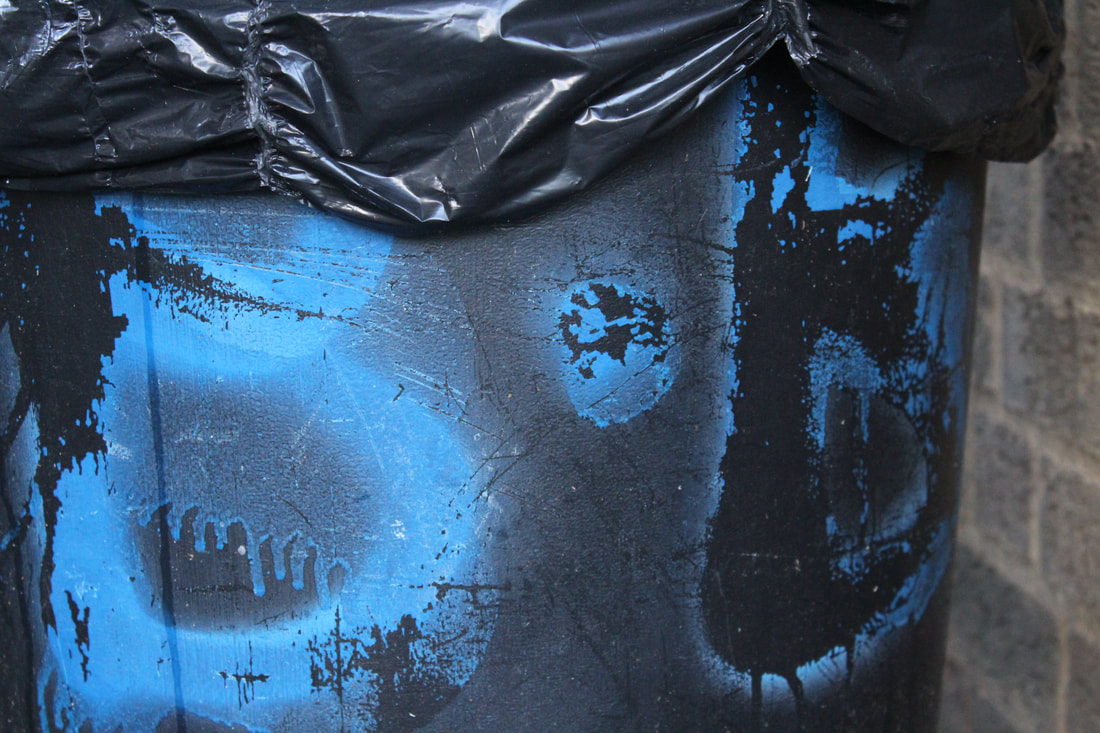
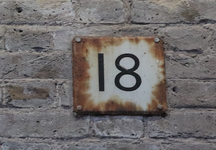
Contrast Rust Graffiti
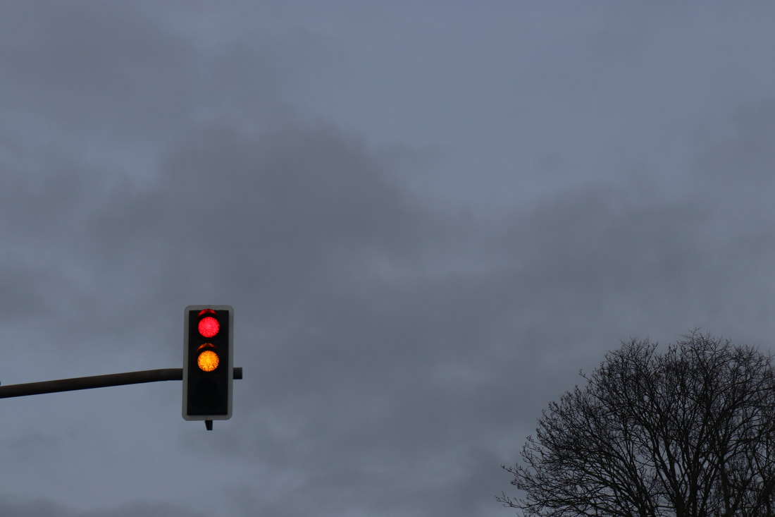
Light
Blue
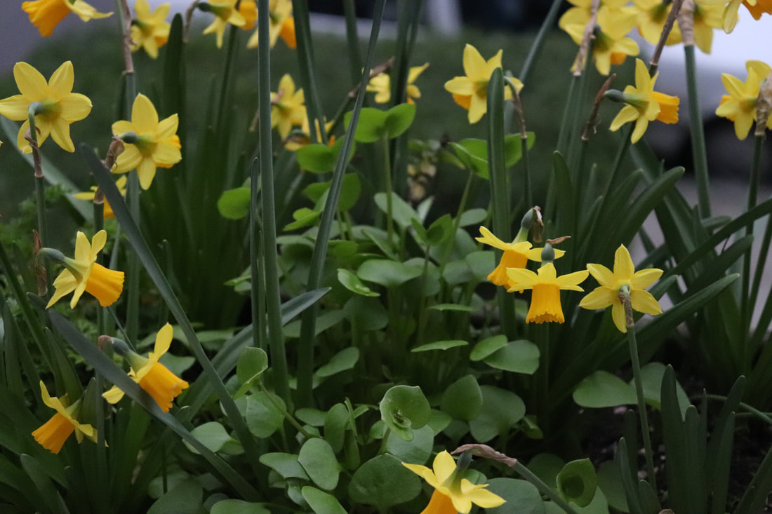
Flowers
|

|
|
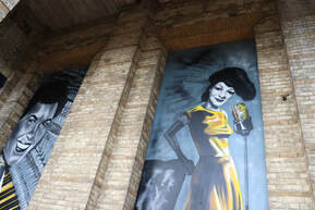
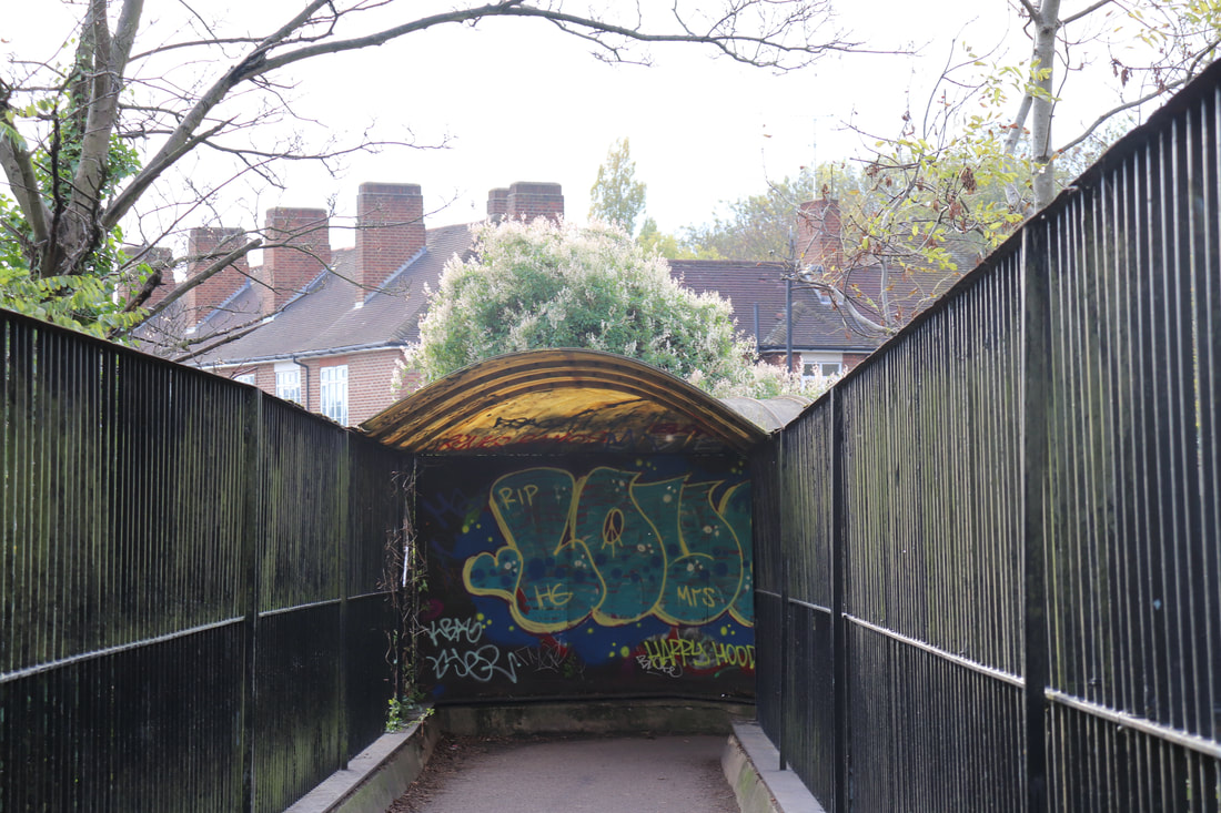
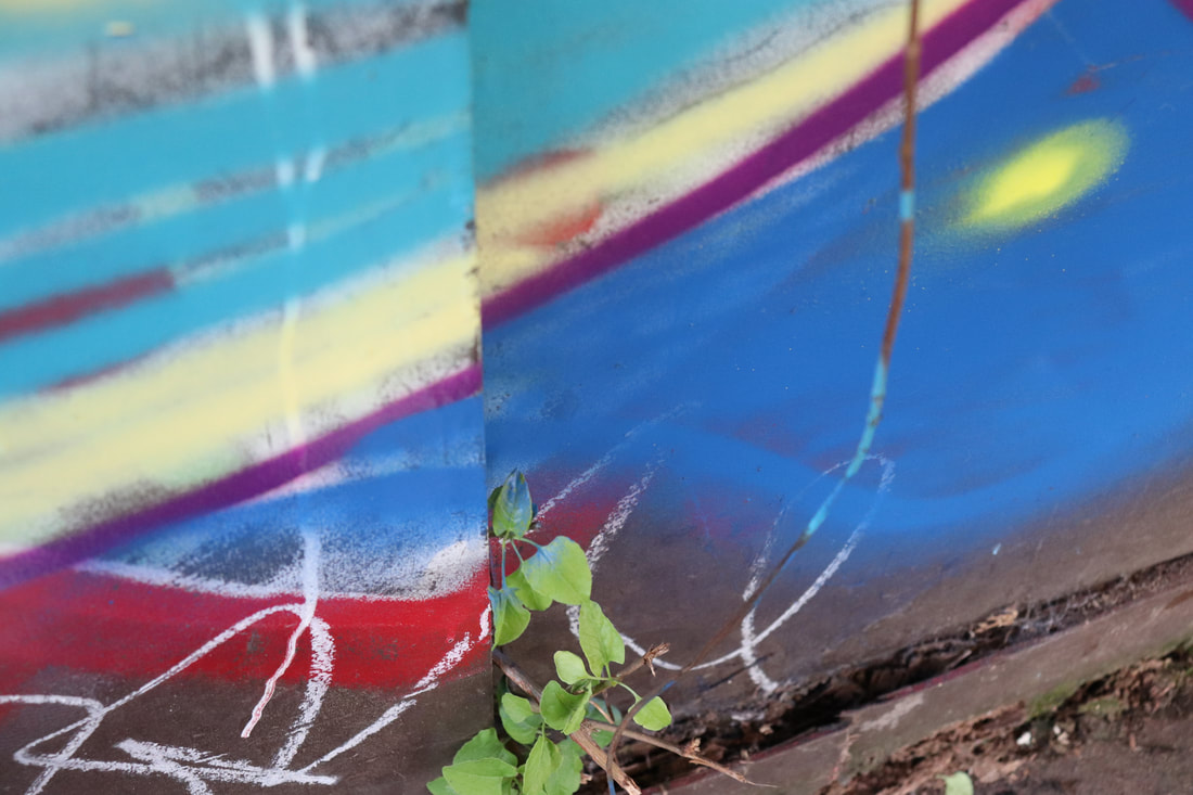
Graffiti
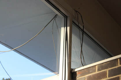
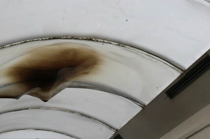
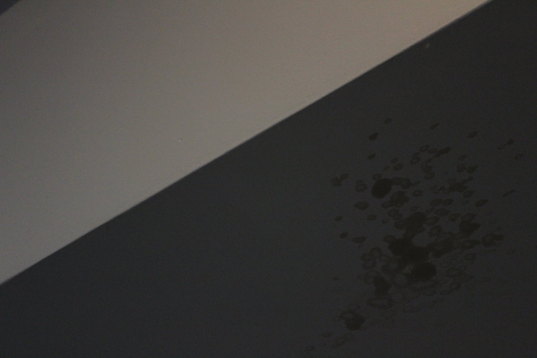
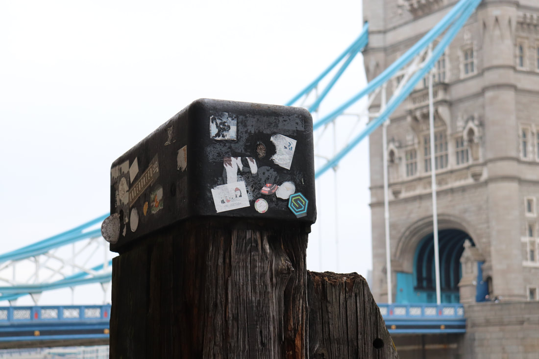
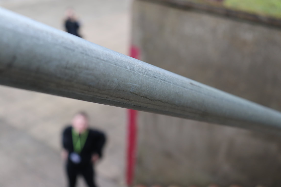
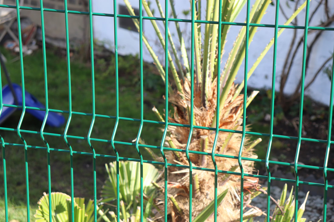
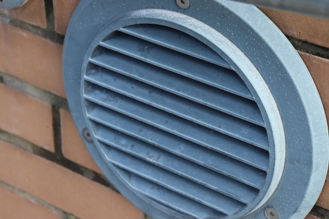
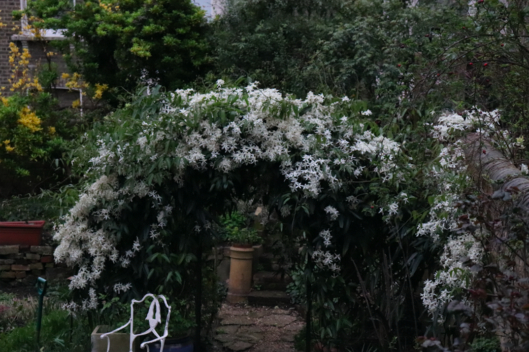
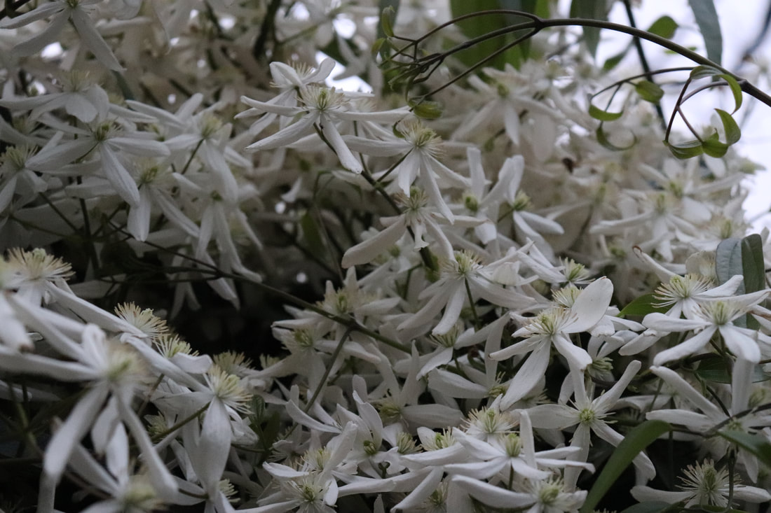
Close up far away
First response
|
|
|
|
|
|
|
|
|
|
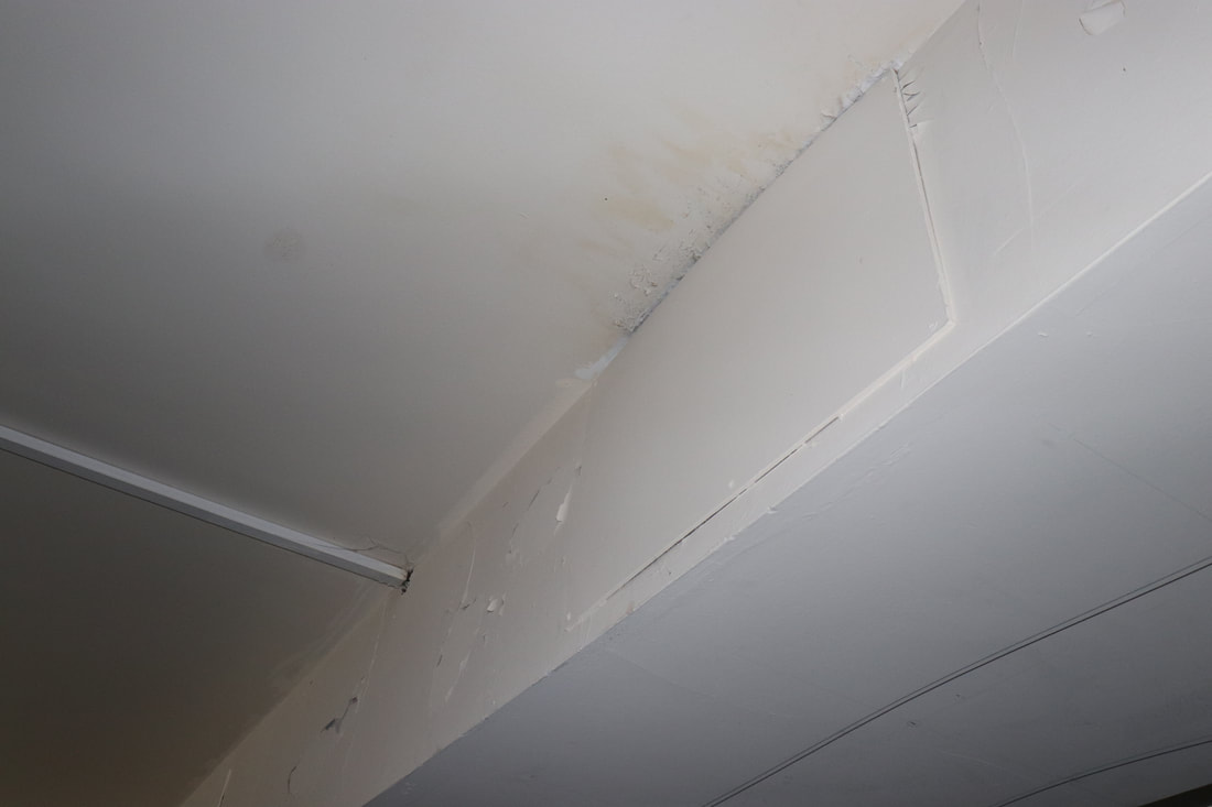
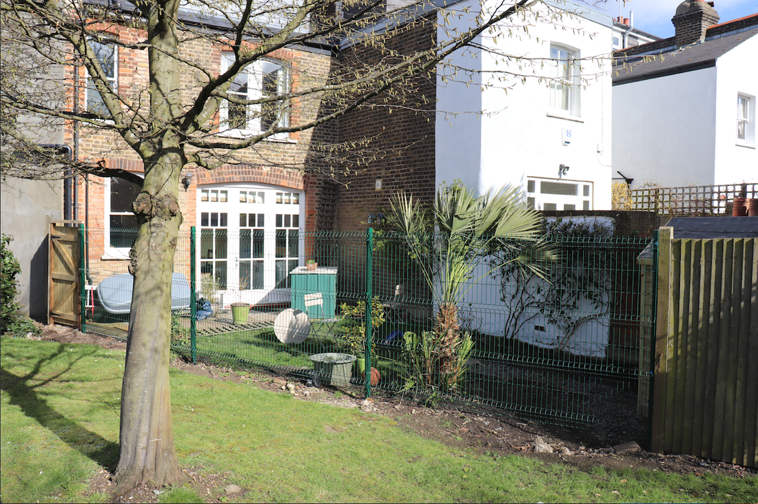
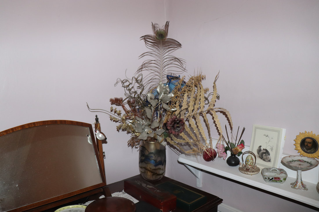
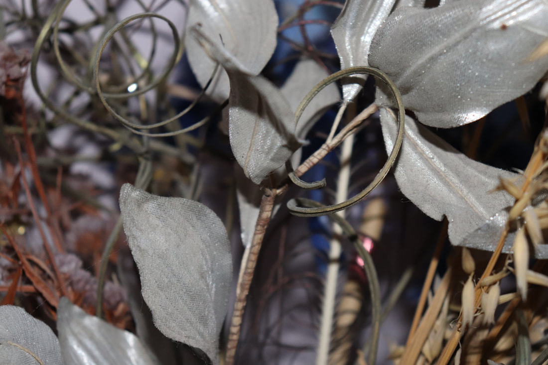
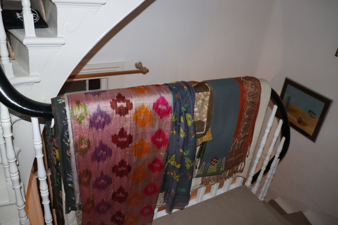
Home environment- Second response
|
|
|
|
|
|
|
|
|
|

|
|
|
|
|
|
|
|
|
|
|
|
|
|
|
|
|
|
|
|
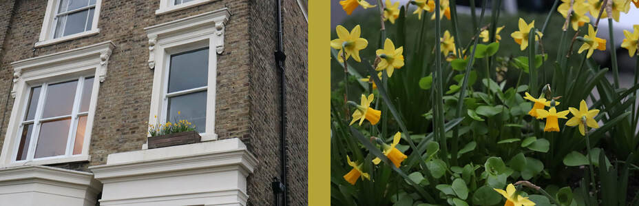
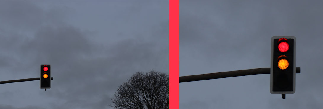
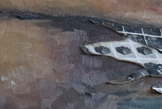
I did these edits using photoshop getting the image as close up and far away and then putting a connecting colour between them.
