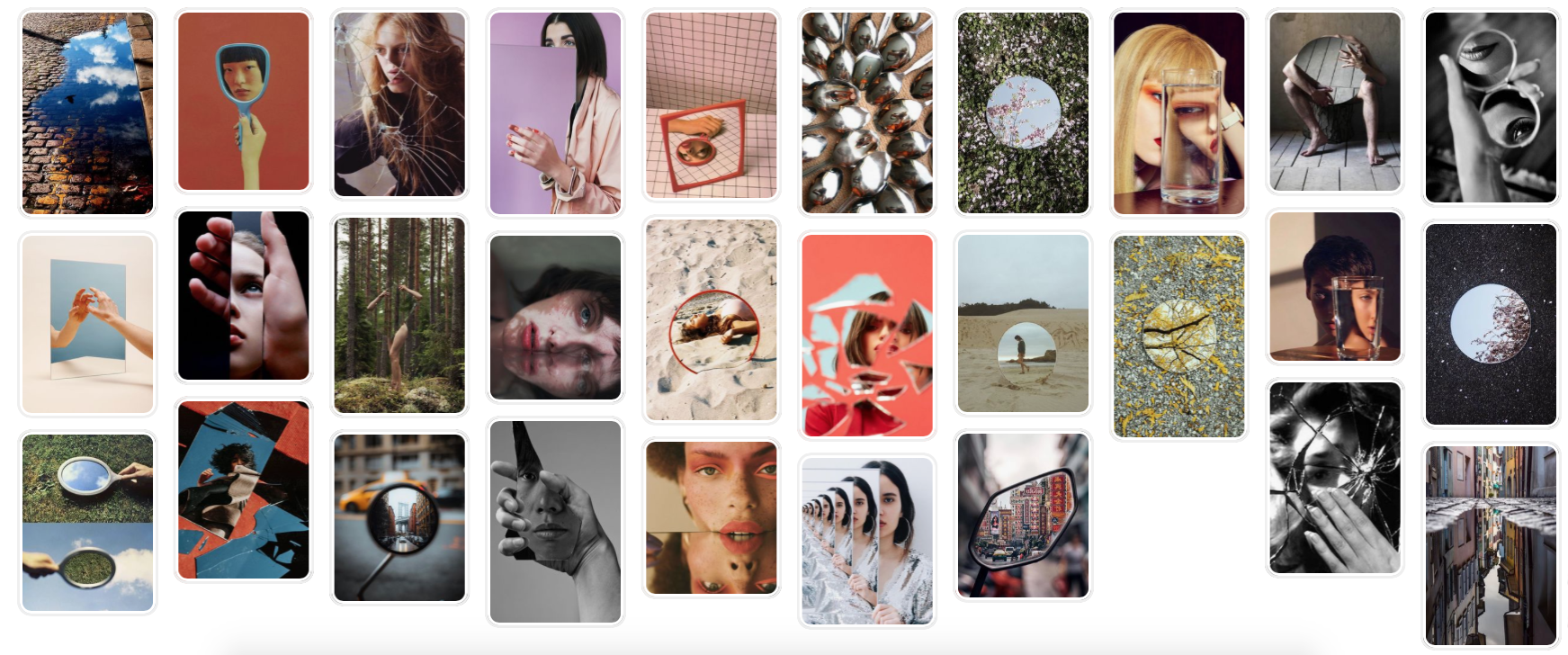
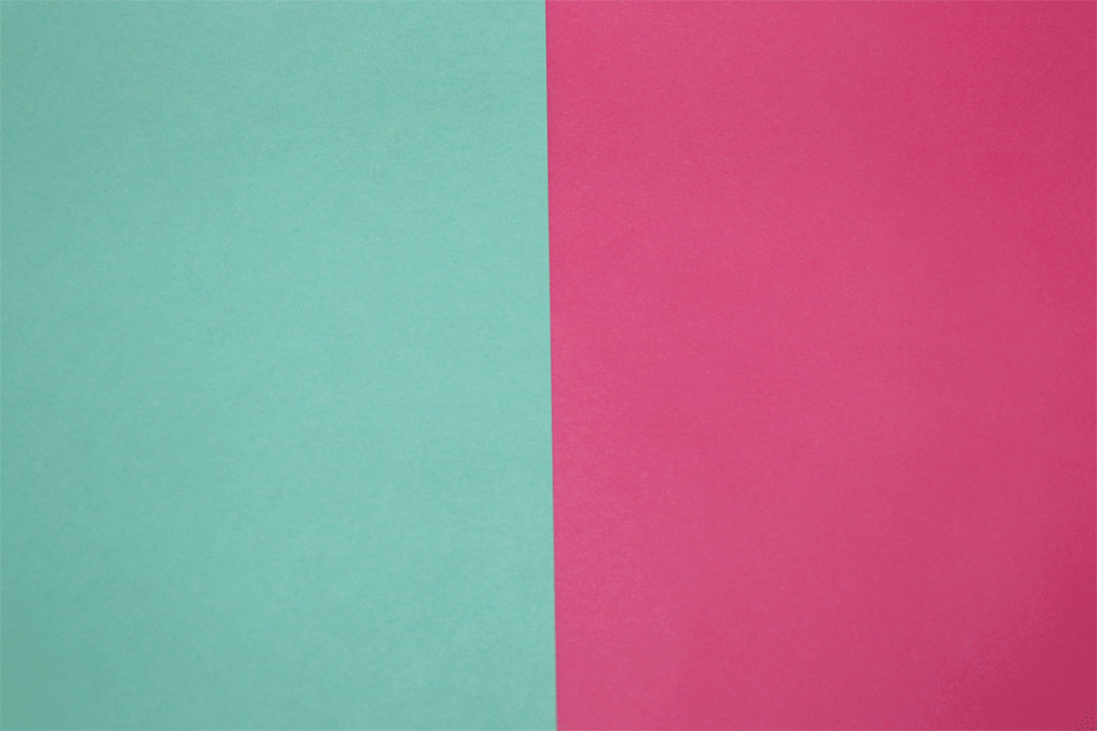
Mirror Reflections
Sebastian Magnani- Link Artist
Born in 1985, Sebastian Magnani started photography whilst training as a media designer in 2006. His most famous collection of photos is called the “Underdogs” and “Under-cats”, which got a lot of media attention and were on many newspapers, magazines. Since then he's won 13 awards including Daily Batman, Lurser’s Archive, 200 Best AD Photographers and 2019 Reflections. This project is about reflections, these are interesting because it shows 2 contrasting photos in one.
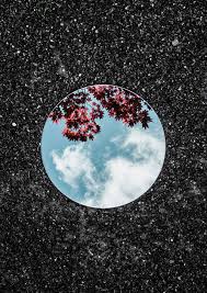
This photo is taken with the circular mirror against the pavement, in the reflection there is the sky and a blossom tree. The contrast between the really dark textured background and the bright blue sky and pink leaves creates layers which looks very interesting.
|
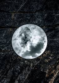
In this next shot it continues on the dark theme which makes all his pictures look nice together. The background I think is bark its hard to tell but like most its a dark textured surface. The sky this time is more dark and stormy, but against the surface it looks smooth and calm.
|
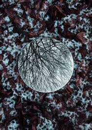
This picture is a good contrast to the picture on the left. The ground is rocky and snowy with the reflection of a dead tree with no leaves which shows a lack of life. This image is one of his only ones which doesn't majorly contrast itself, as the colours are similar in the background and reflection.
|
Artist and Me
|
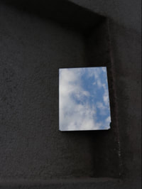
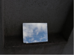
Here I tried to copy the image by getting a dark background with a bright sky. I upped the contrast on my image as the background was white so I made the back darker and the sky brighter to copy the image. My image was taken of the mirror balancing on a wall whereas Sebastian puts his mirror on the ground and photographs over it. The circular mirror used by Sebastian makes his images look a lot smoother and more abstract where as I used I share one which could look more framed.
|

|
First Response
In this shoot we used a mirror and took it into nature. This reflected certain elements of nature against other backgrounds. For example the bright blue sky against the dark grey building this creates a bright contrast between the reflected image and the real image. For the edits I've upped the contrast using weeblys editing in order to make the contrast of the images a dark and light comparison.
|
|
|
|
|
WWW- I like the contrast between the bright colours in the reflection and the dark background.
EBI- Some of the mirrored images almost blend into the background. So I need to make it more of a contrast. I couldn't figure out which setting would be best to make both the background and the mirror reflection be in focus and some of the are very blurry so if I did this again I would make sure both images were in focus.
EBI- Some of the mirrored images almost blend into the background. So I need to make it more of a contrast. I couldn't figure out which setting would be best to make both the background and the mirror reflection be in focus and some of the are very blurry so if I did this again I would make sure both images were in focus.
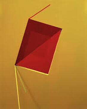
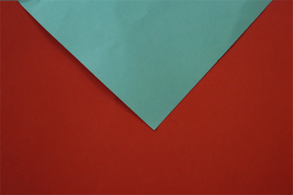
Reflection in shape and colour
Tamara Lorenz- Link Artist
Born in Oberhausen, Tamara studied Media art at the academy of media art in Cologne. Tamara tends to work with lots of colour and is most known for her shoots involving well complimenting colours. She used paper to cut out shapes and then place them on one block colour.
This image uses shadows to create different shades of red, and a light source probably a torch to create an ombre effect in the yellow background. She has cut out different shapes in paper and then folded them.
|
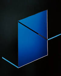
In this image the ombre effect which is where one colour fades gradually from dark to light is on the shape rather than the background. She uses light and dark blue against a very dark green background to contrast.
|
Unlike most her images this photo uses three colours which all contrast each other. The back ground almost looks pixelated as they are different layers of a similar colour getting lighter and then the colour changes with the blue and red.
|
Artist and Me

|
This is the comparison between mine and the link artists photo. The main difference is that I made mine into a gif, but it's based of the same idea of using paper to create an abstract image. Mine can compare as she uses a block colour background as did I and we both also used one colour on top which contrasts well however Lorenz uses different shades of one colour and has more intricate designs on her work which makes it look more delicate.
|
|
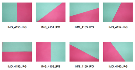
Reflection in shape and colour- GIFS
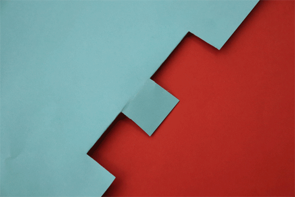
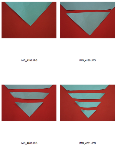
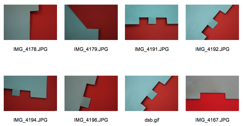
In this shoot we used different colours and shapes of paper and cut it up and took pictures each time the paper changed in order too make a gif, when choosing the colours of the paper I tried to use colours which contrast but still look nice together, using this idea it made my work closer to the link artist as Lorenz uses contrasting colours in her work.
|
|
|
|
|
How its made:
WWW- I like the colours I used and some of the shapes are interesting.
EBI- Do smaller jumps from photo to photo to create a smoother gif, also some of the edges of the paper make it obvious that it's paper taking away from the abstract element.
EBI- Do smaller jumps from photo to photo to create a smoother gif, also some of the edges of the paper make it obvious that it's paper taking away from the abstract element.
Distorted reflection
Antonio Gutierrez- Link Artist
Antonio Gutierrez is a Spanish photographer who mainly works with water. The images here are from her portrait distortion collection from 2013. She has done many other shoots around water distortion such as landscapes through glass with water on it and photos above a swimming pool. Most her images are in black and white although the ones that aren't focus a lot on different colours and lighting.
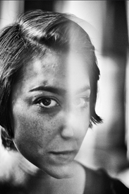
In this photo the photographer has distorted the image with 2 cups of water. The parts through the glass appear bigger making an interesting shot. Also like most her photos it is in black and white.
|
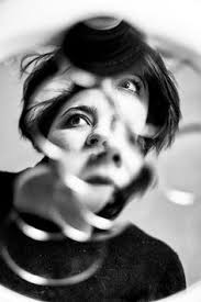
This photo is taken of bubbles in water. As each bubble captures a different part of her face, it cuts up the image up and also repeats parts. The image looks edited as the lines between the bubbles are blurred.
|
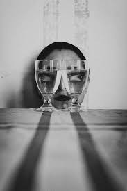
This image the distortion is coming from the sense. I think the photographer has put a drop of water onto the lens to create a blurred distortion effect, and covers the half the face of the women.
|
Artist and Me
|
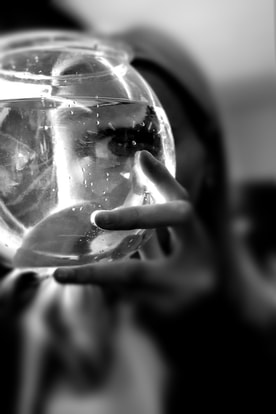
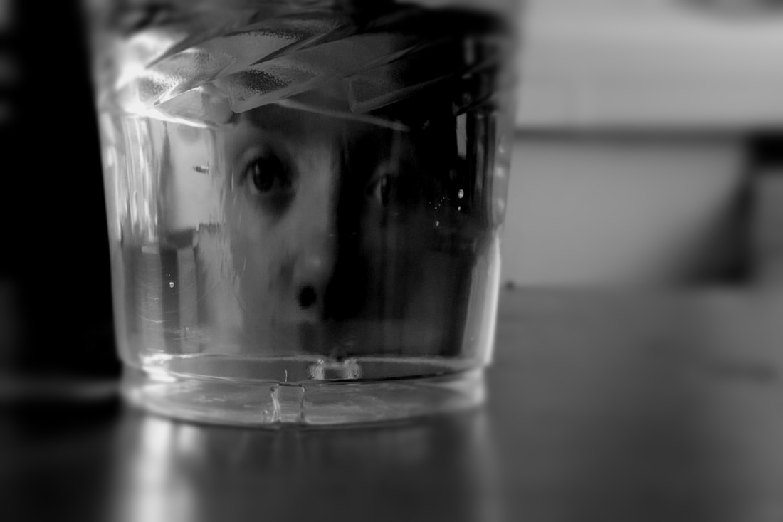
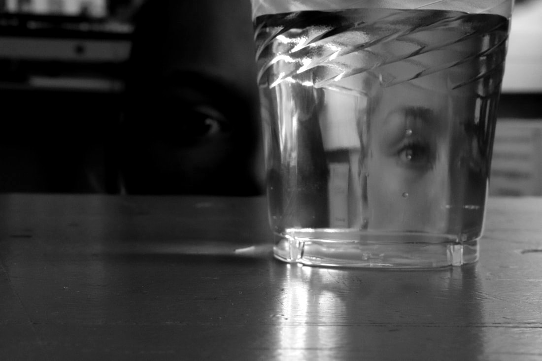
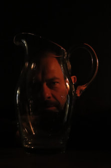
I am comparing my image with this one of Antonio's because they both mainly focus on distorting the eye. Antonio's model looks quite far away from the camera and the actual image is mainly the build up as it gets closer and closer to the model from a far. Another way in which our images are similar is because there is an extreme focus on the water which is distorting the reflection. Both the images are black and white I did this so my image would compare nicely to the image even more. Although I think my image is more distorted I think the images compare well.
|

|
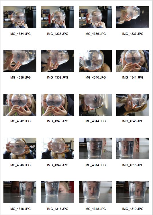
First Response-
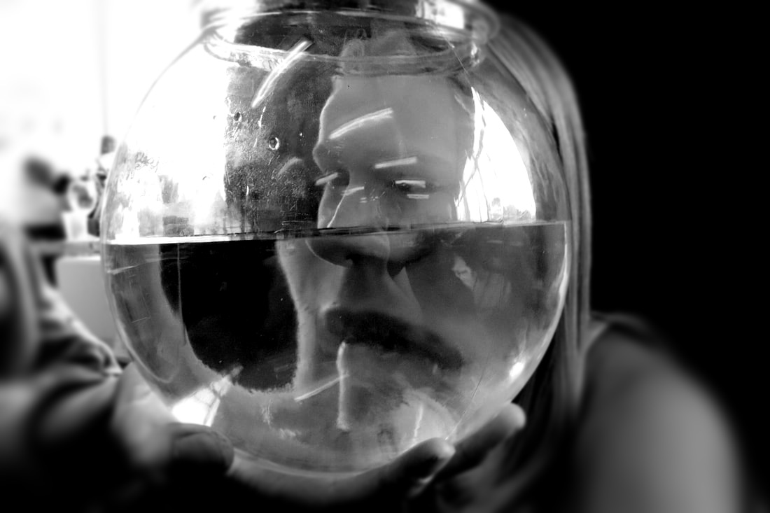
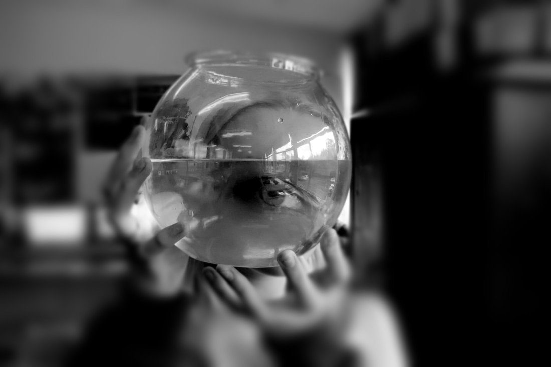
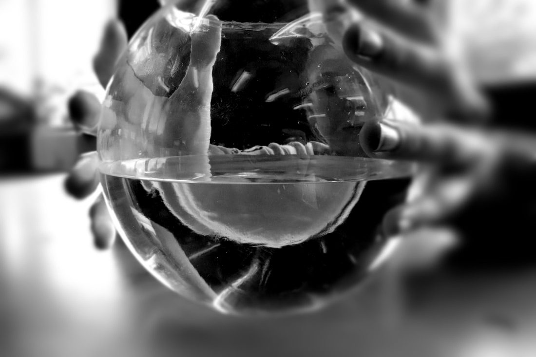
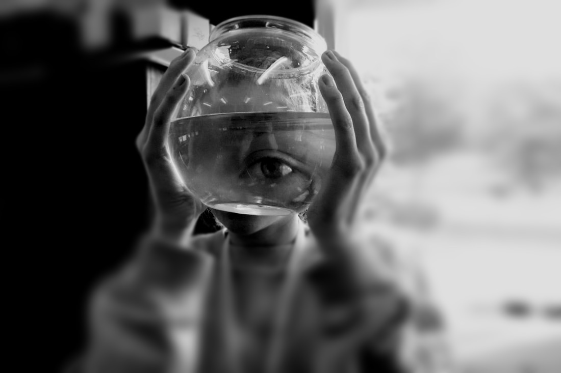
In this shoot we used different objects like plastic bowls and cups in order to distort the reflection on the other side. In editing I added a radial focus around each of the bowls and jugs so the rest of the image is blurred apart from the distorted portrait, I made the images black and white as the contrast made the image look nicer as we took the images in the classroom so I aimed to remove the background, I also upped the contrast and lowered the brightness.
|
|
|
|
|
|
|
|
WWW- I like the focus effect around the bowls and cups of water.
EBI- For some of them the background is too dark to see what it is.
EBI- For some of them the background is too dark to see what it is.
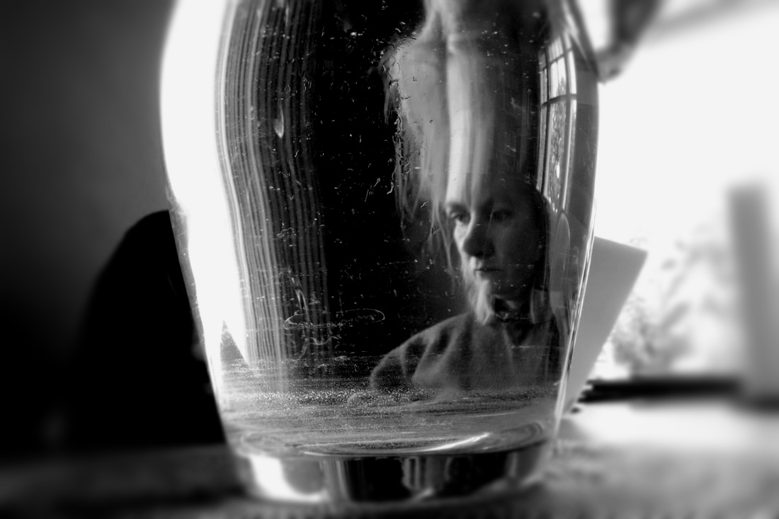
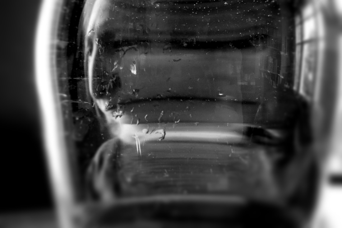
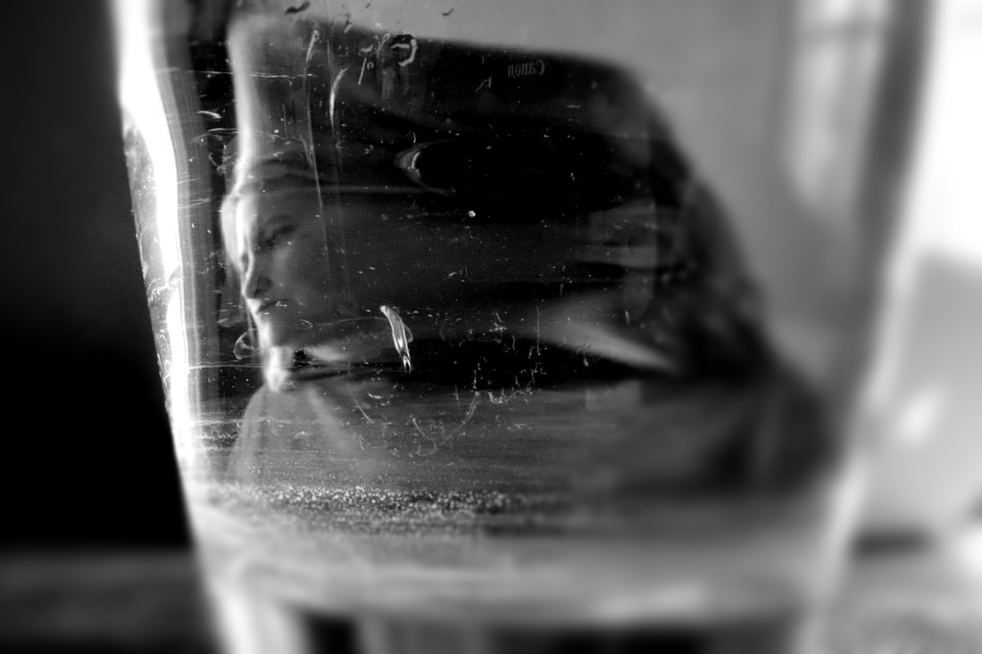
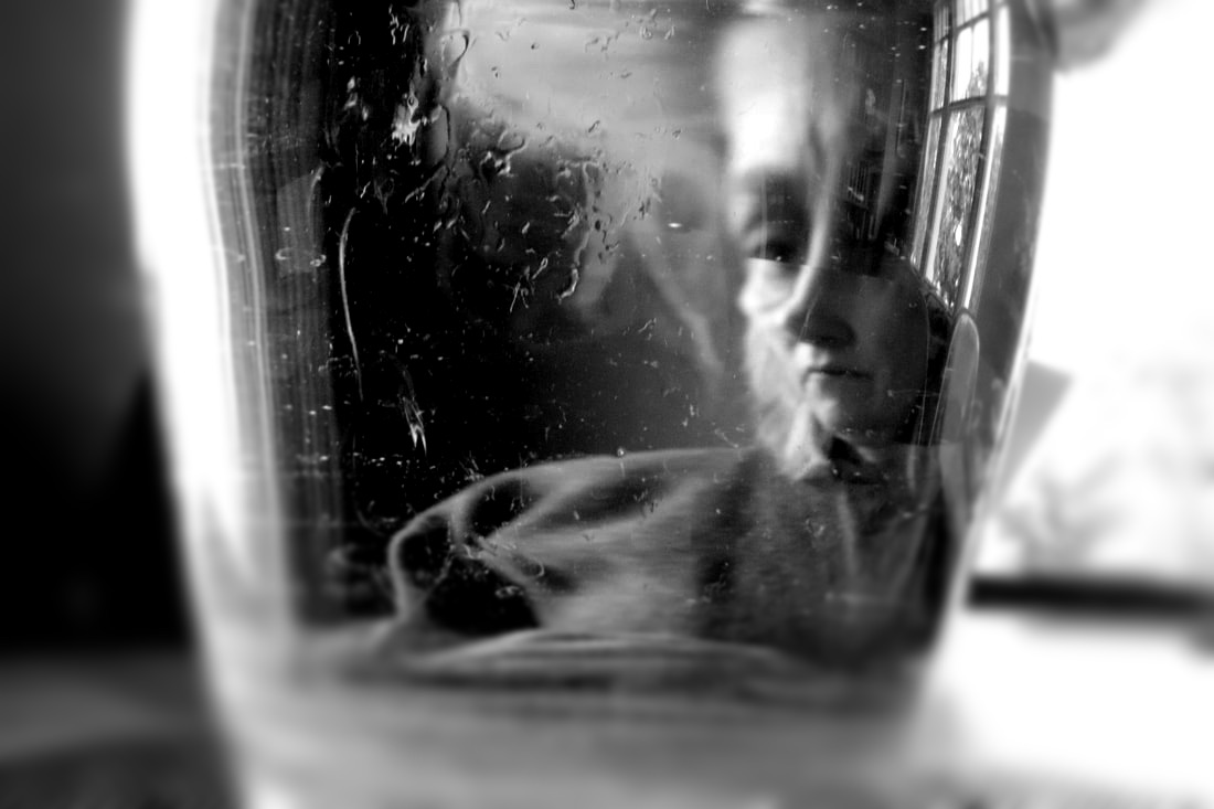
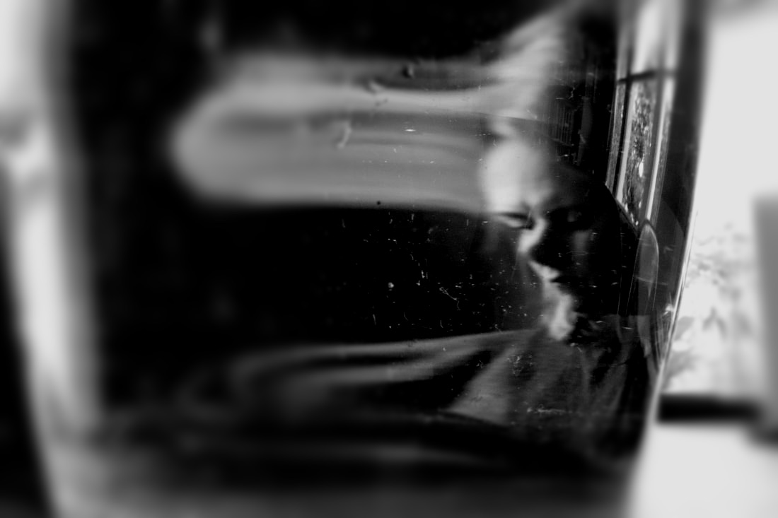
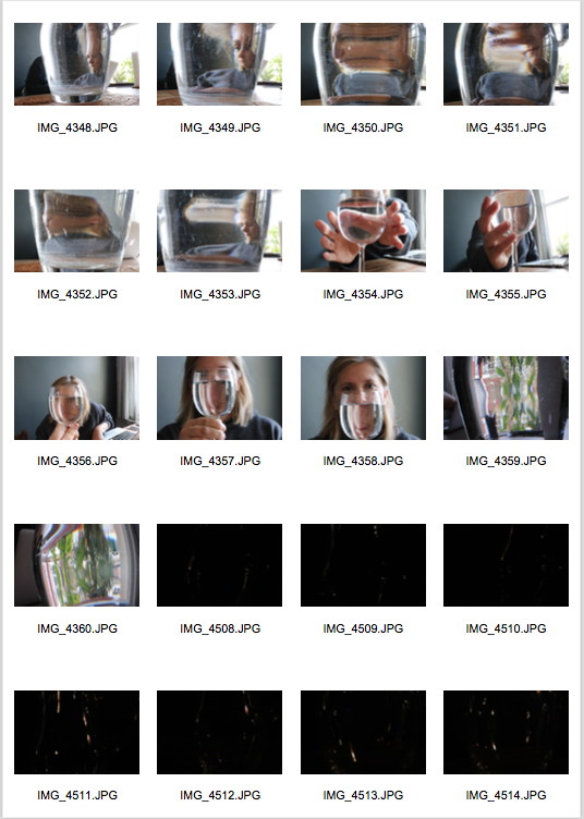
Second Response- Homework
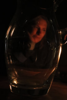
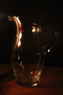
For the black and white images of my second response I used a jug filled with water, I did this shoot during the day right next to a window so used natural light without flash to create the image, for most of the black and white images in editing I lowered the saturation and raised both the brightness and the contrast, I then put my pictures in B&W for this final editing I used the editing software available on Weebly. For the second shoot in my second response homework(the 3 last ones not in black and white) I photographed at night therefore couldn't use natural lighting given the circumstances I thought it was a good time to experiment with different lighting and used a candle to light the image, this reflected different shapes and colours onto the jug, for those pictures I didn't do any editing on them as I liked the colouring of the final images as they are, I also didn't add a filter.
|
|
|
|
|
|
|
|
|
|
WWW- I like some of the shapes and blurs formed through the jug. I like The lighting in the darker images.
EBI- Some of them are too blurred meaning you can't really see what the object is in the reflection.
EBI- Some of them are too blurred meaning you can't really see what the object is in the reflection.
How its done-
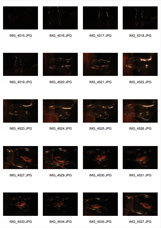
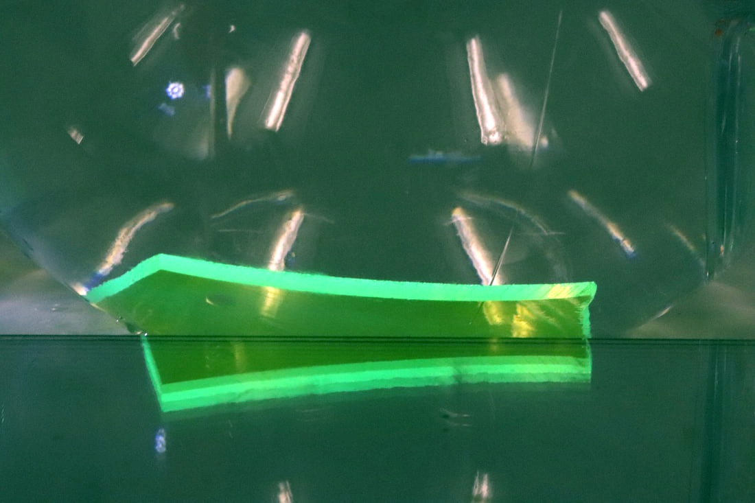
Distorted reflection- Plastic
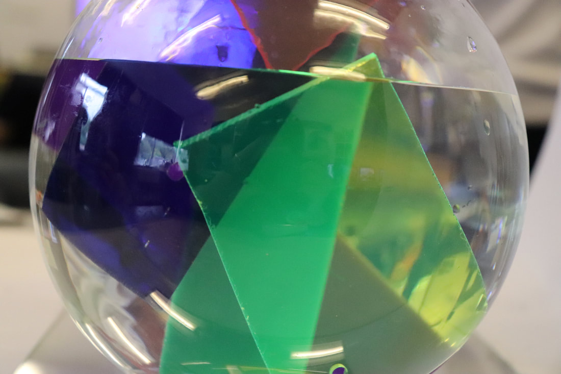
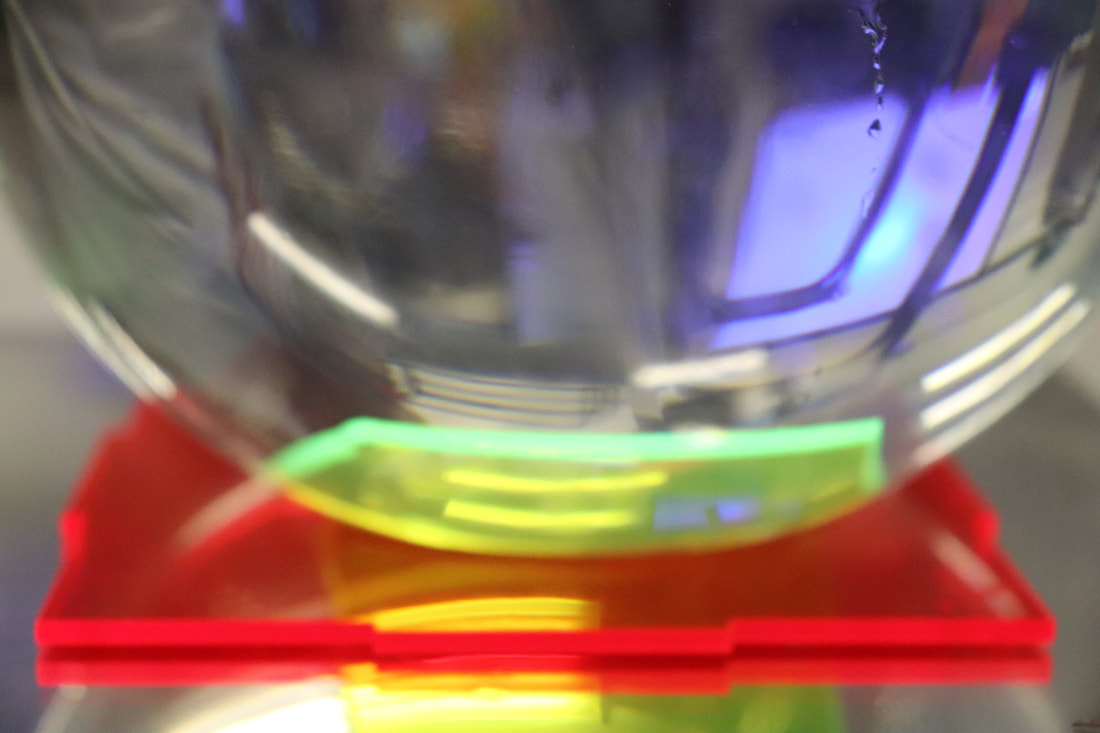
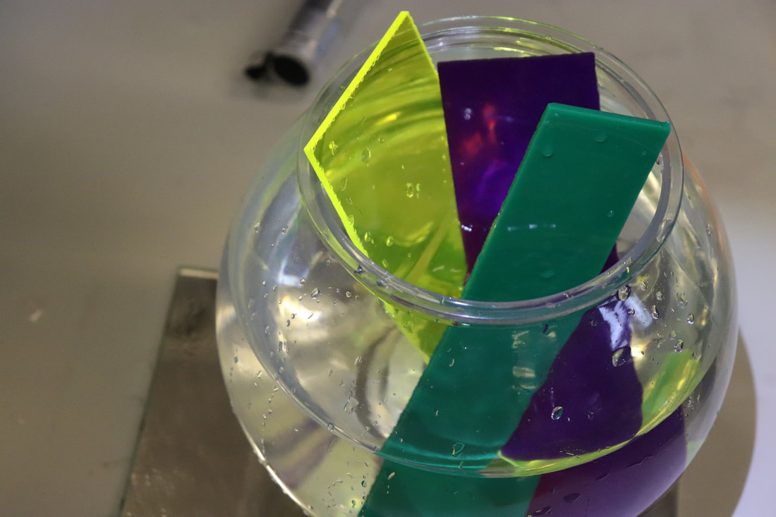
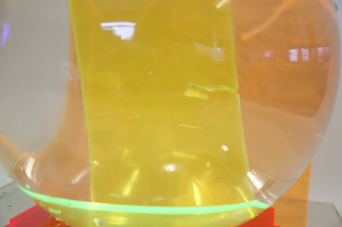
In this shoot we had a bowl of water and placed different pieces of plastic of different colours and shapes and then used a torch to reflect light onto the water.
|
|
|
|
|
|
|
|
WWW- I like some of the shapes caused by the mirror underneath the jug and I like the colours.
EBI- Zoom in more to the objects so you can't really tell what the photo is of and make it more abstract.
EBI- Zoom in more to the objects so you can't really tell what the photo is of and make it more abstract.
Nine square gif
This topic doesn't have a particular link artist as there are multiple artists who have done this. What it is they are made with paper and moving the paper and forming a gif with those images and then putting them all together, however they all have to match otherwise they wouldn't look nice together.
|
|
|
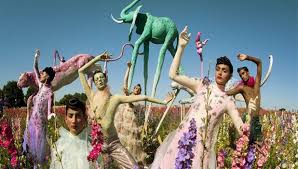
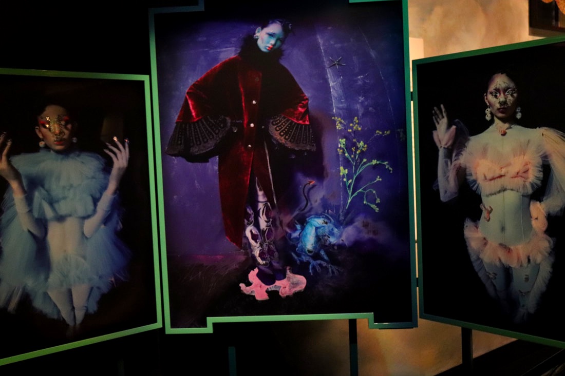
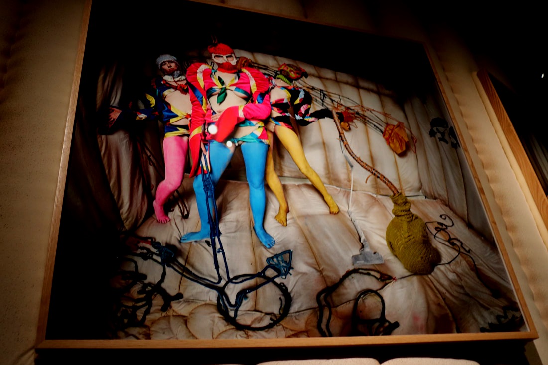
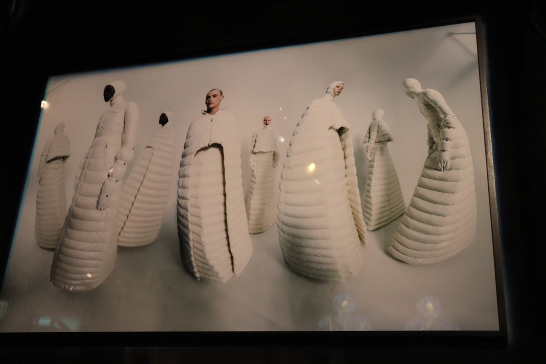
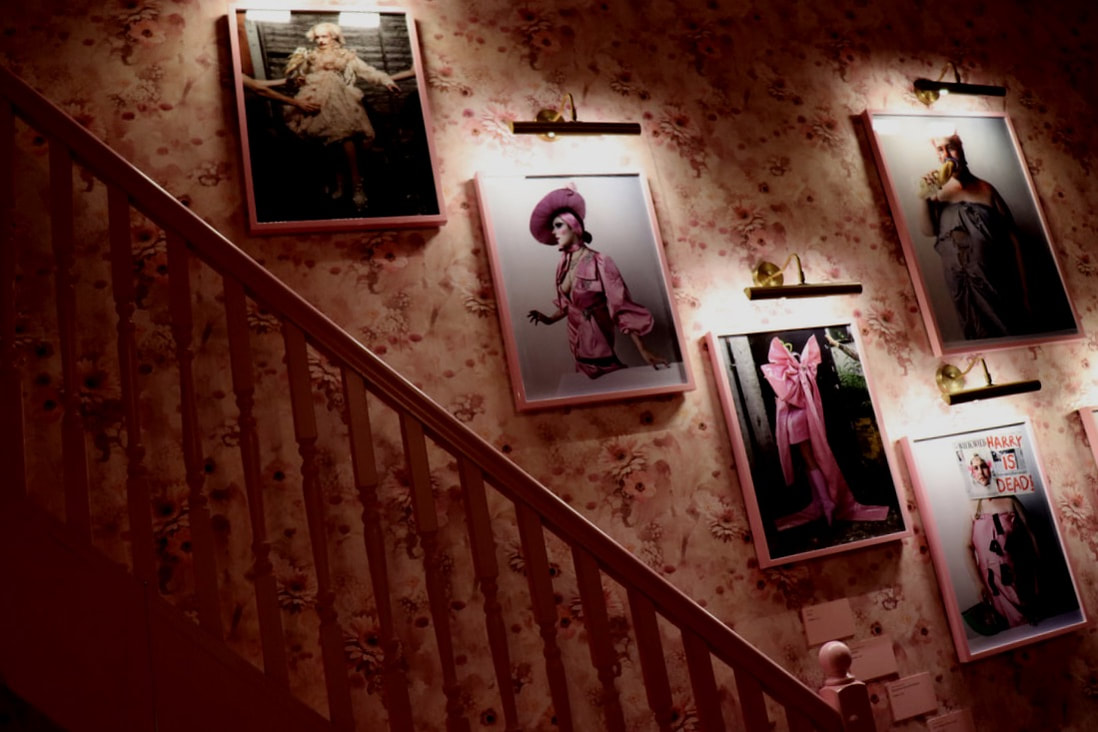
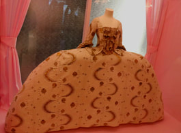
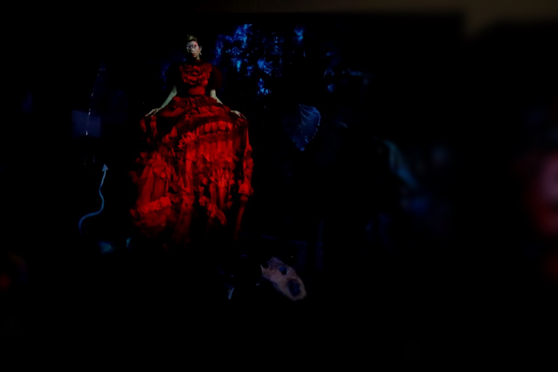
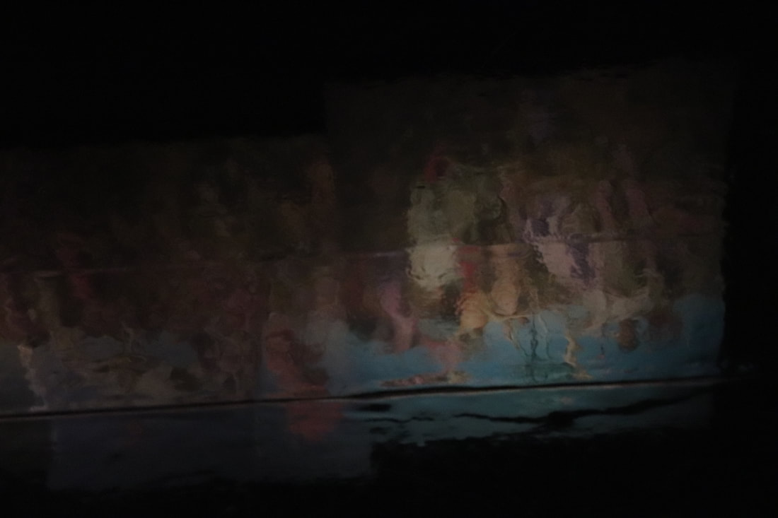
Exhibition- Tim Walker
For a school trip, we went to the Tim Walker "Wonderful Things" exhibition. Tim Walker is photographer most well known for his monthly debut in vogue magazine. Walker focuses a lot on fashion photography hence his position as a photographer for vogue. The "Wonderful Things" exhibition was focused around colour and fashion. Walker has published several books such as "pictures" and "stern portfolio". Walker has also won many awards one being for his short film "The Lost Explorer" which premiered at the Locarno film festival in Switzerland.
Walkers original photographs-
|
|
|
My photographs of the exhibition-
|
|
|
|
|
|
|
|
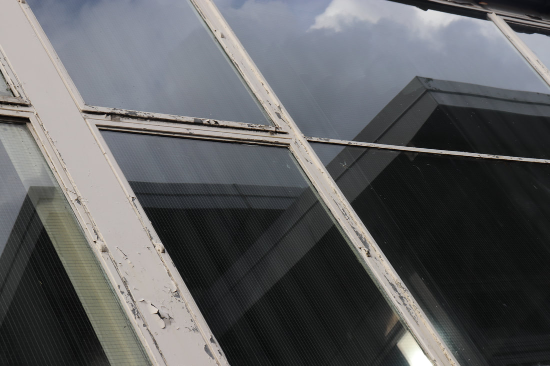
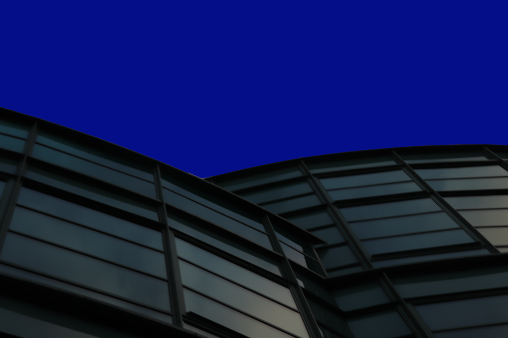
Reflections in architecture-
First Response-
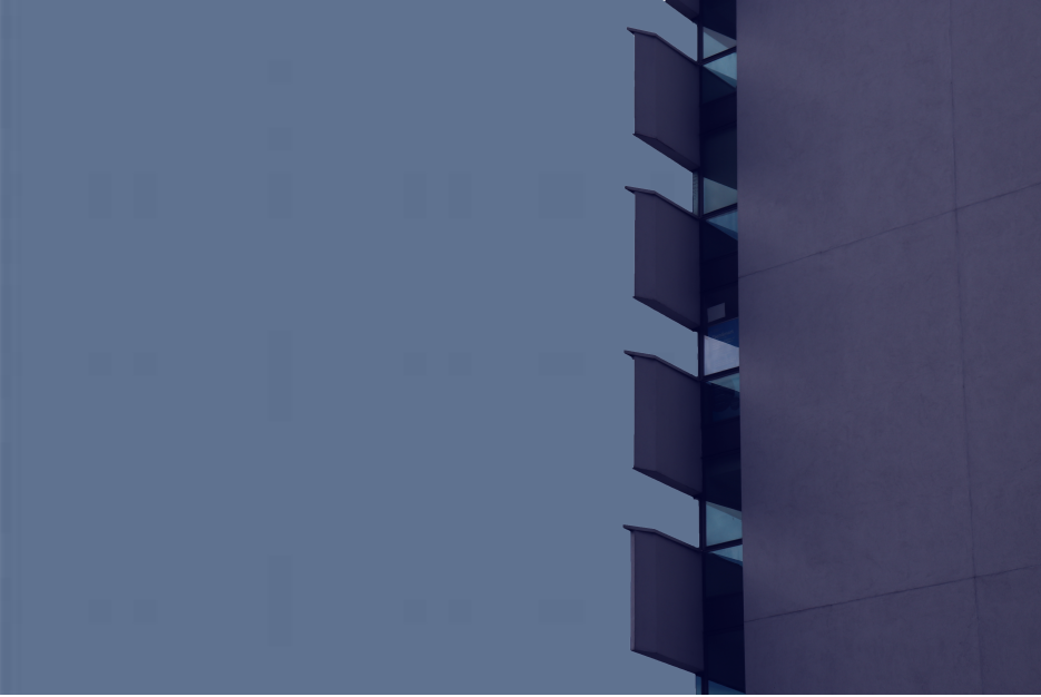
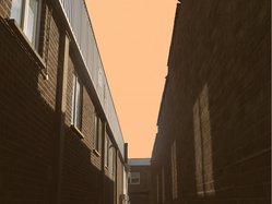
For this shoot we went around fortis mere looking for reflection and symmetry in the buildings, puddles and windows.
For this shoot we went around fortis mere looking for reflection and symmetry in the buildings, puddles and windows.
|
|
|
WWW- I like the colours and shapes of the blurred reflection in the third image, and the texture in the other images.
EBI- More creative angles and get more of a reflection as in many of the image the reflection is barely there.
EBI- More creative angles and get more of a reflection as in many of the image the reflection is barely there.
Second Response-
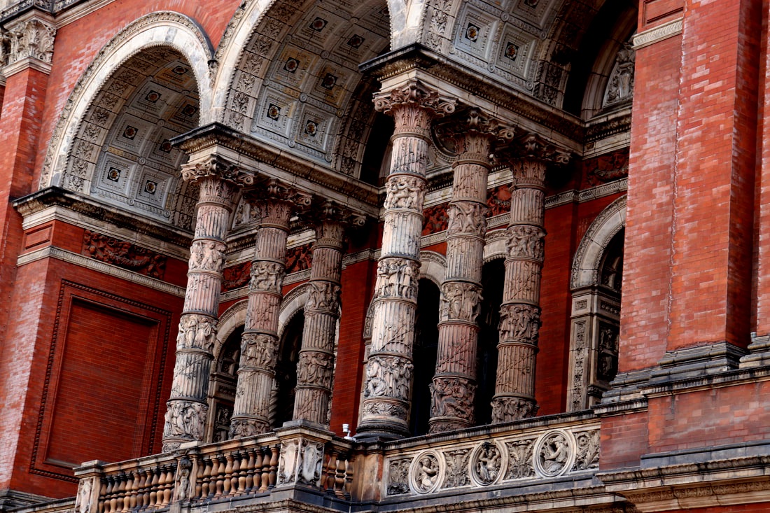
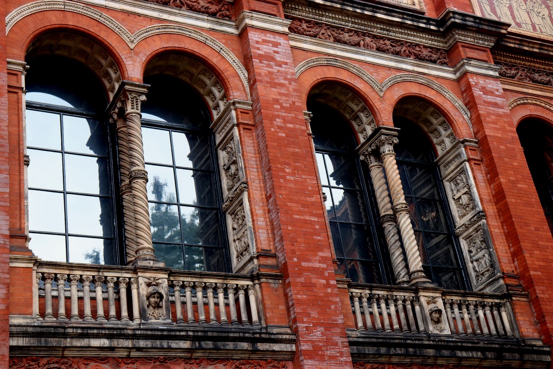
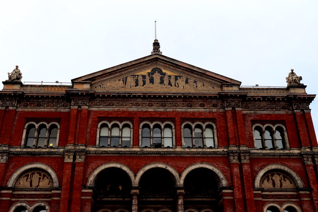
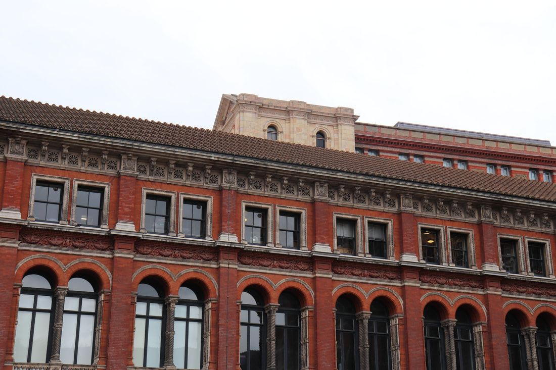
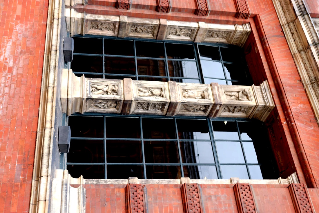
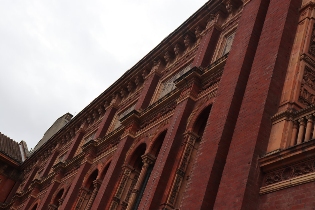
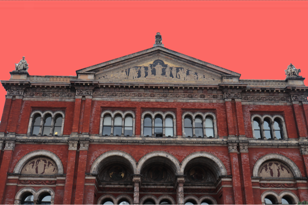
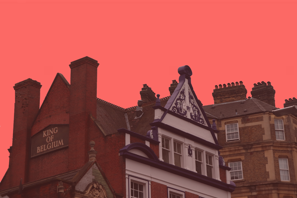
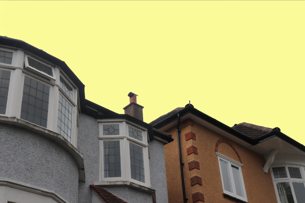
This shoot was taken around the V&A building when we went on a school trip for the Tim Walker exhibition, looking for symmetry and reflections in the windows. For these images I lowered the brightness and raised the contrast to make the red colour of the bricks. I left the saturation at neutral as I found the red brick became too bright when it was up and didn't look very nice.
This shoot was taken around the V&A building when we went on a school trip for the Tim Walker exhibition, looking for symmetry and reflections in the windows. For these images I lowered the brightness and raised the contrast to make the red colour of the bricks. I left the saturation at neutral as I found the red brick became too bright when it was up and didn't look very nice.
|
|
|
|
|
|
WWW- I like the saturated red colour of the bricks and the contrast with that and the sky.
EBI- Get more close ups of the windows to see more of the reflection or get the images more symmetrical.
EBI- Get more close ups of the windows to see more of the reflection or get the images more symmetrical.
|
|
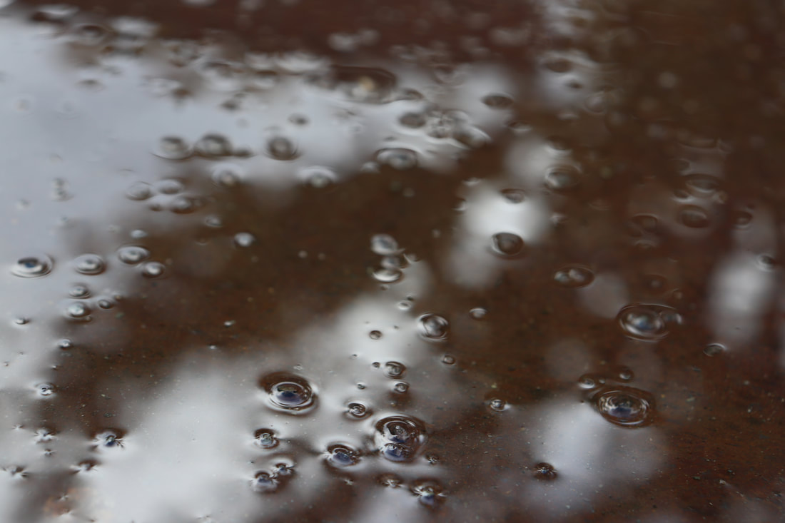
Reflections in water-
Link Artist- Slava Semeniuta
Slava is a photographer who focuses a lot on different lights and colours. Most her images contain some form of reflection like on puddles and windows and different lights on people. Slava describes her style as neon realism and focuses on making ordinary daily items look out of place and make things you would normally walk straight past stand out using multiple different colours and lights.

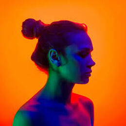
This image is taken against an orange background, the colours being reflected onto the women
contrast with the background as they are cool dark colours against a warm bright colour, like most the images in this series the background is empty (just a block colour). |
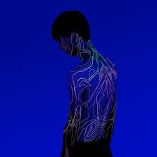
This image compared to her others includes a heavy amount of editing in order to give the almost robotic look to the model, the colours in this image are all blue, very dark and cool, it also doesn't have the detail of the face so the detail is focused on the lines.
|
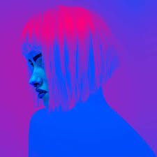
For this image it only contains two colours using the same shade of each, although the image is interesting as the background starts off as purple at the bottom and goes into blue at the top, whereas the model goes from her hair being purple and her body being blue.
|
Artist and Me-
|
I don't think this link artist compares well with the task we were asked to do but in term of all the bright colours and reflections they can be compared. I haven't done it with most of them but for the purpose of comparing them I've made my image a square frame. In Slava's images I noticed she often contrasts warm colours and cool colours. I tried to work this into my images by putting the red light on yellow and green glow sticks.
|
|
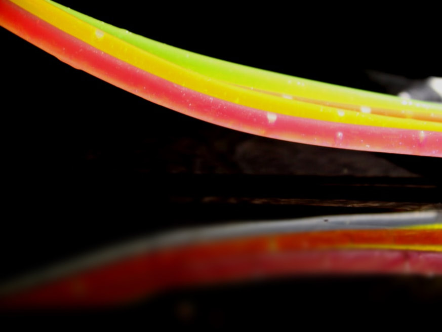
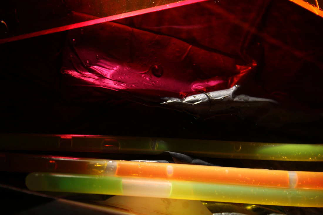
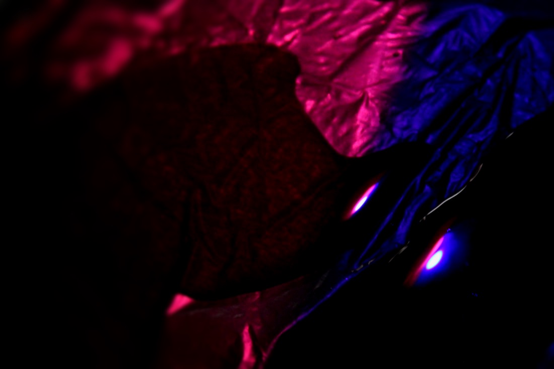
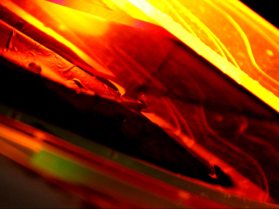
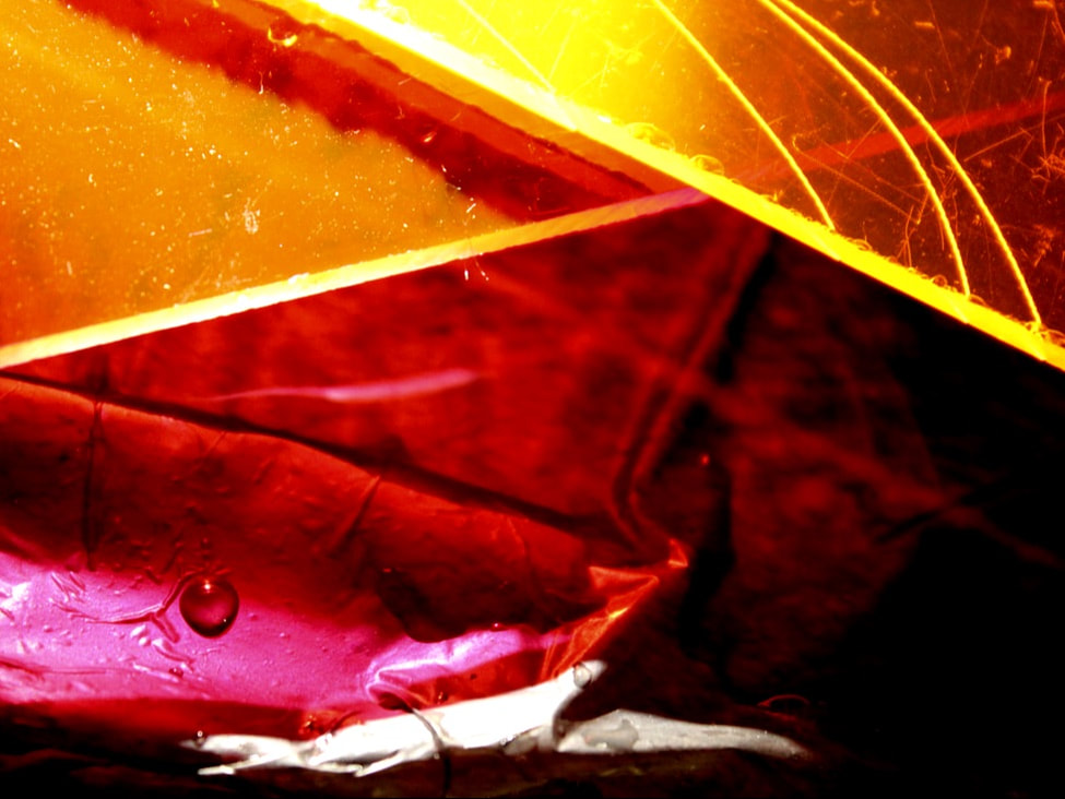
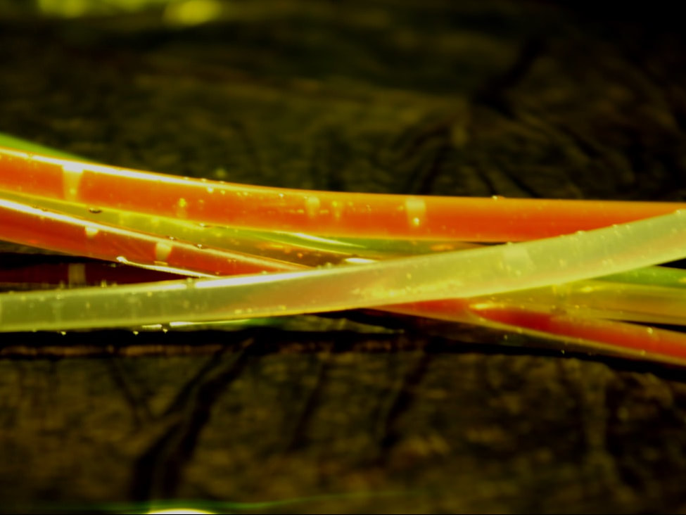
First Response-
In this shoot we used glow sticks and small parts of perspex plastic in different colours and reflected it on dark water, the water was dark as a black bin bag was placed on the bottom of the pan of water and then the water on top making the water look black and dark, using a torch we then reflected different shapes and movements onto the water. They were all taken in a dark room using just the light from the torch.
In this shoot we used glow sticks and small parts of perspex plastic in different colours and reflected it on dark water, the water was dark as a black bin bag was placed on the bottom of the pan of water and then the water on top making the water look black and dark, using a torch we then reflected different shapes and movements onto the water. They were all taken in a dark room using just the light from the torch.
|
|
|
|
|
|
|
|
WWW- I like the bright colours reflected on the water and the ripples in the water which creates an interesting reflection when the light is on it. I also like the contrast of the bright lights against the dark water.
EBI- Because it's so close up some of the pictures are blurry.
EBI- Because it's so close up some of the pictures are blurry.
3 Strands
Colours in Buildings
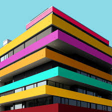
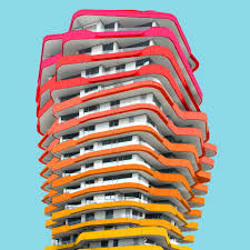
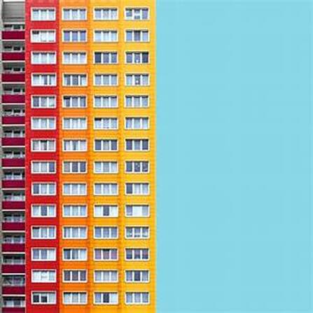
Link Artist- Paul Eis
Paul Eis is a German photographer who focuses on German architecture. He edits all the colour into his photos and then removes the background and replaces it with a clear blue to look natural and to contrast the bright red and yellows on the buildings.
This image is of a very layered building consisting of different sized squares. He has edited them al different colours and a darker side considering shadows.
|
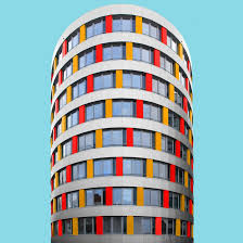
This is of a more circular building. His has focused less on changing lots of colour in this image as the majority of the building is original leaving walls and windows.
|
This image is of a very modern building which is architecturally very impressive. He has changed the colour of each of the strips and the colour fades from red to yellow.
|
Artist and Me
|
In order to compare these images I made my image square and changed the background colour from a darker blue to a brighter more sky blue. I also chose an image of Paul Eis's where the building was coming out of the side. One difference is the colour, I didn't change any of the colours of the buildings in this task whereas thats the main element of Paul's work.
|
|
First Strand-
For this shoot I went to Camden and got pictures of several coloured buildings like purple and green, I then removed the sky from the image and replaced it with a lighter colour of the colour of the building.
For this shoot I went to Camden and got pictures of several coloured buildings like purple and green, I then removed the sky from the image and replaced it with a lighter colour of the colour of the building.
|
|
|
|
|
|
|
|
|
|
WWW- I like the dark to light contrast of the photos with the light background and also how the image is simplified by removing everything apart from the main building like surrounding buildings and the sky.
EBI- Make the image more interesting and focus more on the shapes created in the building when other elements are removed.
EBI- Make the image more interesting and focus more on the shapes created in the building when other elements are removed.
How it's done:
Flowers in Water
Link Artist- Pinterest
Link Artist- Pinterest
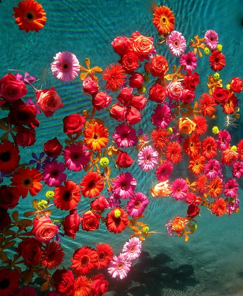
For this strand I took inspiration from many photographers on Pinterest. Most the images are taken in swimming pools as swimming pools usually give the blue shapes effect in photographs as shown in the first and third photos.
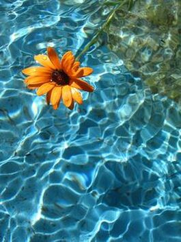
This photo unlike the others focuses on a single flower in water. The water is very blue and there are many light reflections on the ripples of water.
|
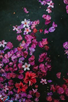
This photo is of multiple flowers. The image focuses on making an ugly thing of dead flowers in a pond look nice by making the flowers brighter.
|
This photo is a set up image of fresh flowers as they are facing upright in clean blue water, like the first one as this
|
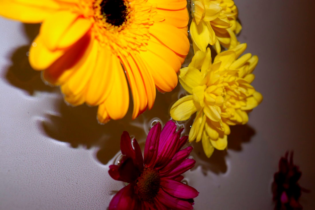
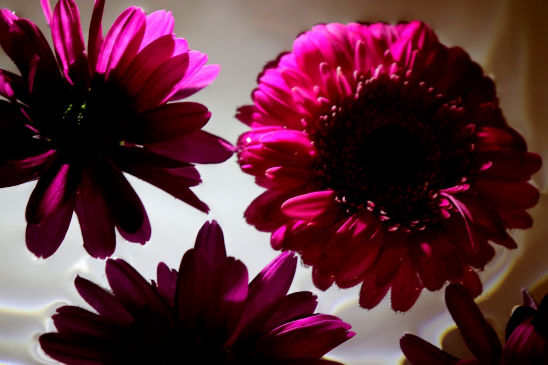
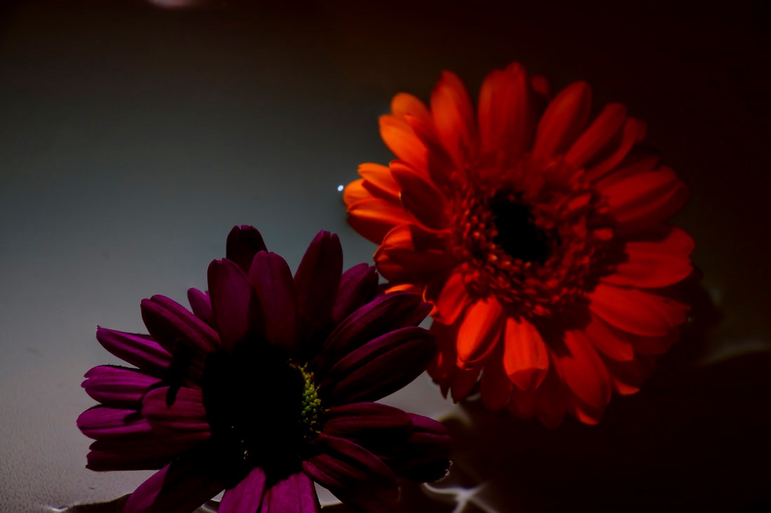
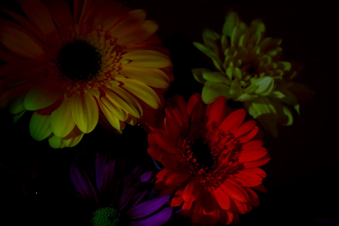
Second Strand-
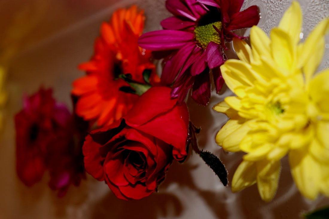
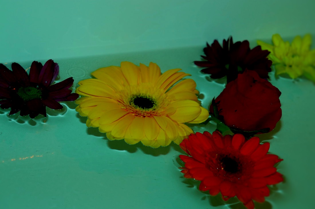
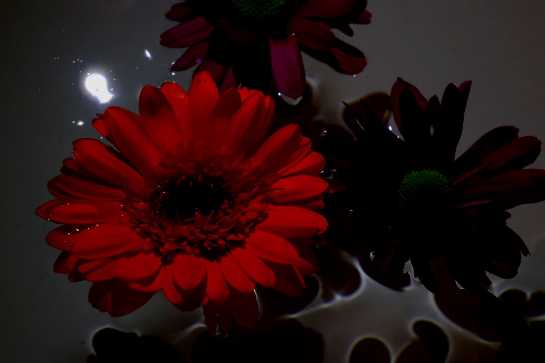
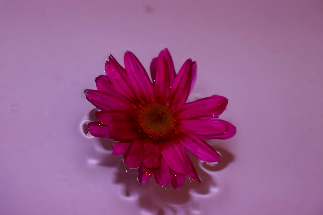
I took these images of flowers in water in the bath and coloured in tape and placed it on a torch to reflect different lights onto the water. With different colours of the flowers and the flowers reflected on the bottom of the bath. I made sure to get multiple different colours of the flowers so that when I turned up the saturation the colours would show more, I also did the same thing with the colours I put over the torch so the colours would look nice.
|
|
|
|
|
|
|
|
|
|
WWW- I like the different colours reflected on the water with a contrasting colour of the flower like the blue water on the pink flower.
EBI- Get more reflections and shadows on the water from the flower.
EBI- Get more reflections and shadows on the water from the flower.
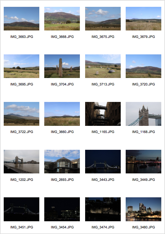
Countryside reflected on City-
Third Strand-
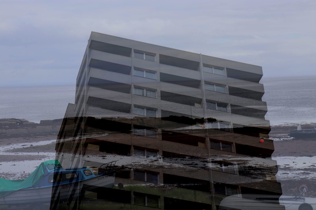
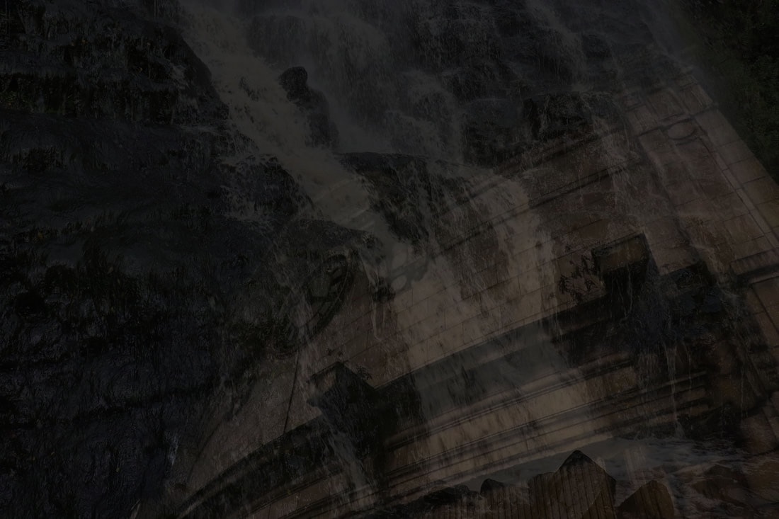
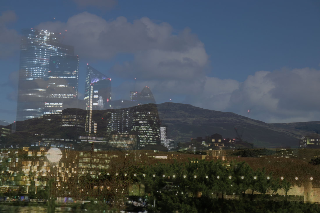
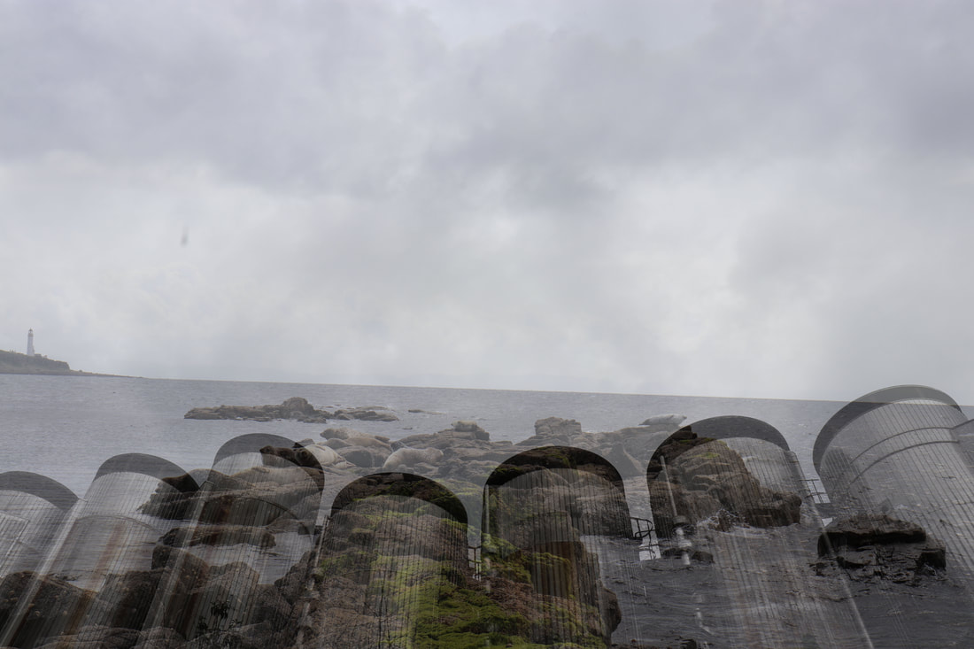
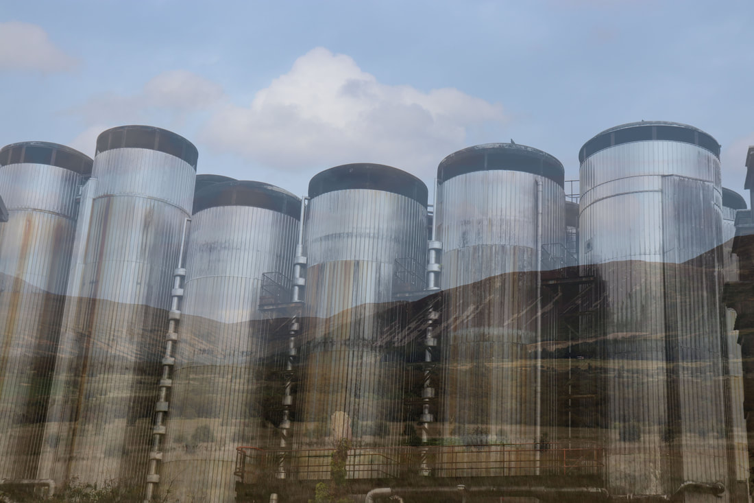
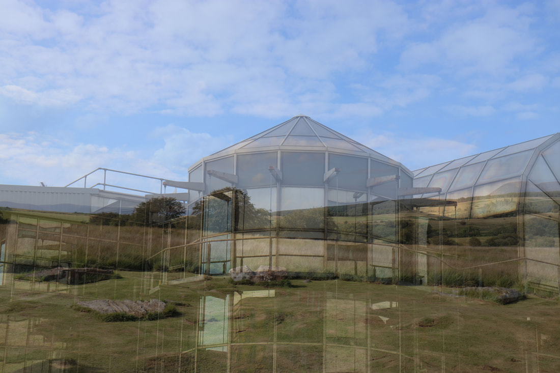
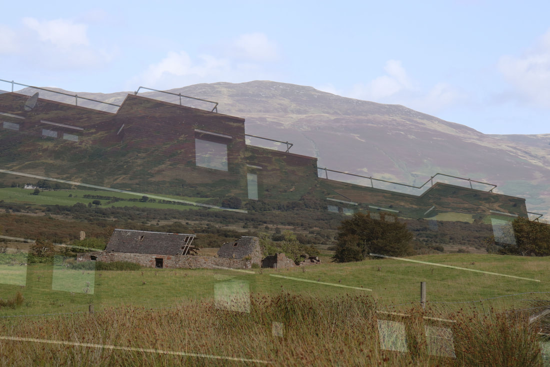
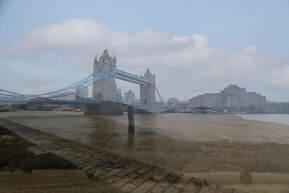
For this shoot I used pictures of the country side in Scotland and overlaid various images around London to show a contrast between country and city. I did this by putting the images onto of each other on photoshop and then lowering the opacity I think the contrast created looks nice as the harsh lines and heights of the city photos goes nicely with the gentle images of beaches, fields and other natural landscapes even things like waterfalls.
For this shoot I used pictures of the country side in Scotland and overlaid various images around London to show a contrast between country and city. I did this by putting the images onto of each other on photoshop and then lowering the opacity I think the contrast created looks nice as the harsh lines and heights of the city photos goes nicely with the gentle images of beaches, fields and other natural landscapes even things like waterfalls.
|
|
|
|
|
|
|
|
|
WWW- I like the similar shapes of the different images contrasted, like a tall hill and a city skyscraper.
EBI- With the images of the city that are dark/taken at night fade out the country image behind it.
EBI- With the images of the city that are dark/taken at night fade out the country image behind it.
Final Piece-
Colours in Buildings
Second Response-
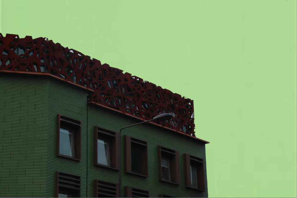
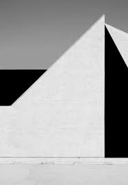
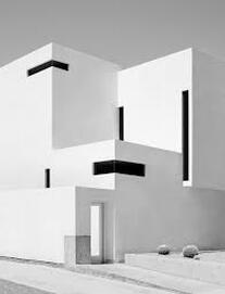
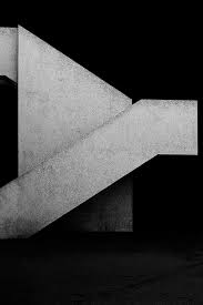
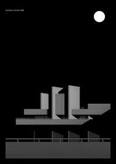
Link Artist- Nicholas Alan Cope
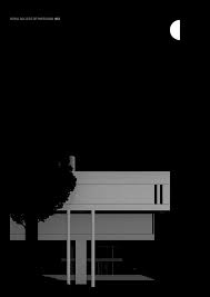
These images are taken of brutalism architecture. The buildings photographed are white and Cope has cut out different sections of the darker bits and just replaced it with black to create more of a contrast. In all the images the sky is grey so all the images are in greyscale but with multiple different shades. The point of his images is to simplify the most simplistic form of architecture which is why most the images are just the ground, pavement and sky.
These images are taken of brutalism architecture. The buildings photographed are white and Cope has cut out different sections of the darker bits and just replaced it with black to create more of a contrast. In all the images the sky is grey so all the images are in greyscale but with multiple different shades. The point of his images is to simplify the most simplistic form of architecture which is why most the images are just the ground, pavement and sky.
This image takes away all elements of the building and just makes the lines out of the walls which almost don't even look like walls because of the colours. The whole image is on a greyscale with the sky being grey and some of the walls being white and some being black.
|
This image of Cope's is less abstract as he's removed less of the detail and contrasted the different tone less. The only part of he image he has properly deleted and replaced with a block colour is the windows. Like all Copes images this is in black and white but this one has less contrast.
|
This image is similar to the second one as less detail has been removed and you can still make out that its a building. There is a heavy contrast of light and shadow on different parts of the building and once again he's removed the windows and replaced it with block black.
|
Artist and Me-

|
To compare these images i first tried to make my image more similar by making it portrait instead of landscape, and also making the colour of the building brighter as it is in the photo. I chose this one to compare as they both have a black background but the building also has a darker industrial look, they aren't white more grey and dusty. For these reasons I think the images compare well.
|
|
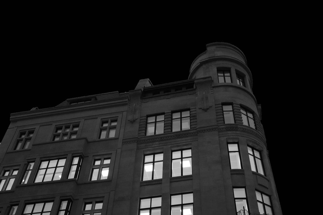
For this shoot I went to a few different buildings including The Barbican. I put a layer of the colour clack in the background and using photoshop cut out the background and windows or just any lighter colours making the building more simplistic by cutting out detail.
|
|
|
|
|
|
Third Response-
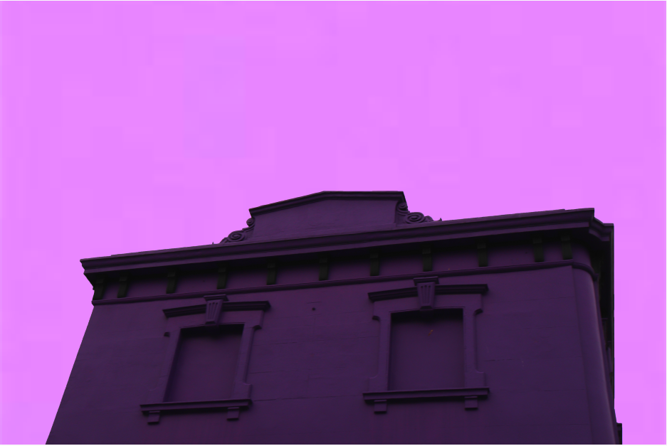
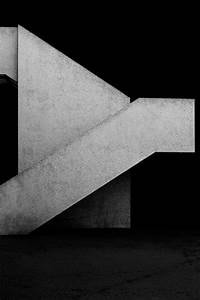
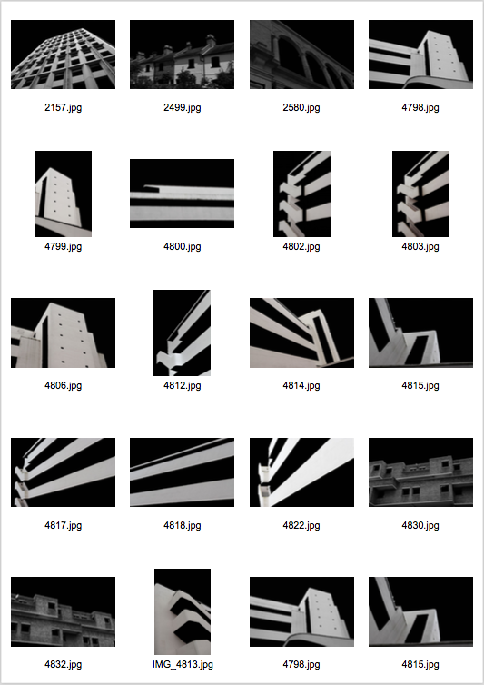
Link Artist- Thomas Danthony
Thomas Danthony is a French photographer based in London and Barcelona. Some of his most well known clients have included Google, Transport for London and Penguin. Danthony mainly focuses on illustration but recently he's been creating a few pieces through textiles. His Brutalism pieces below which I have been focusing on was a collaboration with Black Dragon Press about brutalism architecture in London.
Thomas Danthony is a French photographer based in London and Barcelona. Some of his most well known clients have included Google, Transport for London and Penguin. Danthony mainly focuses on illustration but recently he's been creating a few pieces through textiles. His Brutalism pieces below which I have been focusing on was a collaboration with Black Dragon Press about brutalism architecture in London.

This image is quite different to some of Danthonys others only in the sense that it incorporates a piece that isn't abstract, the tree. It links in with others obviously as he used the same technique to create the image.
|
This image is one of Danthonys more abstract pieces as you can't really see what goes where. Danthony carefully makes his pieces very aware of shadows and how different light would look in different places.
|
This image is shown as being least exposed as only one side of the building is shade in a way where you can see it. Like his other images the rest of the image is just a black screen.
|
Artist and Me-
|
My image is different to the artist as Danthony uses digital art to create his images Danthony also focuses a lot on shadows on different sides. He also cuts a lot more out of the images like things blocking the building to create interesting shapes. Our images are similar as they are of abstract architecture and use very simple shapes to create the building.
|
|
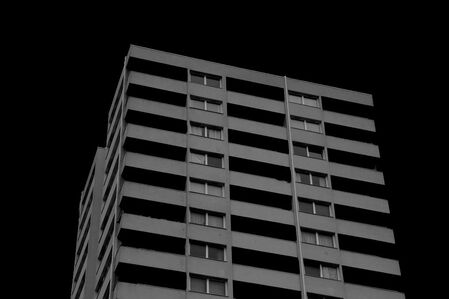
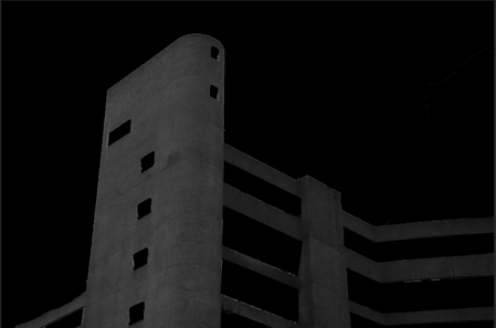
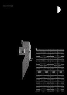
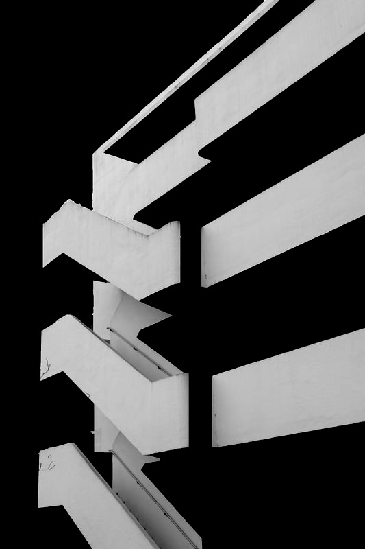
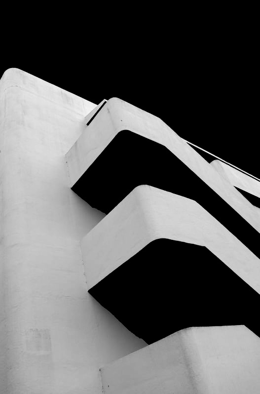
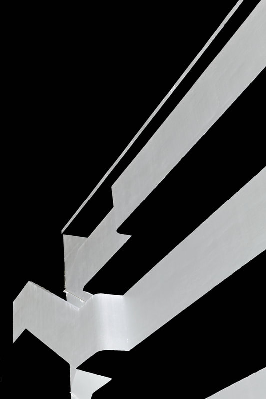
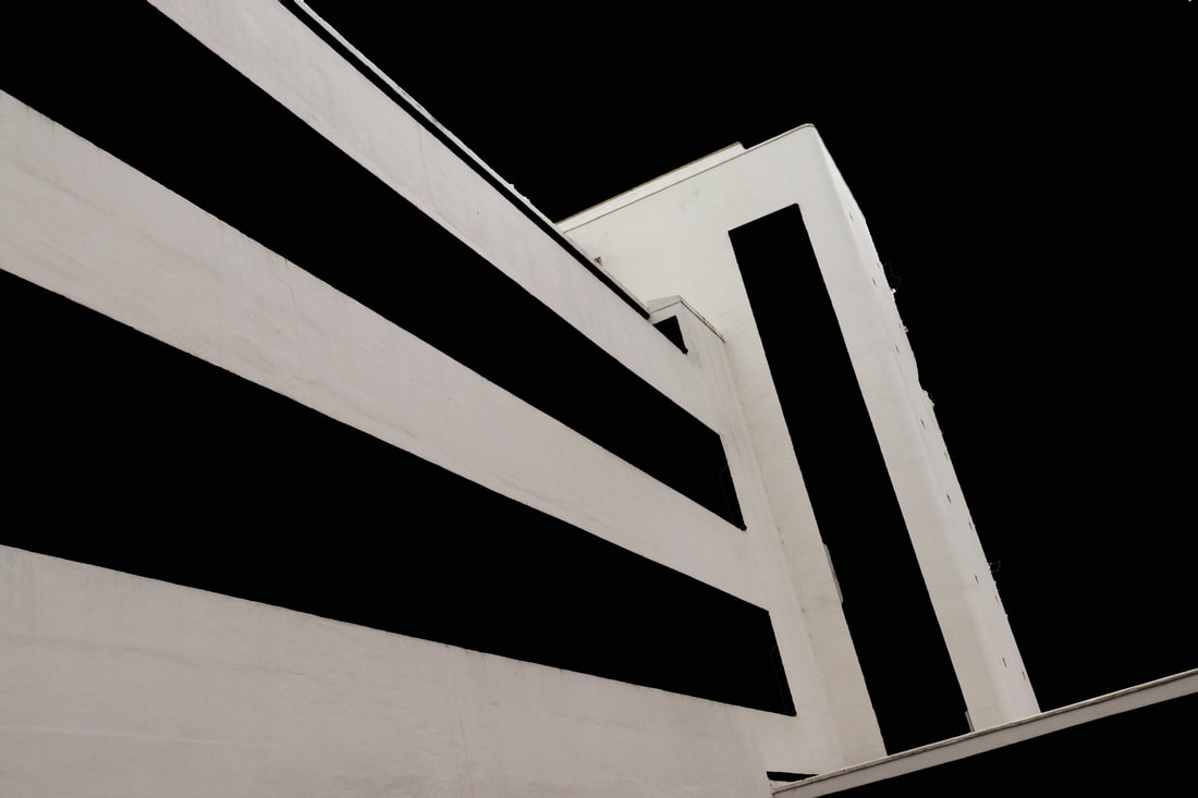
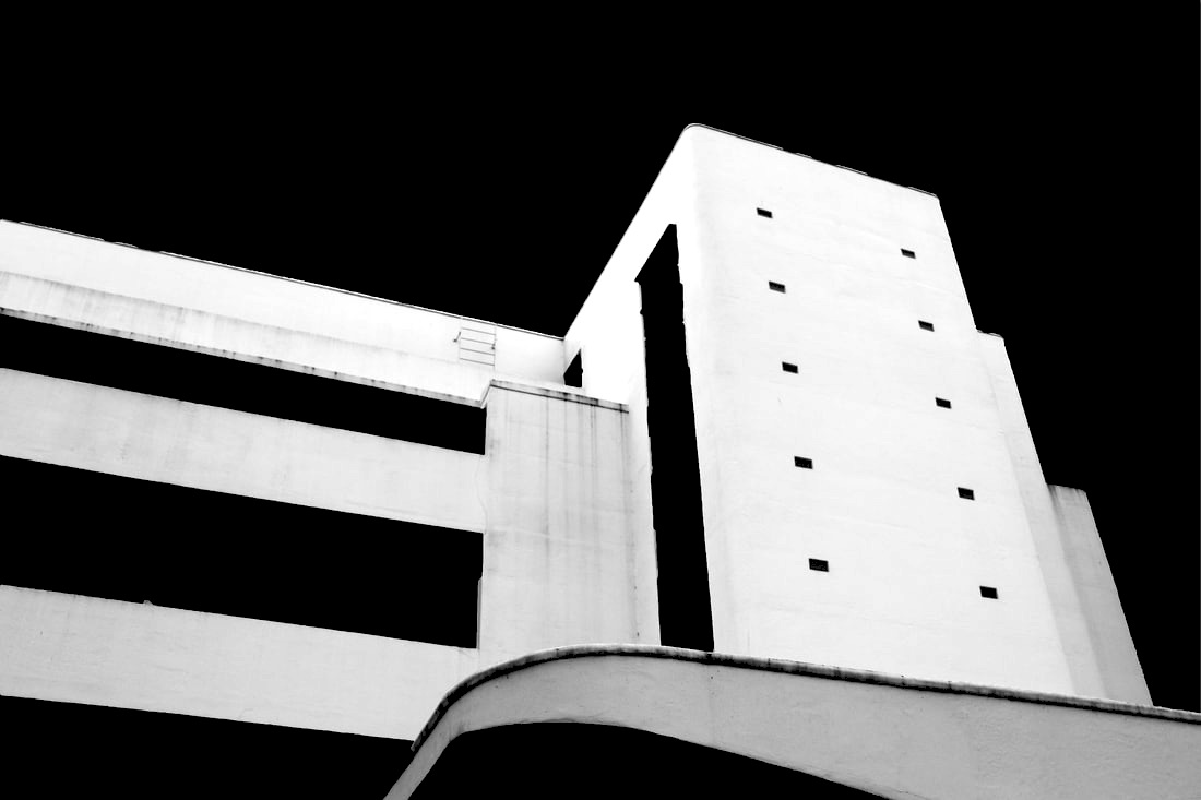
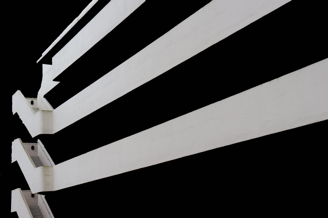
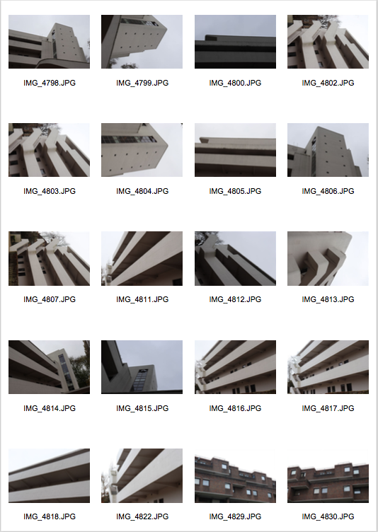
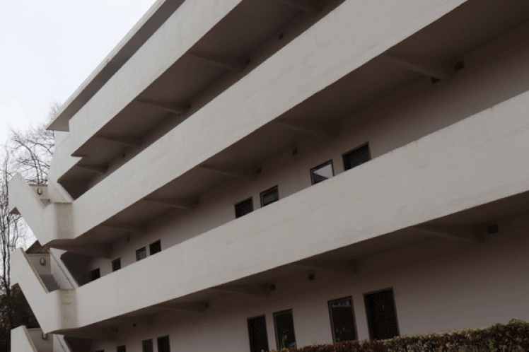
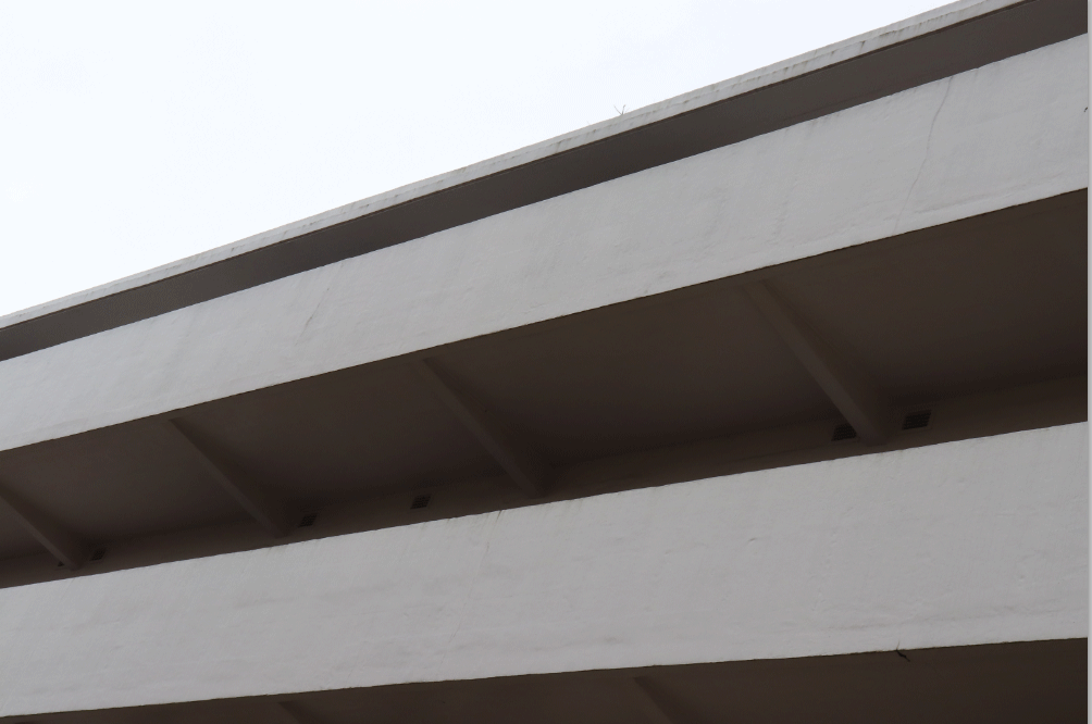
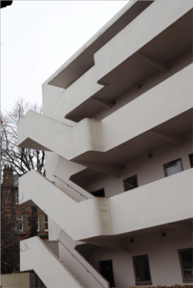
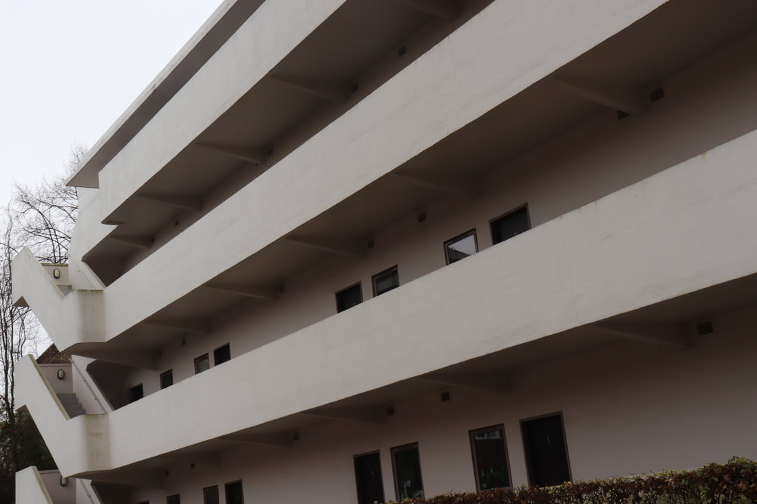
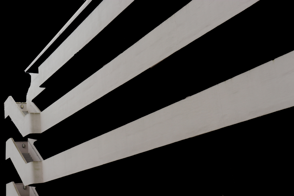
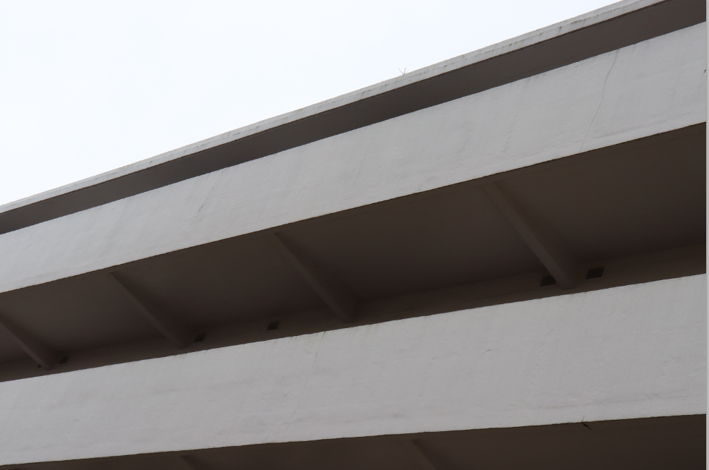
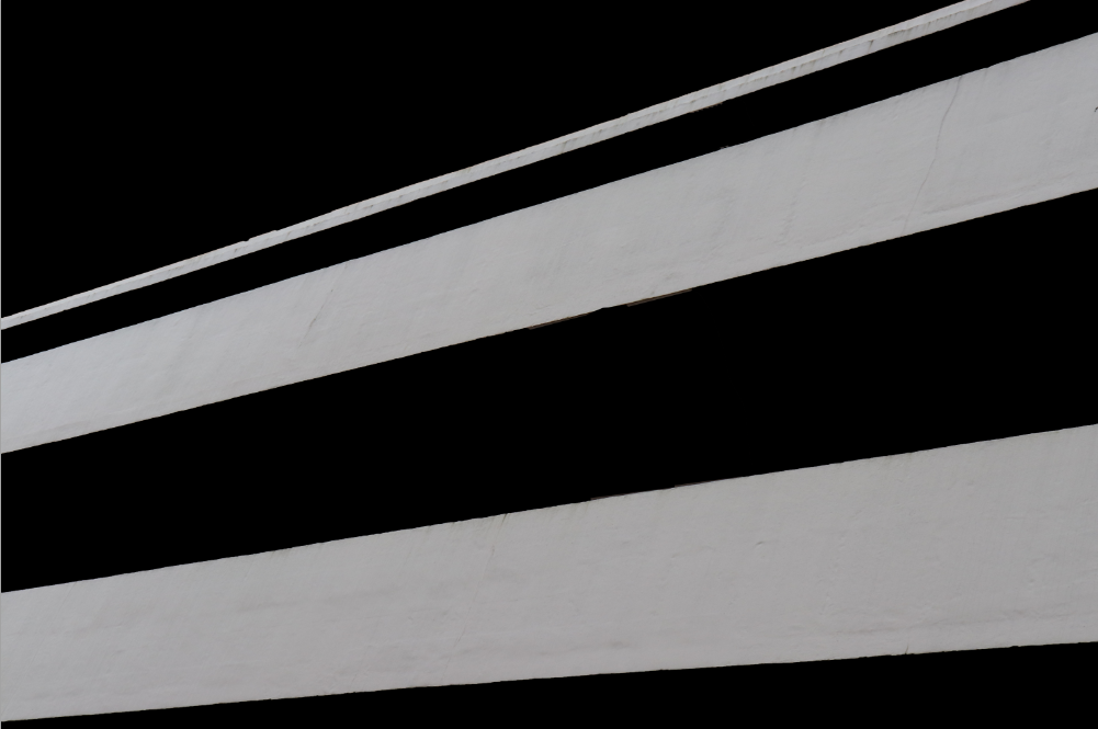
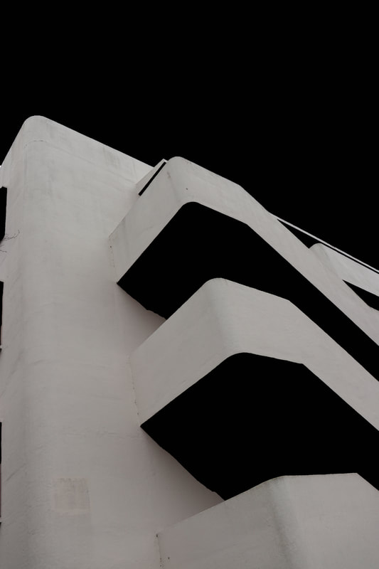
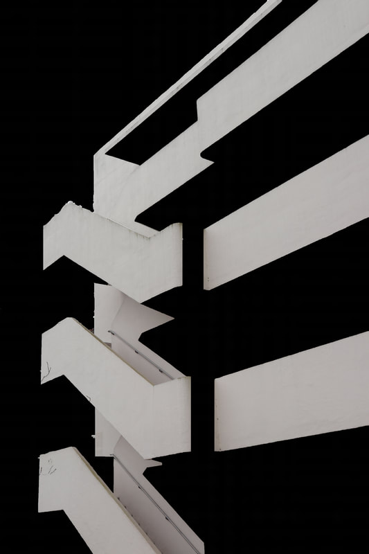
For this shoot I went to a brutalist building called the Isokon building. I then used photoshop to remove the sky and also the dark bits of the photo to make it a block black. I then raised the brightness of the image to contrast the building and the black background. With the complete contrast of black and white it created a very abstract look to the point where some of the images don't even look like the building although I prefer the images that look like the building as the architecture is nice as it is. For some of the images I changed them into black and white only to make them look the same as the other picture as the building was white so naturally some of the parts of it were a bit dirty so changing them into black and white removes that detail. To experiment I tried other buildings, I tried an abstract block of flats, Alexandra Park and a few other buildings around where I live. Although as these buildings weren't white and were made of brick it didn't quite create the same look as the ones of the white building.
|
|

|
|
|
|
|
|
WWW- I like the sharp lines and the sharp contrast of black and white.
EBI- Get more angles of the building.
EBI- Get more angles of the building.
How it's done:
Fourth Response-
Architecture GIF
For this I used one of my previous pictures, using the same process but doing it slowly bit by bit, and screanshotting it each time. That method creates the effect that the black background is travelling through the image almost take it over.
Architecture GIF
For this I used one of my previous pictures, using the same process but doing it slowly bit by bit, and screanshotting it each time. That method creates the effect that the black background is travelling through the image almost take it over.
|
|
|
|
|
Fifth Response-
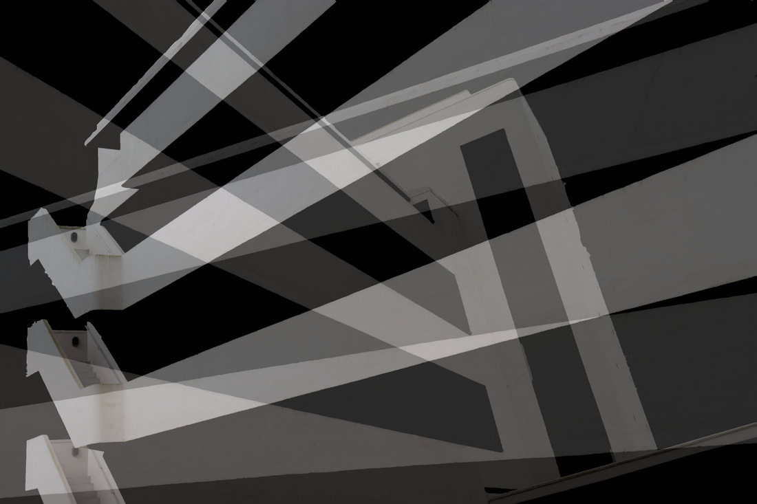
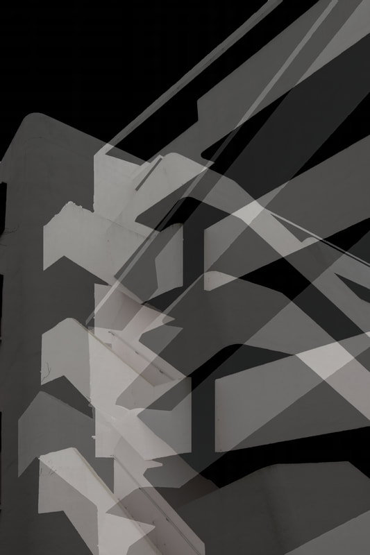
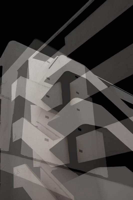
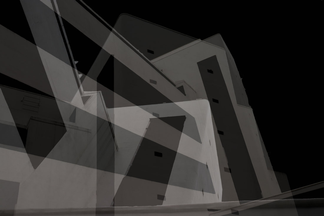
Brutalism Layering
For my fourth response I used the same images from my third response and layered them, I like the lines this effect creates. To do this I put three images on top of each other and lowered the opacity of the two on top so you can see all the images vaguely.
Brutalism Layering
For my fourth response I used the same images from my third response and layered them, I like the lines this effect creates. To do this I put three images on top of each other and lowered the opacity of the two on top so you can see all the images vaguely.
|
|
WWW- I like all the different lines and shapes created through layering the images.
EBI- I could have taken new images.
EBI- I could have taken new images.
Interim final pieces-
I decided to choose these three images for my final piece as I believe they are my strongest pieces from the topic of 'Reflection'. I think these three images also go well together as a trio.
|
|
|
